Affordance is a term that describes the relationships between an object’s property and the people who use them. An object’s usage is not usually limited by its original purposes but needs. For instance, a person can use a water bottle to grab, pour and contain. Users can also use the water bottle’s cylindrical shape to flatten flowers when cooking or replace the compass when drawing circles.

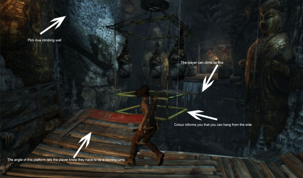
When it comes to design, designers tend to apply affordances to their products to guide user behaviours, for example, in video games. Tom Pugh posted an image and a couple of his thoughts on the use of affordances in Tomb Raider. As we can see, designers have implied colours, textures and lightings to secretly inform players where to go next and how to overcome the difficulties, which are the effective use of affordances.

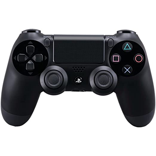
In addition to video games, video game consoles also feature affordances in their designs, for example, SONY’s PS4 controller.
As we can see, the controller has two handles which is a significant sign of grab. Buttons are placed on the controller, and two analog sticks are slightly away from the handles, which is designed based on the ergonomics of human hands. The affordances of the ps4 controller inform the users to grab, press and push immediately after seeing it.

In conclusion, affordances should be applied when designing because it is an intelligent way to direct user’s behaviours without telling them what to do through words, but instead through acknowledgement from the users. It makes the interaction more engaging and immersive.
Here are a list of affordances of an ipad:
- The circular button informs users that this is the central control button.
- The button on top is for switching on & off; therefore, it is small to prevent accidental pressing.
- The two buttons on the side are to control volume; consequently, they tell that this is to adjust them either higher or lower volume.
- Ipad is rectangular, just like a book, to inform users that this is to hold vertically or horizontally by hands.
- The screen is almost taking the entire surface with only one button underneath; therefore, it tells users that this is a touch screen, and users can do most of the functions through hand gesturing.
- Cameras are on both the front and back of the iPad, informing users that it can take pictures and videos.
- When pressing the top button, the users can hear a ‘locked’ sound to notify them that the iPad is now locked.
- Users can switch pages by swiping left or right on the desktop, just like turning pages in a book.
- When login into the iPad, the desktop contains all essential apps to help users learn how to access the iPad’s vital functions. All apps are in different colours with unique icons so that the users can understand their purposes immediately.
- The control button only has three functions: back to the desktop(press), show all pages(double press) and call Siri(hold). Users can quickly work it around and learn to use it.
On its extension, perceived affordance focuses on the method to make affordances happen. For instance, designers want the ps4 controller to be perceived and used as a hand-use object; therefore, they designed it based on human hand ergonomics to inform where to grab when seeing it. Besides, in the Tomb Raider game, designers directed players through the lighting system to let them follow the light when everywhere else is dark in the environment.
References:
Water bottle: https://www.goodhousekeeping.com/home-products/g27312224/best-water-bottles/
Tom Pugh: https://twitter.com/tompugh1112/status/1030862556179705856
PS4 Controller: https://www.amazon.com/DualShock-Wireless-Controller-PlayStation-Black-4/dp/B00BGA9X9W
Perceived Affordances: http://johnnyholland.org/2010/04/perceived-affordances-and-designing-for-task-flow/