App research
This is the stage where I need to start thinking about the appearances of my design.
During my conceptualise stage, I mentioned about Bauhaus style because it uses simple geometries and colours to build a system of art, which I was inspired by a lot in this project.
Therefore, for the appearance design for this project, I will specifically look into the Bauhaus style: clear and strong aesthetic. Here is a video about the system itself:
One thing I was inspired by Bauhaus is that it concludes the rhythm of nature and created a system to teach people about art. What I am doing in this project is in fact very similar to the Bauhaus: To create a system that allows people to use synesthesia to create art and music.
AESTHETIC RESEARCH.
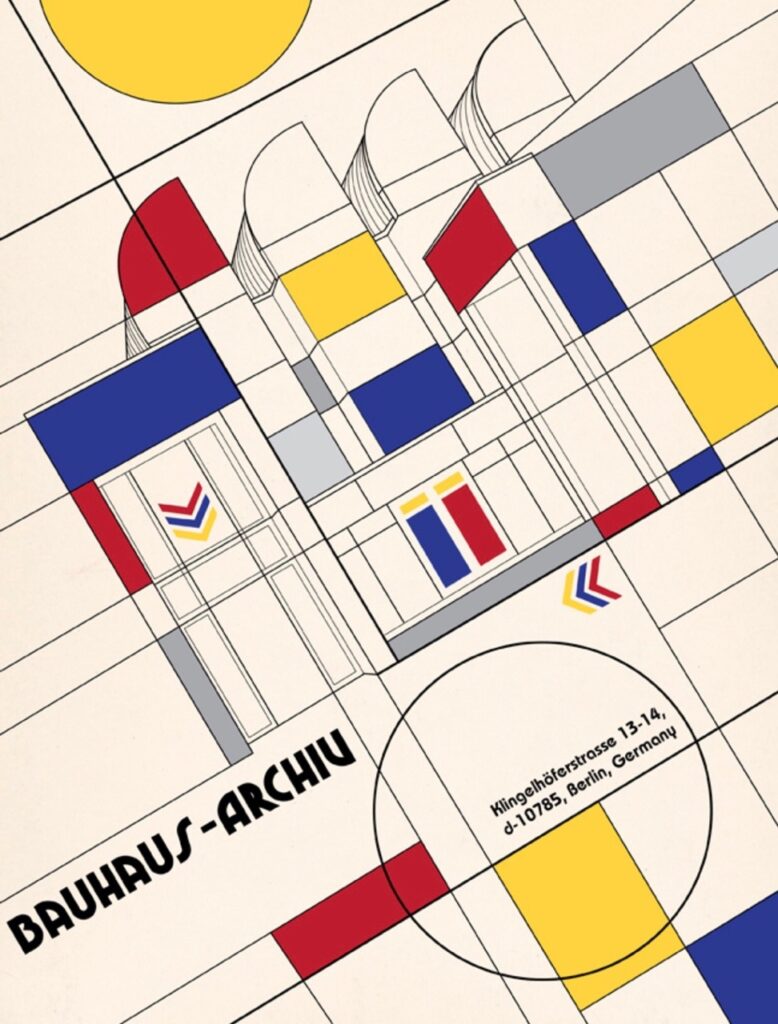
App Bauhaus.
The first look is an app called the Bauhaus app. We can tell that it is largely influenced by the style itself, which has a strong sense of colour and structures. Functionality wise, I can only guess it is about teaching people about this system of art:
Synesthesia Music Video.
The second look is a ‘simulation’ of how a person perceives music with synesthesia. It looks very interesting because it matches the similar concept of my design: using simple geometric shapes & colours to express the feeling after hearing sounds:
What I found interesting is that the shapes are following the rhythm, which could be a mechanic in my future development. I also like how the artist uses darker colours to represent certain musical features: bass and minor key – dark; synthesiser – purple. The melodic lines are represented by the geometric shapes with brighter colours because they stand out from the entire music.
The contrast between the background colour and the objects could be a feature in my future design.
Bauhaus visualisation.
This is a very interesting video because the artist turned Wassily Kandinsky’s artwork into a motion graphic. One thing I found inspiring is the idea of turning a whole thing into different parts, which is a great example of decomposition just like a piece of music.
Bauhaus Animation.
The next video is from the same author. But this time it is more ‘2D’ than the previous video. I really like the way they started this video: shapes appearing one by one to match the rhythm in the background. Another thing I noticed was the background is always the same, but the elements on top of it change the aesthetic.
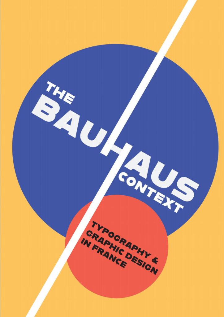
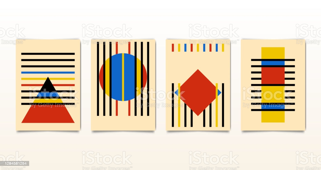
Bauhaus graphics.
Here are some posters and illustrations I found:
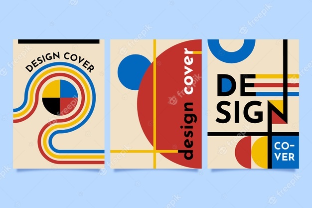
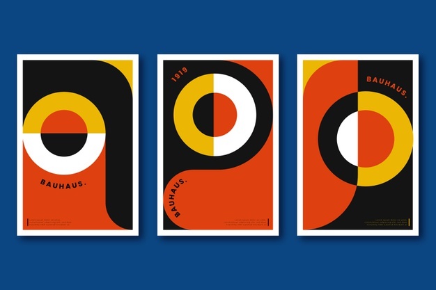
One thing important in Bauhaus is the contrast between colours. The visual impacts from Bauhaus always came from colours. Although they are simple, yet powerful contrast creates a strong impact on the audiences, which is something I want to do in my design.
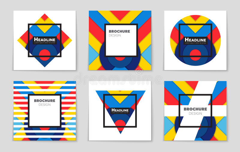
When it gets to the modern days, the colours are becoming more saturated and ‘white’ colours’ became more prominent in the design. I think this is a great way to merge Bauhaus into modern-day designs.
Another interesting fact that I found out about the modern-day Bauhaus is that the colours are also becoming ‘gradient’.
3D is an important element I found in Bauhaus. It is very easy to build a 3D shape based on simple 2D lines, which gave me an insight: If we can control the simple geometries, everything could be drawn.
This is a video about Bauhaus. In this video, the aesthetic is a very topical modern-day Bauhaus because the colours are more ‘gradient’ and ‘soft. It also includes some interactive and 3D elements to make it look more ‘user-centred’, which is a great way to educate people.
Now here is an interesting video. I really like the interaction in this video: simple and deliberate. This is something I want to have in my design:
After learning about Bauhaus, I started to believe that these three shapes can create everything we can see. And I also noticed these symbolic colours and shapes are always used in Bauhaus related projects:
Although triangle, square and circle are the three essential elements of Bauhaus, lines are also important because they build up the composition of the painting:
Here is another interesting video I found, it turns Wassily Kandinsky’s painting into motion graphics:
APPS.
APP DESIGN.
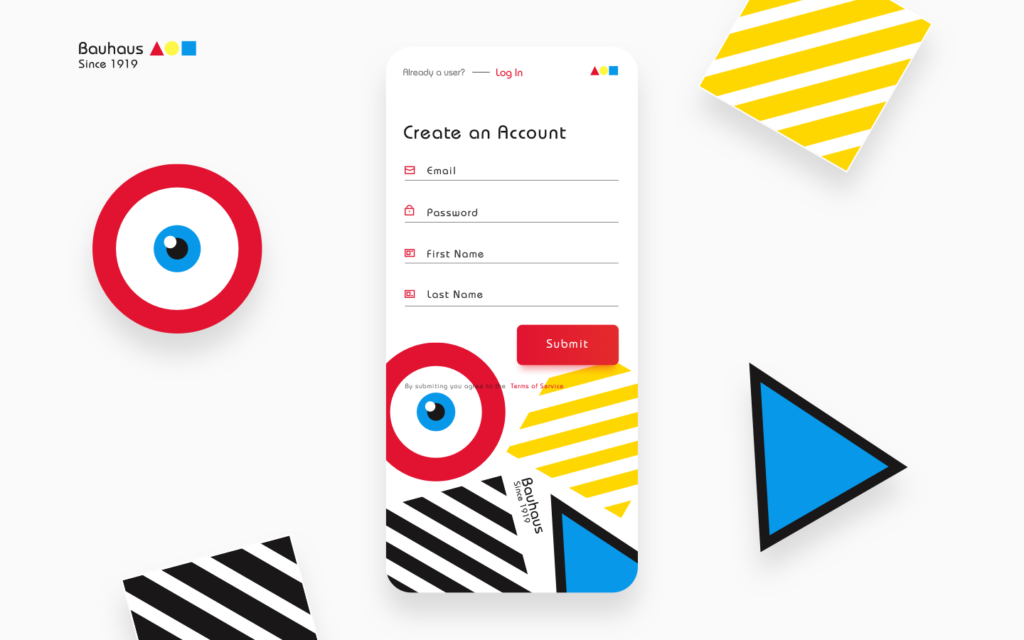
I found this app attractive because it clearly used Bauhaus style as the foundation, but with more ‘modern’ features built in the app. For example, the brighter colour and the cartoony eye. I think using cute features could attract the younger audiences as well:
These ones look like album covers which I like a lot. I think they are an example of combining both Bauhaus and minimalism. The idea is very simple: Have a set of colours for the entire app, then only use one or two colours on a single page. This design allows users to concentrate on the content instead of the aesthetic.
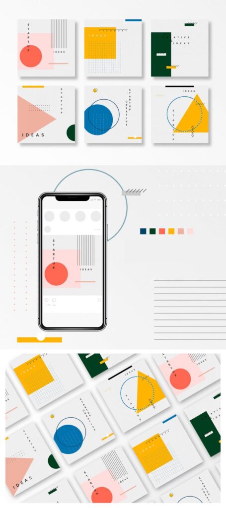
Finally, the extremely modernised Bauhaus app: The shapes are no longer simple, but with more complex structures. One thing I like about this set of designs is the use of lines. If we look closely, we can see that most of the shapes are connected by the lines to create a kind of consistency.
The final thing I looked into was the Bauhaus motion graphic. I like the way the author separates Bauhaus into different aspects, such as dimension, colour, precision, rotation etc..
CONCLUSION.
In conclusion, Bauhaus is a great style I could possibly use in my current project. It only requires simple colours and shapes to create unique paintings, which will be extremely helpful for people who have synesthesia to identify the sound and visuals.
One thing I will do is to keep the aesthetic simple and minimal. The reason for that is because the users/audiences of my design are creative people, and they are using my product to make art or music. Therefore, I need to make sure the interface is clear so that they can expand their creativity as much as possible.
After speaking to my tutor Danny, we both agree that right now, the most important thing is to start making instead of thinking. With all the experiments I have done in the second iteration, I believe that it is about time to start making my FMP outcome.