CONCEPTUALISE.
Following the 5C model, I am now entering the conceptualise phase.
There are three things I need to figure out during this phase: goal, insight and design.
In order to organise my thought process, I decided to use my Pecha Kucha slides to present every step.
As I concluded in the research phase, I finally came back to my first topic: synesthesia(chromesthesia). But instead of looking into the negative things about this topic, I found it more interesting and important to figure out what people can do with it, and how it helps us in certain aspects.
According to my research, there are a couple of issues waiting to be solved:
1. Synesthesia(chromesthesia) is a subjective condition, this means that different people will experience different things. For example, I feel the music note ‘A’ sounds red, but others may think it’s blue. In this case, it’s very hard to make people believe that synesthesia is an actual thing.
2. Since a lot of people don’t believe or aren’t serious about this condition, it is even harder to bring awareness.
3. Based on the research I did previously, a lot of artists are using synesthesia to create art, but again, not many people agree that this is an ‘ability instead of a ‘disorder’. I need to think about how to change people’s views on this.
4. How to make my product functional when it is subjective?
Based on the issues above, I set up three goals below:
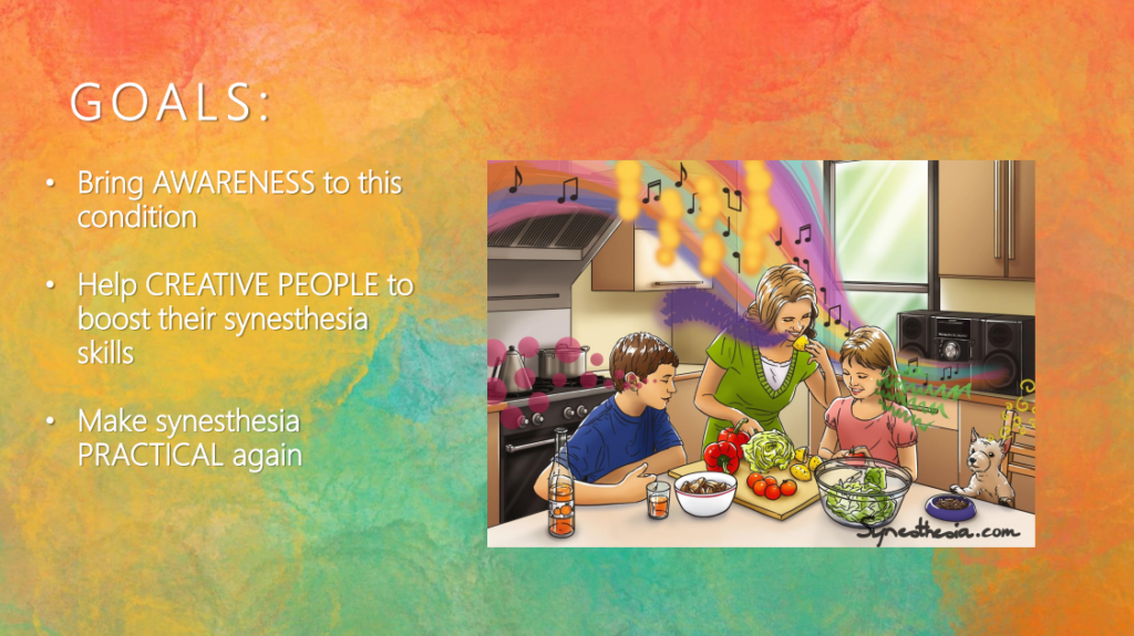
The goals can be concluded into two keywords: awareness and functionality. When designing, I need to think about both at the same time. But at least there is one thing for sure: My target group is creative people who have synesthesia, and my design goal is to allow them to use their synesthesia practically.
To specify my target user group, I started with a mindmap:
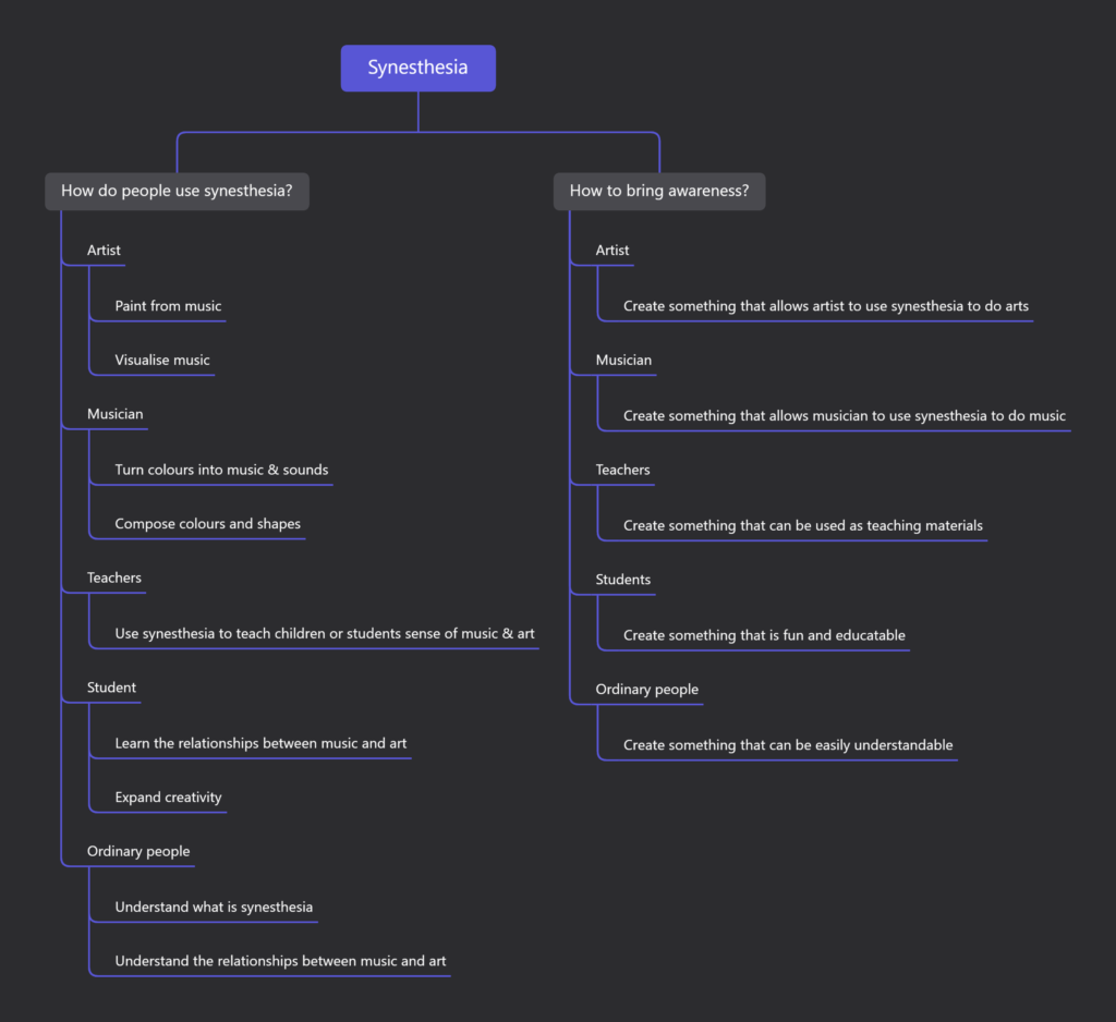
The mindmap contains two topics: ‘how to make synesthesia more popular?’ and ‘how to make it more practical?’.
Here are the personas I made for my designs:
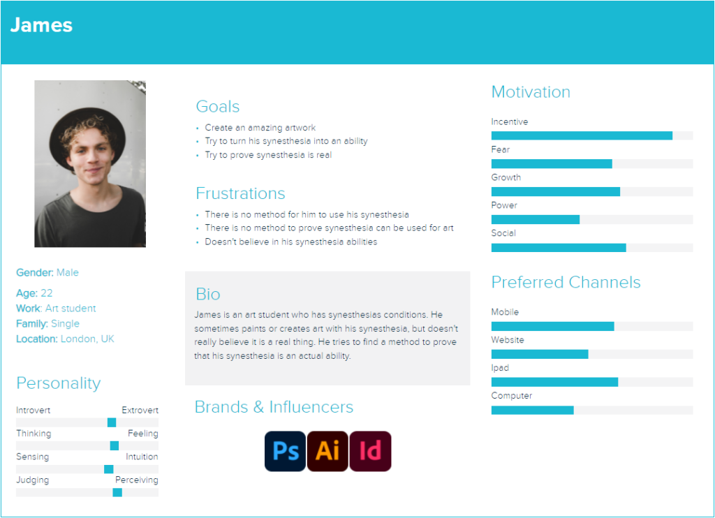
The first persona is an artist who wants to create art with his synesthesia ability. However, he is not sure whether his synesthesia is real or not. Therefore, he needs something to prove that he can make something with his synesthesia ability.
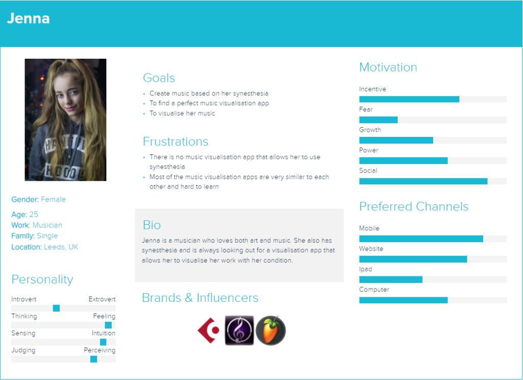
The second persona is a musician. She also has synesthesia but doesn’t know much about art. She wants to make her own music visualisation but the apps nowadays are too complicated to learn or hard to make personalised contents.
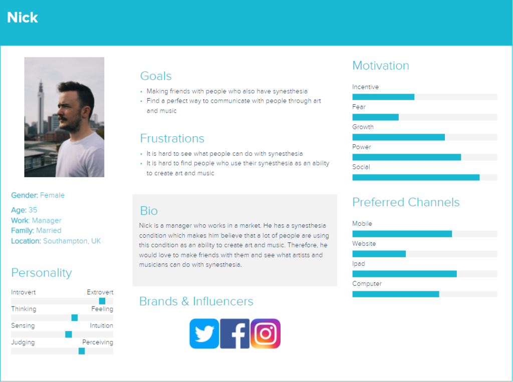
The third persona represents the group of people who has synesthesia but doesn’t know how to use it. He wants to make friends with people who have the same condition and see what they can do with it,
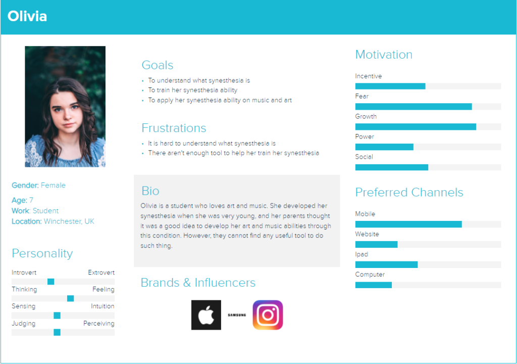
The last persona represents the younger age group who have synesthesia. It is a great time to let children understand the meaning of synesthesia, and perhaps develop it to make them better at music or art.
Whilst making the persona, I realised one issue: Not every artist understand music, and not every musician know about art, so how might we solve the problem?
I think this is a great opportunity to make an HMW list to push my idea forward:
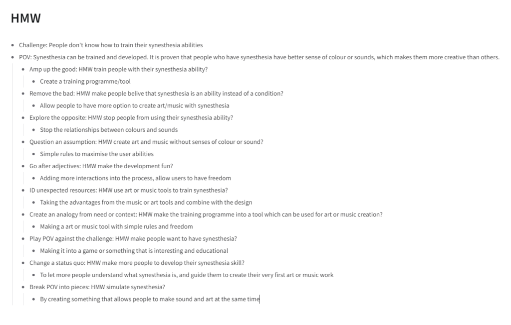
So after a list of HMW, I have come up with two insights:
Brainstorm 1.
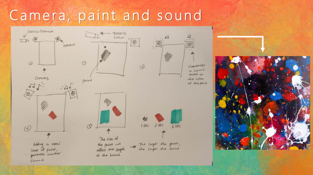
The first idea is painting the sounds. The idea is about setting up a canvas in front of a camera, with speakers on its sides. When the paint is applied onto the canvas, the camera detects the colour and generate a sound. The more paint you put on the canvas, the more sound will be generated, and end up something like the image on the right with layers of sound.
The idea sounds cool, but there are some issues that need to be solved:
1. The shape of the colours – How do we paint with shapes? How does the computer understand what shape you are painting? When there are multiple shapes on the canvas, how does the computer know which one to generate sound?
2. How many colours? – How many colours can the computer read? How many sounds do we assign to each colour?
3. Tone of colours – There is definitely going to be colour shifting, so how do we deal with them? How does the darkness affect the colours?
4. If we have already assigned the sound with colours, can people still create music/art freely?
In conclusion, brainstorm 1 doesn’t provide a clear picture of how it is going to work in reality. In the next brainstorm, I need to think about using shapes to create music instead of colours only.
Brainstorm 2.
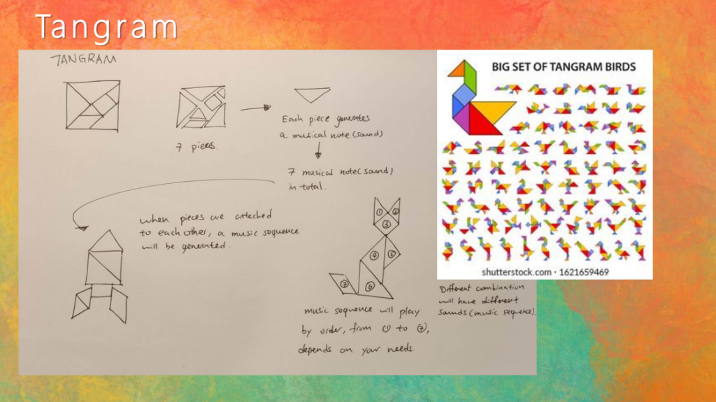
The second idea is Tangram. It is a square made of 5 triangles and 2 other shapes. The idea is that each piece has a musical sound, and when you assemble them, a melody will be generated. The different combination has different melodies, so users can adjust them freely.
This idea is more united than brainstorm 1, however, there are still some other issues waiting to be solved:
1. Users cannot adjust the shapes freely because they are mainly triangles.
2. There will only be melodies playing in this design, and players cannot create or customise harmonisations(more than one sound happens at the same time).
3. Users cannot adjust the sound for each piece since they are preset, so there is no ‘creation’ besides assembling them.
In conclusion, this idea would work but sacrifices the freedom of customisation. Therefore, I need to focus on creating something that allows people to fully customise their work, just like how they compose and paint.
BRAINSTORM 3.
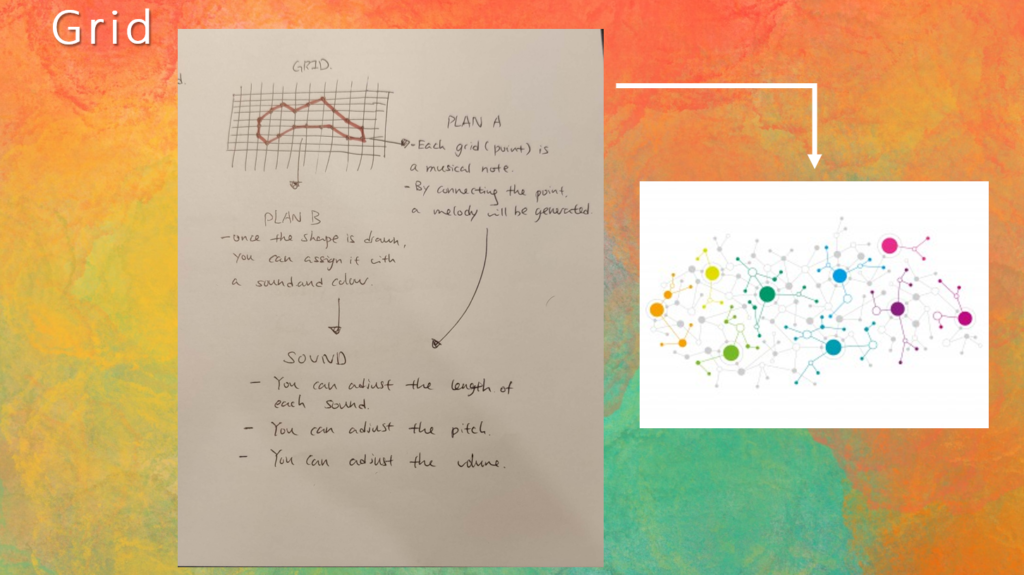
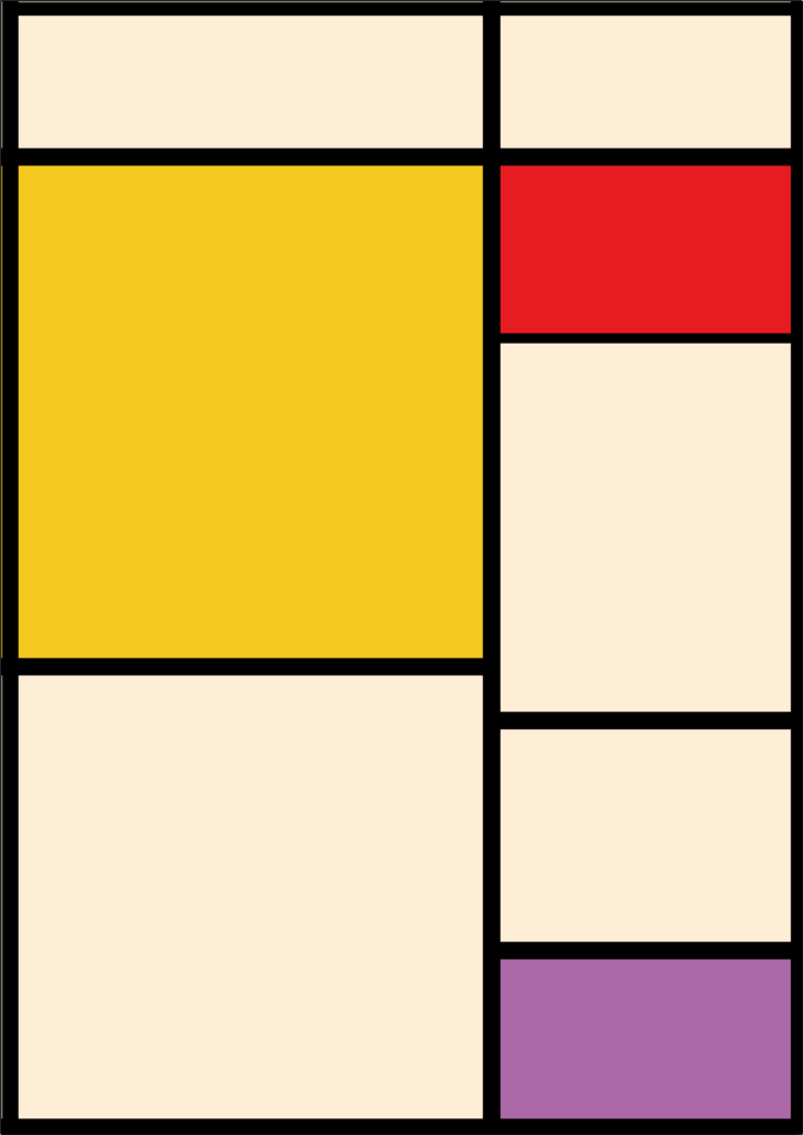
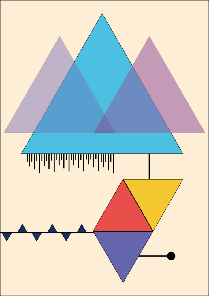
The third brainstorming is the grid. The concept is simple: there is a grid, and the dot for each line intersection is assigned to a musical sound. By connecting the dots, a melody will be generated. The outcome looks like the image on the right.
The idea is straightforward, and it was inspired by the game I designed in my undergraduate course, see gameplay mechanic below:
The simple mechanic doesn’t mean it is suitable for my current idea. Here are some issues:
1. How do users know which dot is assigned with which sound?
2. Again, there is no sound customisation in the game because every dot is preset with a sound.
3. The mechanic is largely based on individual sound, therefore it is hard to create harmonisation.
In conclusion, this idea is interesting but it has a common issue which the previous ideas also have: not enough customisation. Therefore, I need to start thinking about how to expand the customisation and allow users to do as much as possible in the product.
Initial Idea.
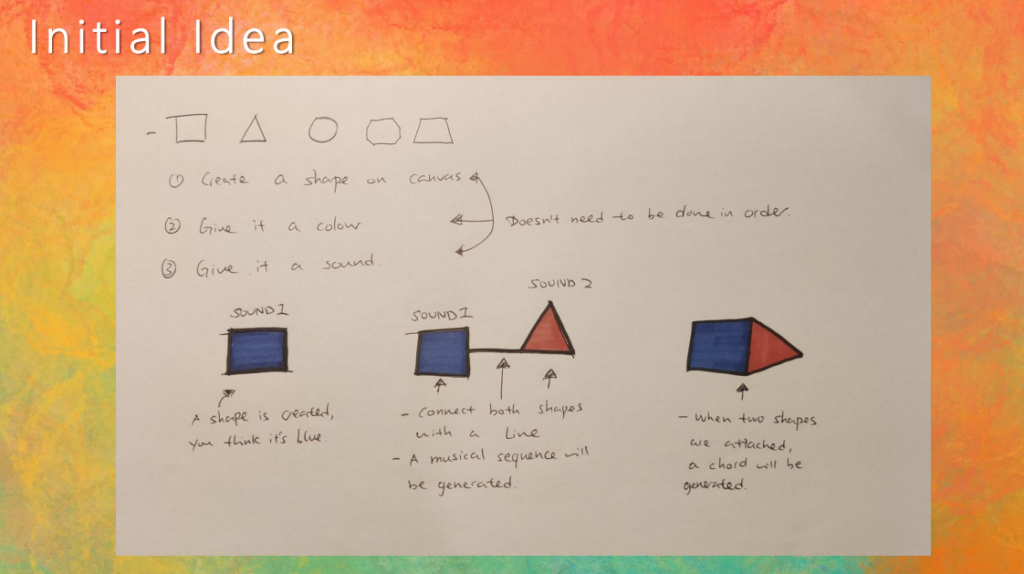
Finally, I have come up with the initial idea, and here is the process: You start by choosing a sound from a set of sounds, then assign a colour and shape to it. For instance, I heard sound 1 and it feels like a blue square, so I assign both features to it. The same goes to sound 2 with a red triangle. So now we have two sounds, and by connecting them, a melody is created. You can also layer them on top of each other to create harmony.
The best part of this design is that it allows the users to choose the colours, shapes and sounds based on their synesthesia abilities. The mechanic of connecting & layering shapes is also very practical in terms of creating art & music.
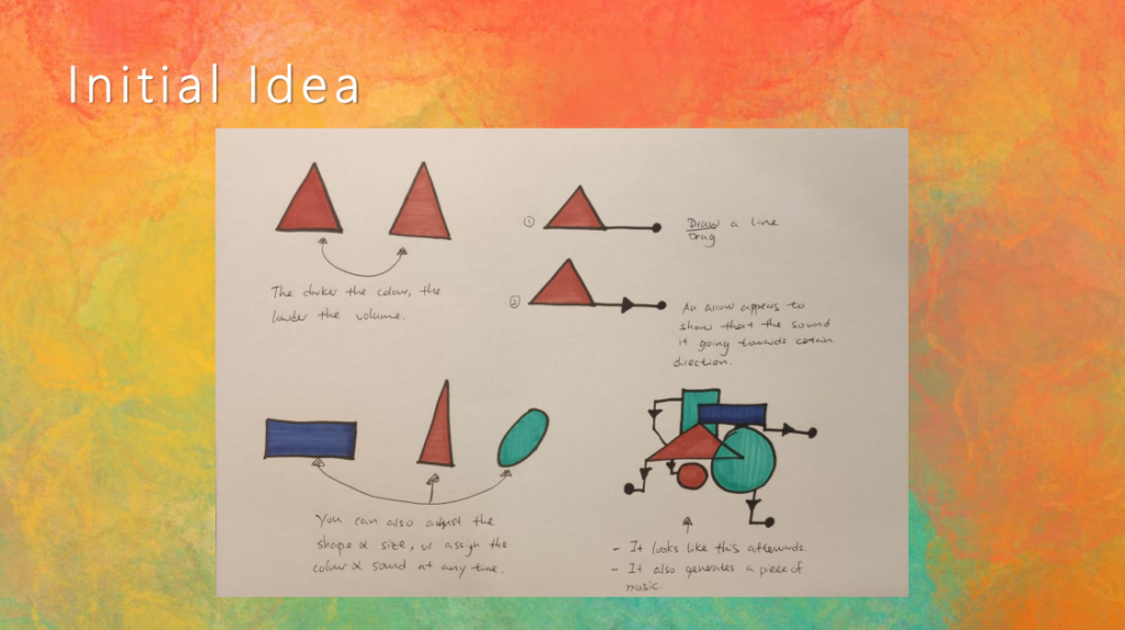
Let’s continue with design: The more visible the colour, the louder the sound; The less visible the colour, the quieter the sound. You can also adjust the shapes: Stretch it, re-scale it or move it around. The end result will look something like the image in the corner. Notice that this isn’t just a piece of artwork, but also a piece of music you compose.
In order to make it more interesting and customisable, I designed a visibility system for the colours. It not only adds more depth into aesthetics but also features more dynamics in the audio part.
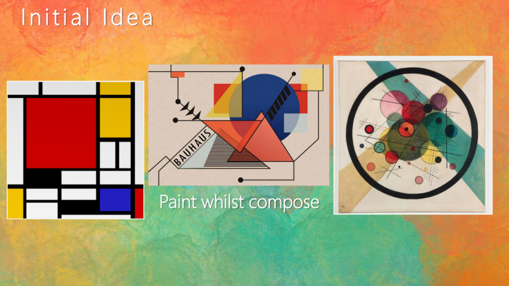
Ideally, the outcome should look like Bauhaus art because the idea of using simple geometry to present organic shapes is very similar to what I am designing right now: using simple shapes and colours to compose music, and using simple sound to create visualisations.
Create.
PROTOTYPE 1: MECHANIC
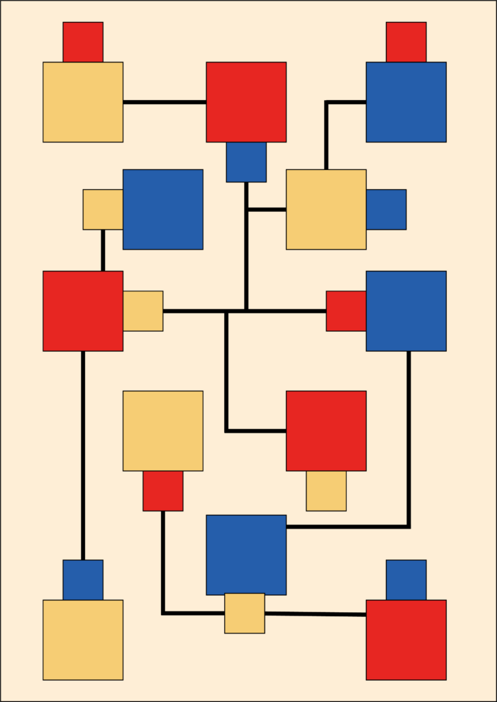
This is the first prototype I made in Adobe Animate. It simply shows a couple of mechanics:
Shape, colour and sound assigning:
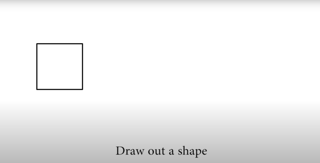

This is the first step when entering the instrument. Users need to start with either a shape, a sound or a colour. In this prototype, we started by drawing out a square, then assign a colour and sound to it.
Connect shapes to create melody:
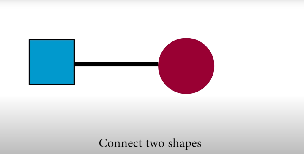
The second stage is to create the second shape, then connect both of them to create a melody.
This mechanic is quite simple since it only requires the users to draw a line in between the shapes.
Layering shapes to create chords:
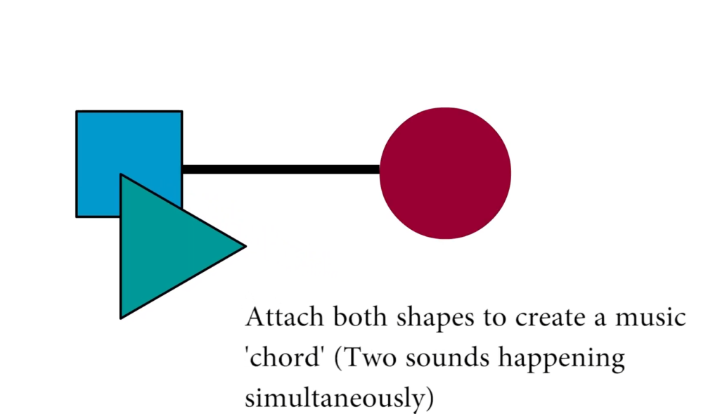
To create a chord (multiple sounds happens simultaneously), users can place shapes on top of another just like the image was shown.
Adjust the visibility to change the volume:
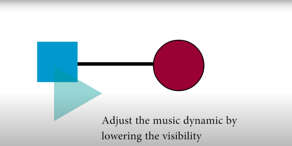
Users can lower or raise the volume by adjusting the visibility of the shapes.
Adjust the size and scale of the shapes:
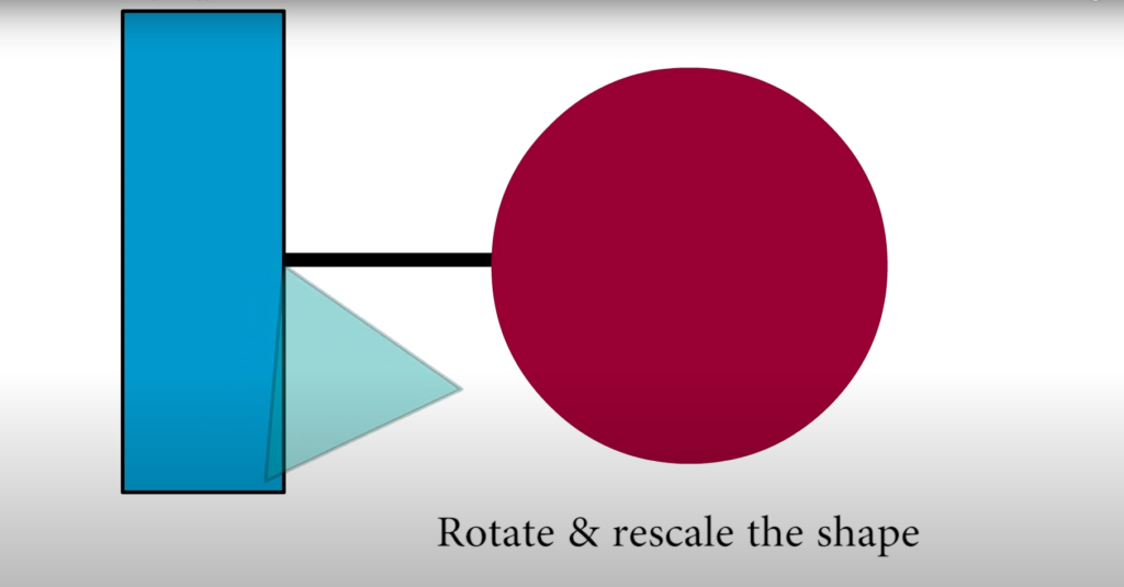
The last mechanic shown in the prototype was adjusting the scale, size and position of the shapes.
Conclusion.
The purpose of creating this prototype is to visualise the mechanics I designed. Overall, the mechanic is functional, but the issue is obvious: Oversimplified. As an instrument, there are still improvements that can be done. For instance, how to control the rhythm? What does rescaling or repositioning do? How do users interact with all these elements?
To test out these problems, I then moved to the next prototyping: user interaction.
PROTOTYPE 2: USER INTERACTION
I made a plan before testing:
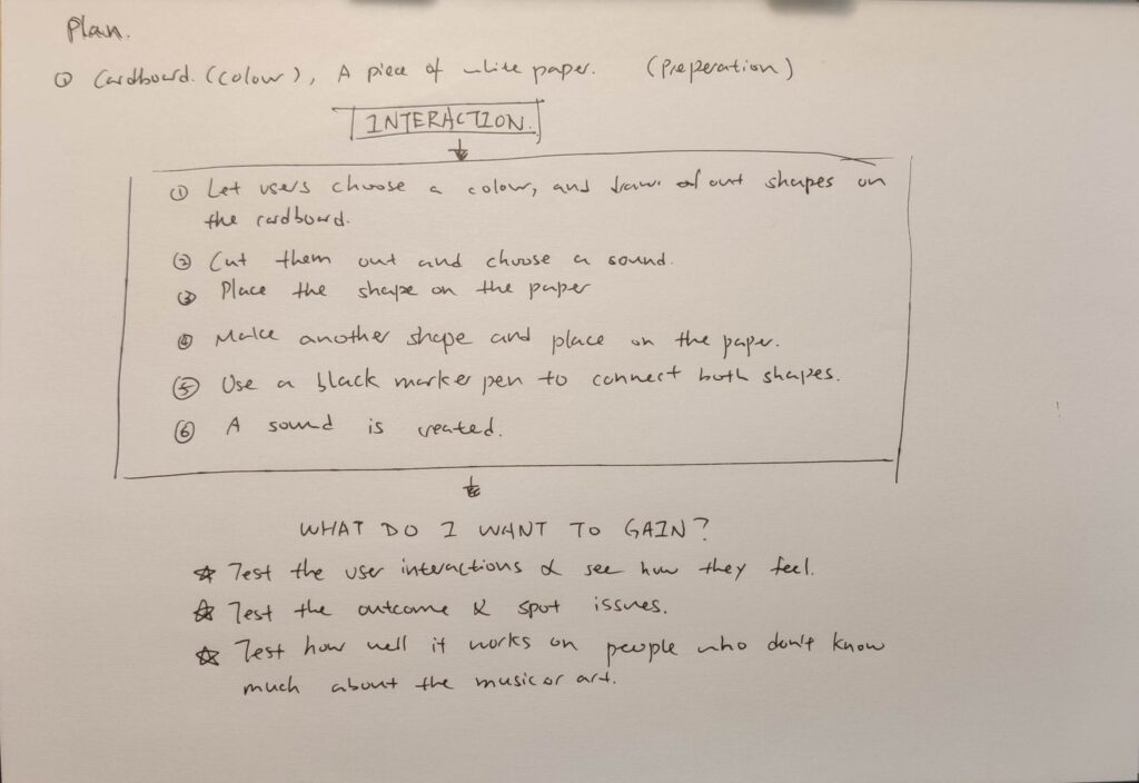
It is nessasery to plan out the work before proceeding to the user testing because I need to know the methods, tools and gains.
After the preparation and planning, I then started the second prototype:
Gathering the users:
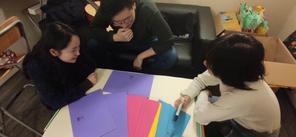
I gathered two of my friends, one musician and one artist to test out my prototype. The reason for this is that I want to have a more dedicated user group to do the testing.
I bought a bunch of cardboard (purple, red, yellow and blue), a pen, a pair of scissors and a whiteboard for the testing.
Choose a colour:
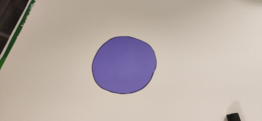
The second step is to choose a colour, and the artist chose purple.
Assign the sound:
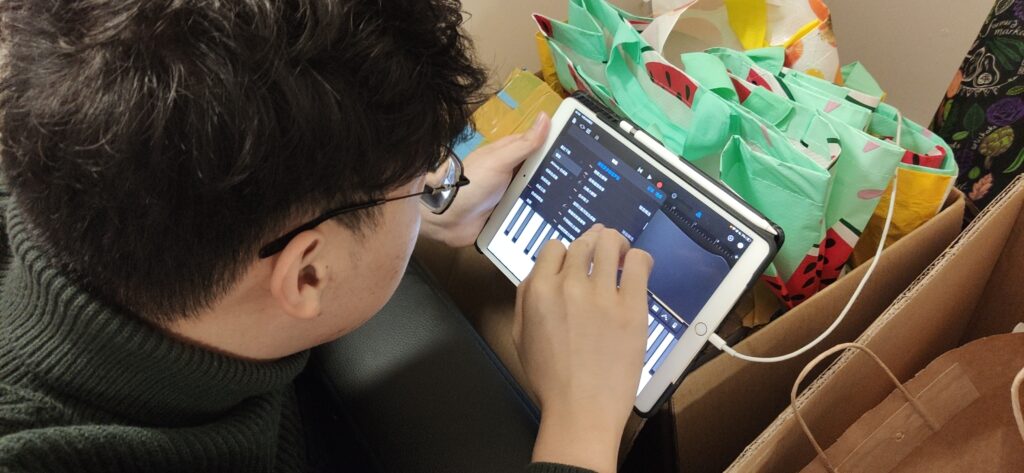
The musician is doing the sound assigning. We used GarageBand because it contains a lot of interesting sounds that we can access easily.
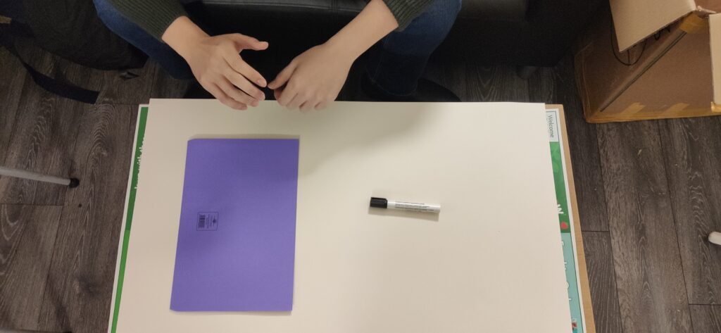
Choose a shape:

The second step is to choose and cut out the shape, place it on the whiteboard.
Connect the shapes to create melody or chords:
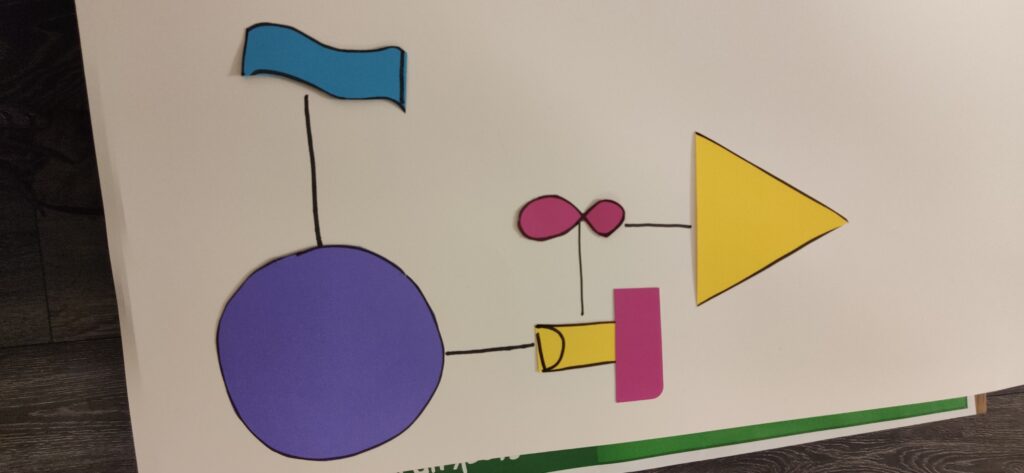
Outcome:
The outcome looks very low quality and boring. However, it would be a lot better if we do it digitally with more options of colours and shapes.
Conclusion.
Overall, the testing was quite successful because now I can see the users’ thinking processes from scratch to finish. One thing I noticed was the artist and the musician were thinking about both art and music whilst playing around with this prototype, and this is something that I really tried to create in my idea.
The biggest issue I found in this prototype was the amount of time it took for the users to finish one sound because there are too many to consider. The second problem I noticed was the difficulty of putting everything into the same style. These will be the focus of the next prototypes and designs.
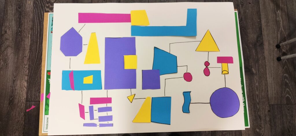
PROTOTYPE 3 OUTCOME.
The last prototype is to test out the aesthetic.
As I mentioned earlier, we should stick the style to Bauhaus because it shows the idea of using simple geometries and colours to form into complicated things.
In this prototype, there are a couple of things to look into:
1. What does the outcome look like?
2. How does it work?
3. How many varients can we create?
4. Can we create something other than the Bauhaus style?
Parts and layers:
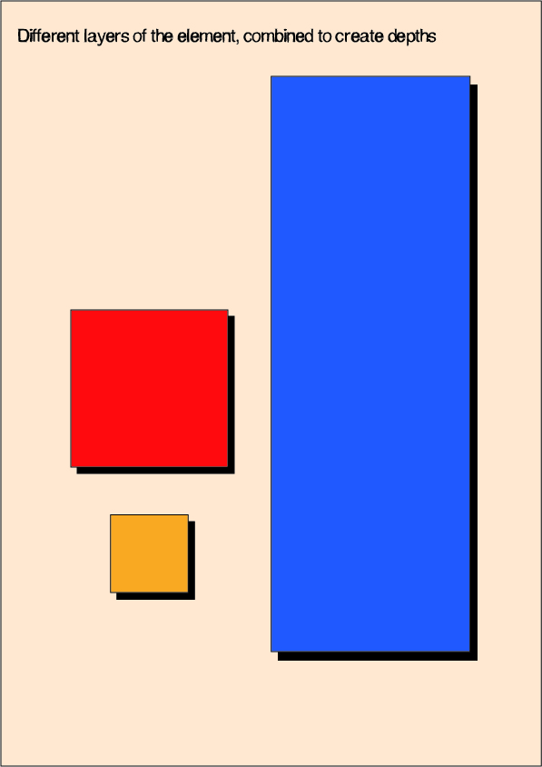
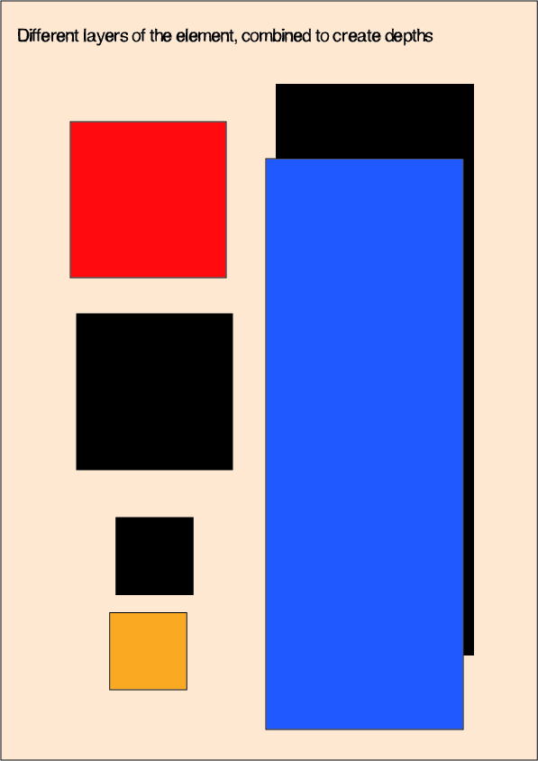
The two images above show the contrast and aesthetic create by colours and shapes.
Image on the left looks like four rectangular shapes with shades, making the image look ‘3D’. But what it really is, is the darker rectangular shapes placed underneath. I thought this might be a good idea to improve the visualisation.
Layers and connections:
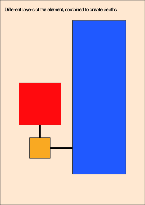
Another thing I want to mention is the connections between the shapes. Althogh the shades look like a part of the shapes, they are still an individual element.
Prototype 3:
The video above shows how it works with layers and aesthetics. One thing I added here was the white ring as an indication of which shape is playing the sound.
Outcome:
Here are some visualisations I did that may look like an outcome of the instrument:

In the top two images, I tried to create visualisations based on lines and colours. They look interesting but I am not very sure how the music is going to be played.
The bottom two images are much more clear and interesting. I picked one image and tested out the sounds.
Outcome 6:
Conclusion:
One thing that I need to figure out is the rhythm. This means how long the sound travels from one to another. Rhythm is one of the fundamentals of the music and it is also an element that makes the music sound interesting.