FINAL IDEA WIREFRAME PREPERATION
After researching the aesthetics, I finally moved on to the making of my final product.
The idea is to create a mobile phone app that allows users to access the tool at any time and anywhere, so it is important to create a wireframe before making it. Here are the wireframe logics before creating them:
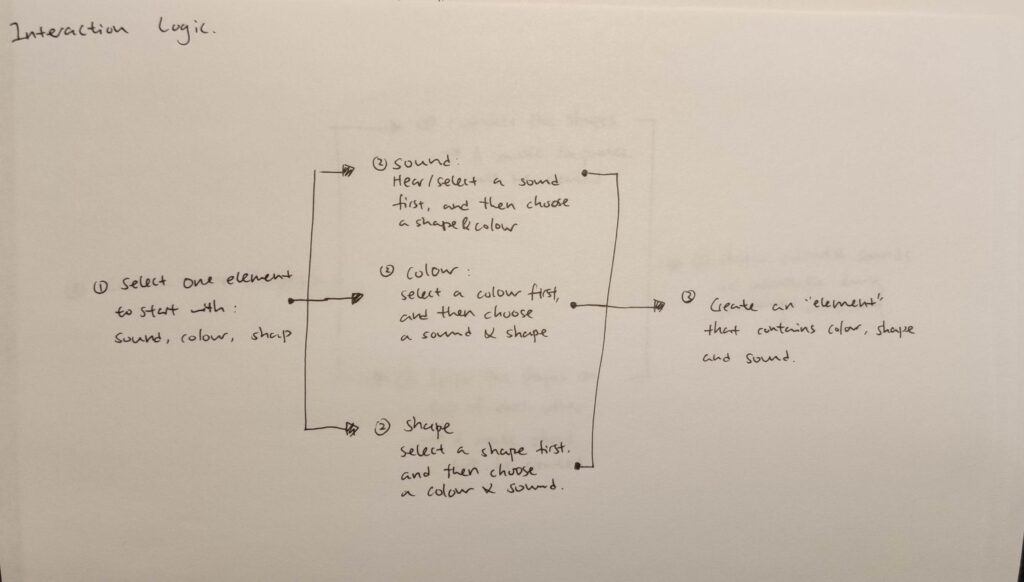
The app is very straightforward and doesn’t contain too many complicated features. The reason for designing my app in this way is because the users are using it to do creative work, and too much information or interaction will distract them. Therefore, I planned out the user interactions into three main categories: assign, create and the community.
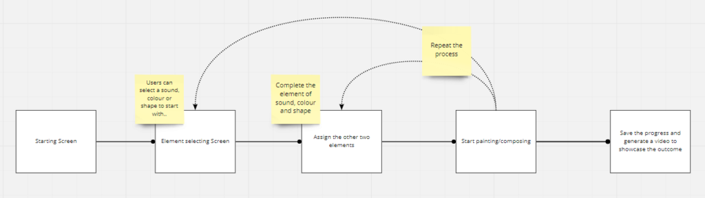
In the assigning phase, users will start with assigning a sound, colour or shape. During this step, they will start to understand the basic mechanics and proceed to the next step.
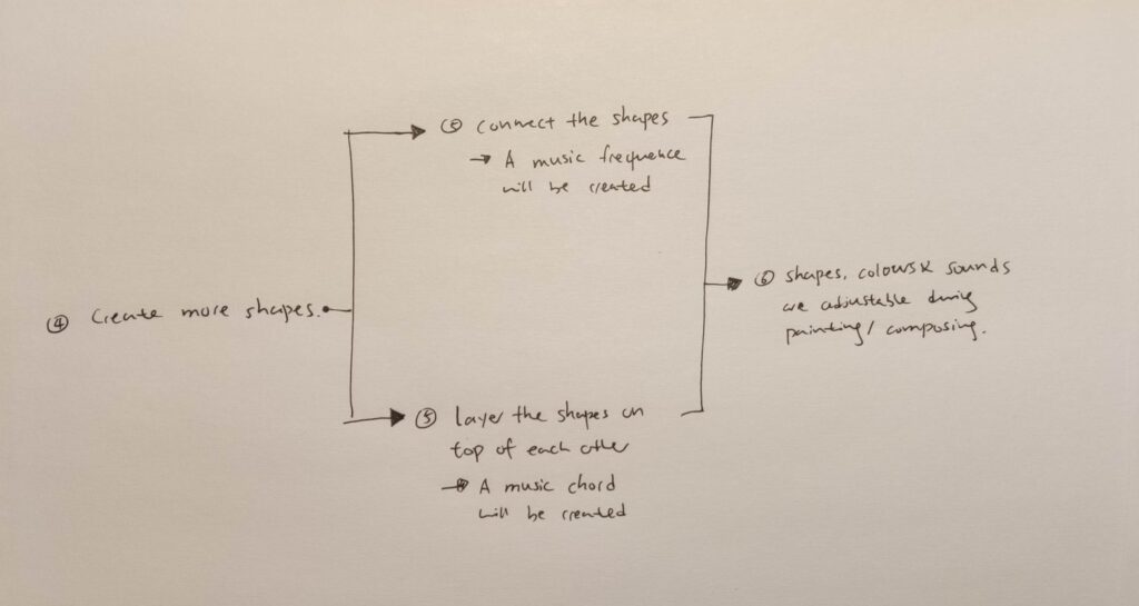
In the creating phase, users will create artwork and music based on their own synesthesia ability or creativity. At this stage, users should understand the basic interactions and gradually learn to master them.
In the community phase, users will start expanding their community by uploading artwork to the gallery and subscribing or getting subscribed.
Overall, it has to be simple and easy to access the app, just like the Bauhaus system itself.
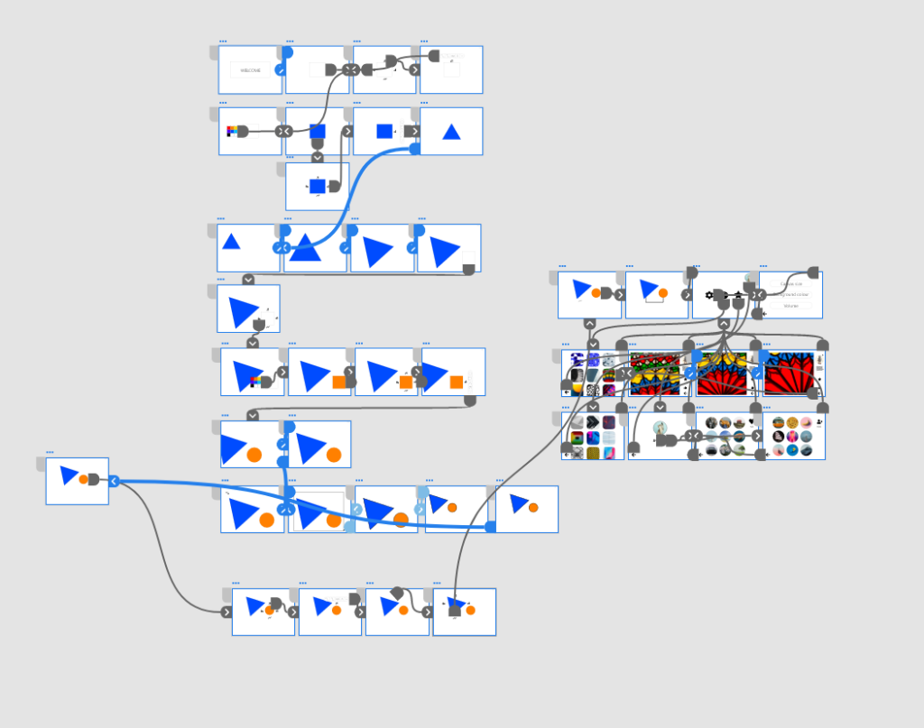
Once the detailed logic is done, I then created a concluded one to help me plan for the wireframes.
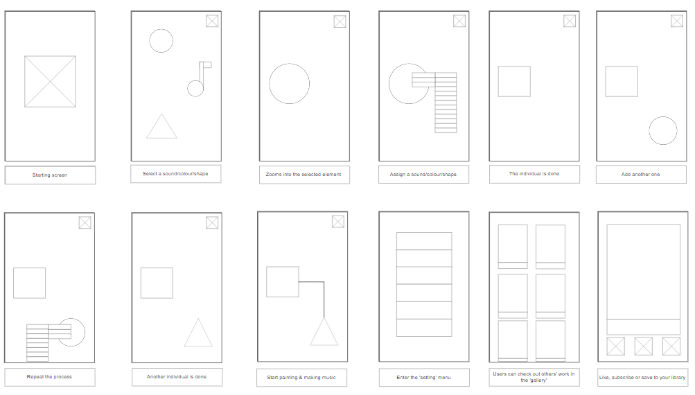
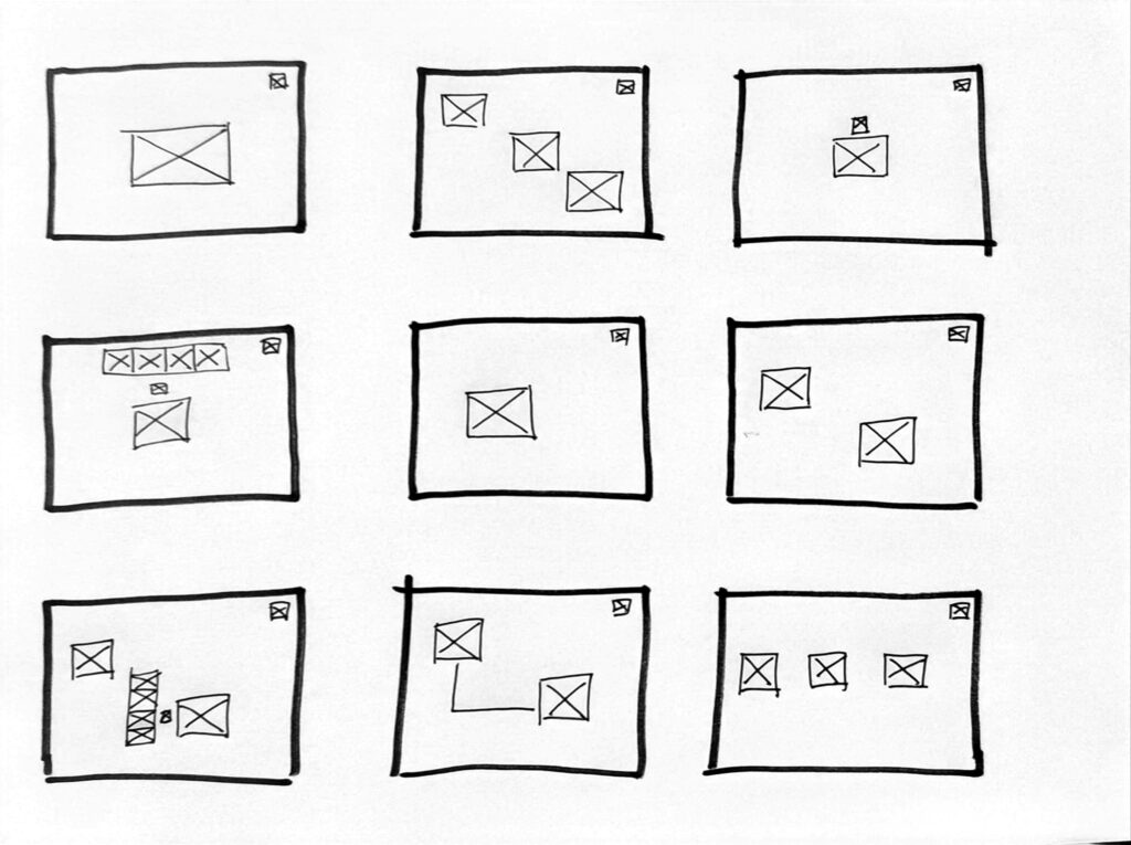
Here is the first set of wireframes:
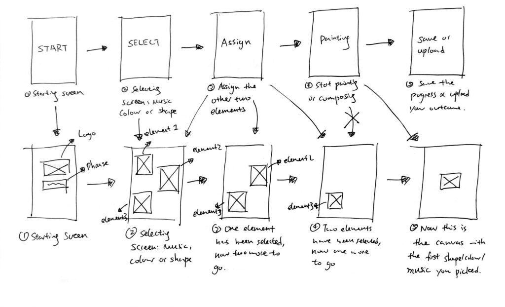
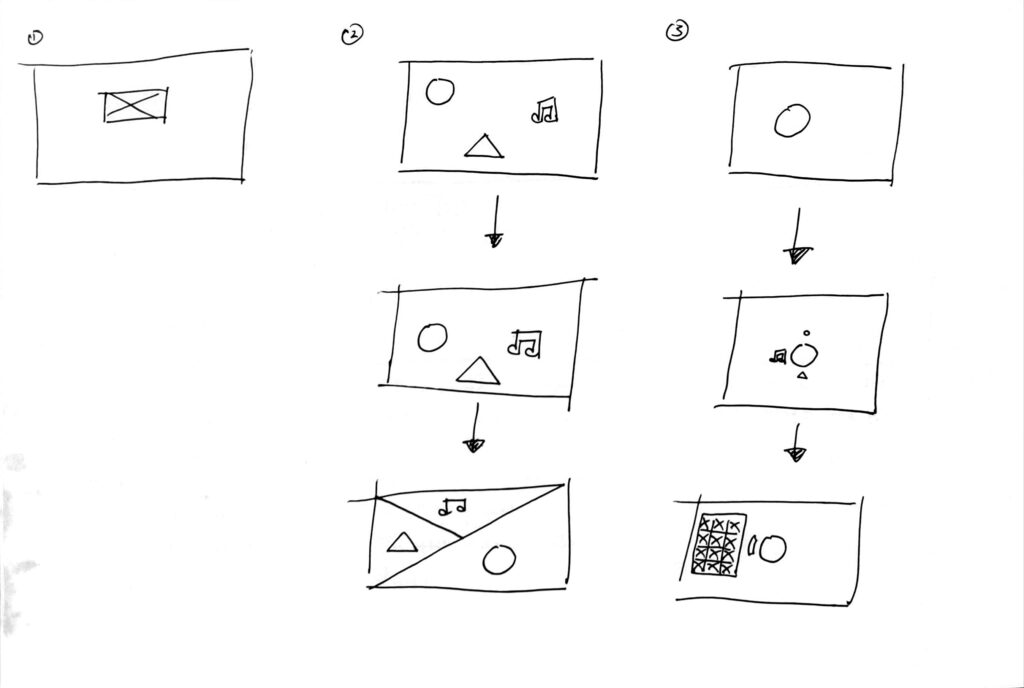
In this wireframe, I mainly focused on the assigning phase. As you can see above, I was trying to figure out how it is going to work: You are given three choices at the beginning: Colour, shape and sound. Choose one to start assigning with first, then move on to the next feature. But this then became an issue later on: If there are three objects, why am I only assigning one?
To fix the problem, I came up with a solution: Each time you choose a feature (colour, shape or sound), the indicated object will disappear, just like this:
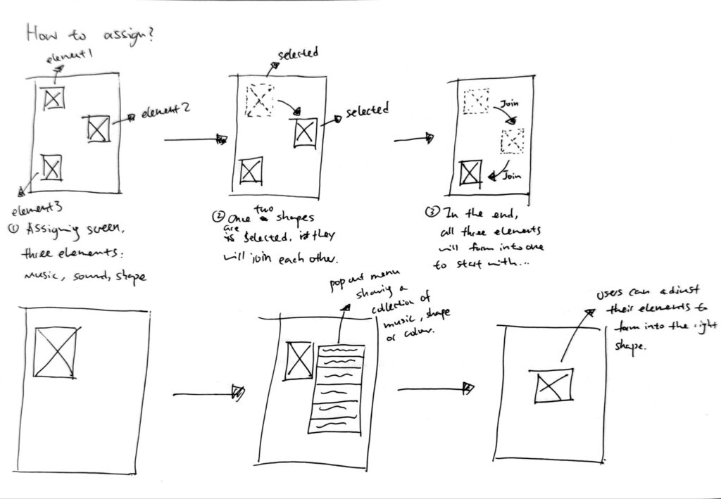
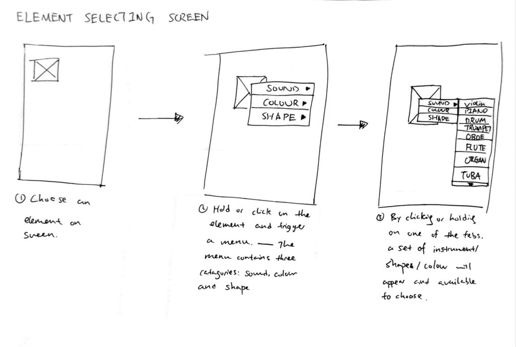
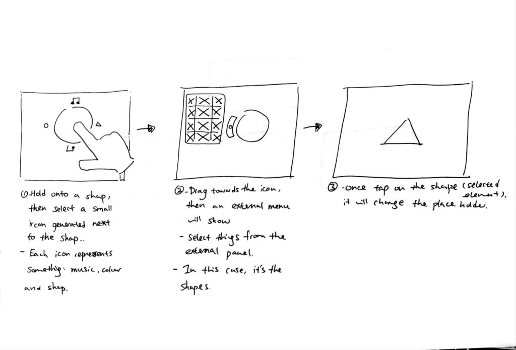
When assigning a feature, simply hold on to the object and call an external menu, this will help you to find which feature to assign.
I also designed another way to assign: Instead of having three objects waiting to be assigned, it is easier to only have one placeholder and then choose one feature to assign at the time, see below:
Once the basic function is done, I then moved onto the thumbnail wireframe to oversee the basic functions:
Next step, I turned the thumbnail wireframes into a digital version:
After creating the digital wireframe, I then tested it with my friend to see how it’s going to work.
There are two main issues spotted after this test:
1. Mobile phone screen is too small to handle the external menu;
2. There aren’t enough space for creating music because the screen is too small.
To fix the issues, I need to use a bigger device to make sure users have enough space to call the external menu as well as enough space for them to work on. I chose the iPad as my device.
Here are the changes after the testing:
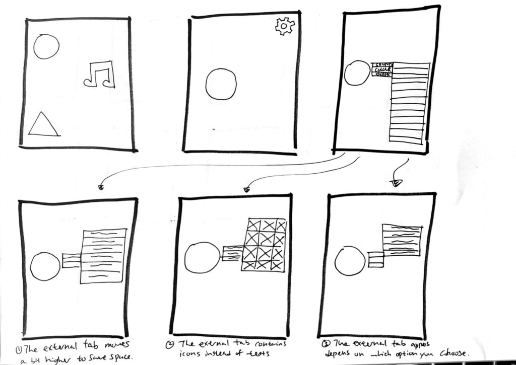
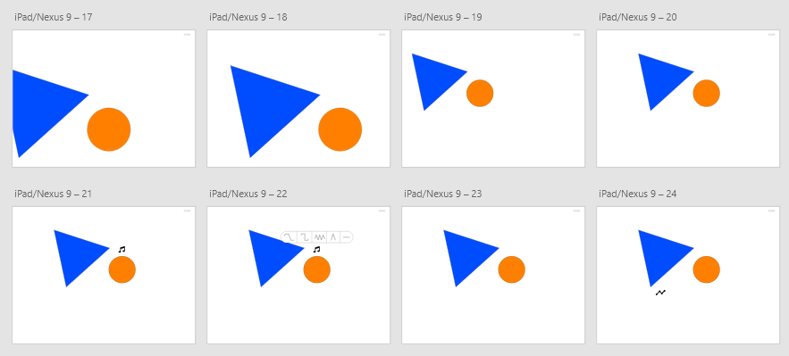
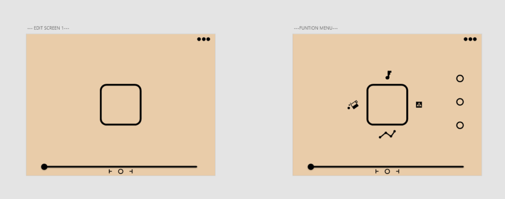
The first thing I did was to see if there are enough space to interact. The previous version of the external menu took too much space, and I need to fix the problem. This time, I used a easier way to to the job:
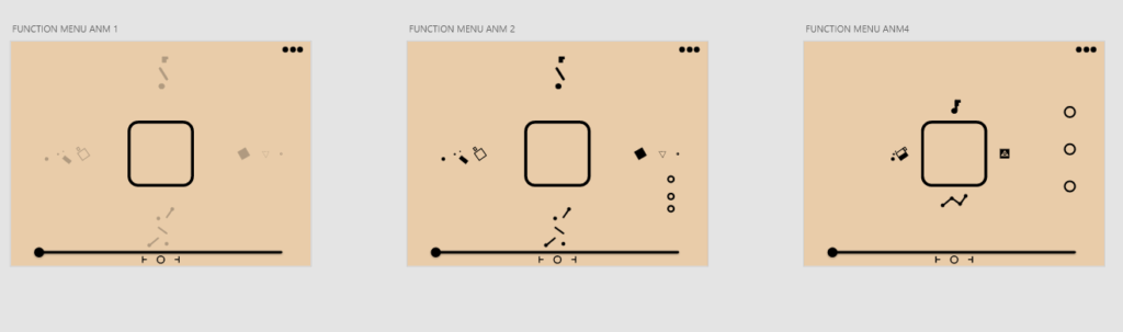
In general, when tapping on the object, it calls out four icons that appear to be on four sides of the placeholder. Each icon represents one feature: colour, shape, sound and connector. Tap the icon to call the external menu:
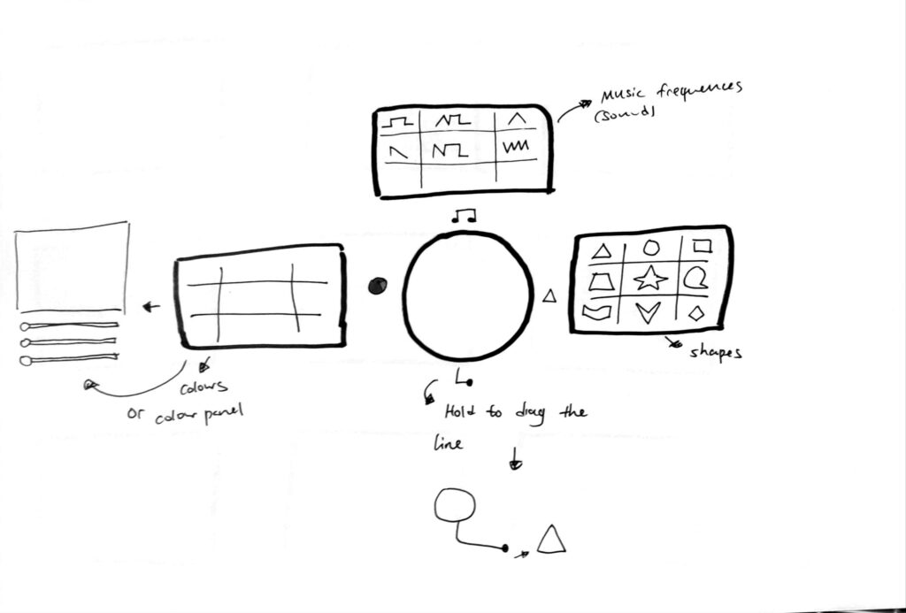
Personally, I really like this method of interaction, so I created a wireframe for it:
The biggest change here is to limit the amount features you can assign. I tried to keep the number of features you can assign to less than four except for the colours.
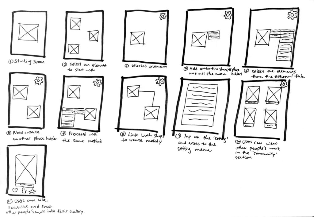
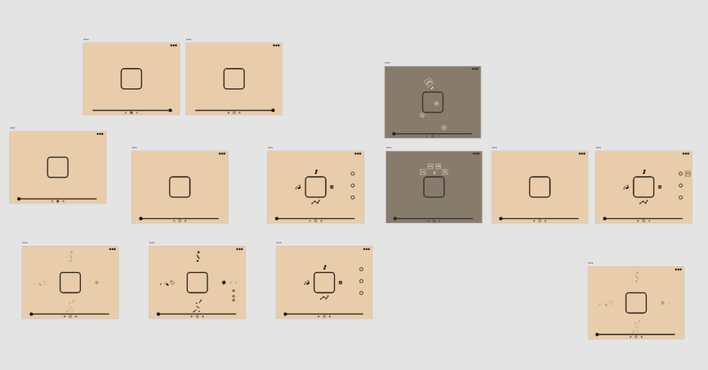
Once the thumbnail is done, I then created a more detailed digital version to showcase the entire interaction of the app:
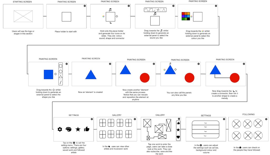
After creating the wireframe, I have a clear image in my head of where the app is going, so I started to create the second prototype in Adobe XD:
Everything stays the same as wireframed, except now I can add more details to it.
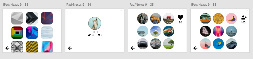
I used two colours: blue and orange because they have contrasts in between.
I was planning to have two shapes out to showcase the composing mechanics.
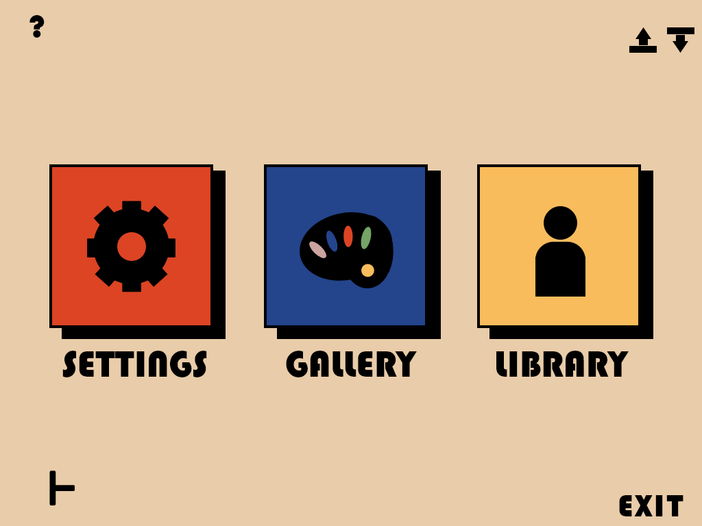
Once the ‘creative’ section is done, I then moved on to the community section:
There are four options in this section:
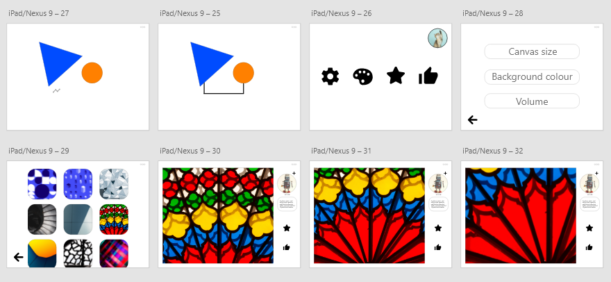
1. Settings: you can choose the canvas size, background colour and volume
2. Gallery: You can view other people’s work
3. Saved work: You can save other people’s work to your own folder
4. Liked work: You can check out the liked work in this section.
You can also tap on your profile picture to access account settings to see the people you subscribed to or people who follow you:
Once the basic structure is done, the next step is to create an actual functional prototype:
Here is the testing:
After prototyping, I noticed a couple of things:
1. White background is distracting from creating things
2. It is hard to express the idea of Bauhaus from what it currently looks like
3. There are way too many colours and I need to limit them
4. The interactions need to be more accessible, for example, need to have a feature to access to playback the music
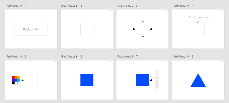
With all the issues I spotted after experimentation, I then moved on to the final step – making the product:
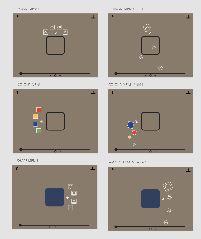
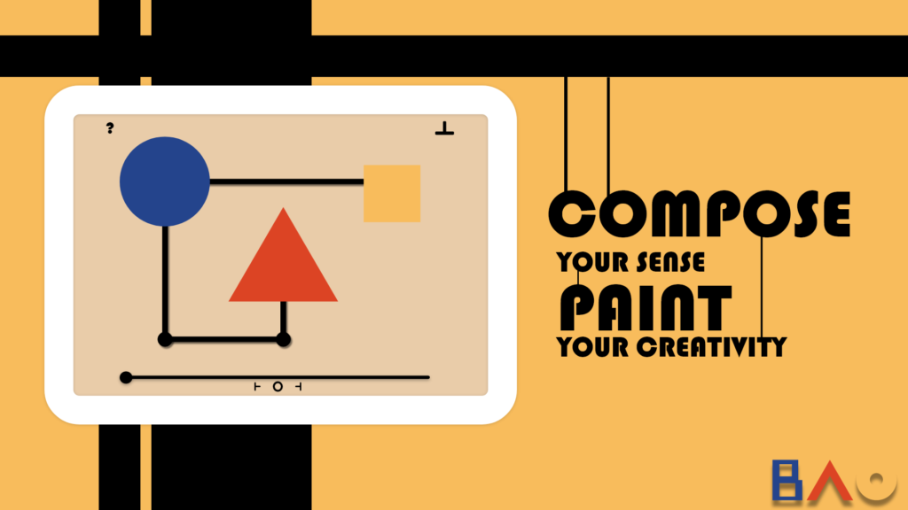
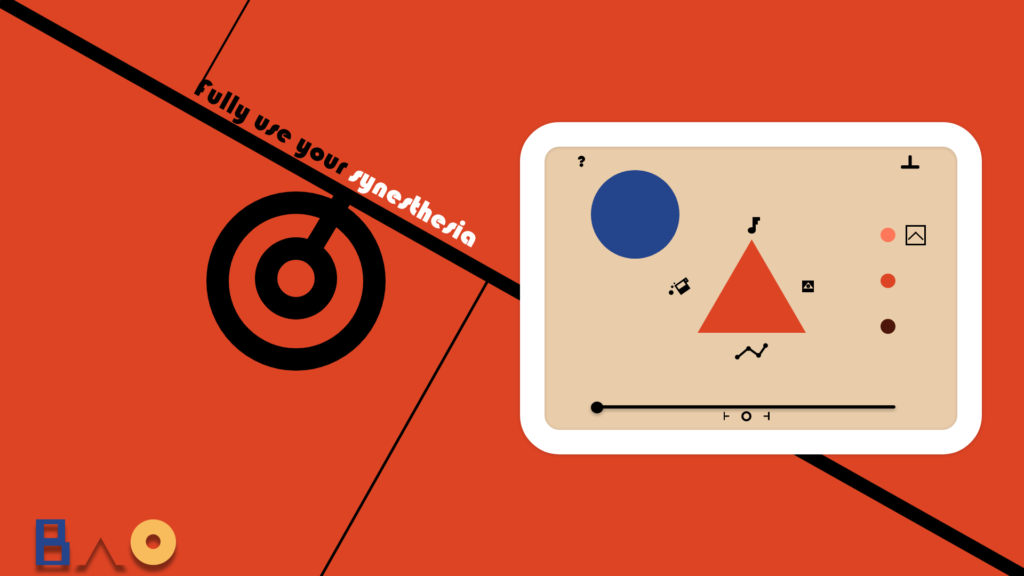
I used a light orange colour as default because it has a strong visual connection to the Bauhaus style.
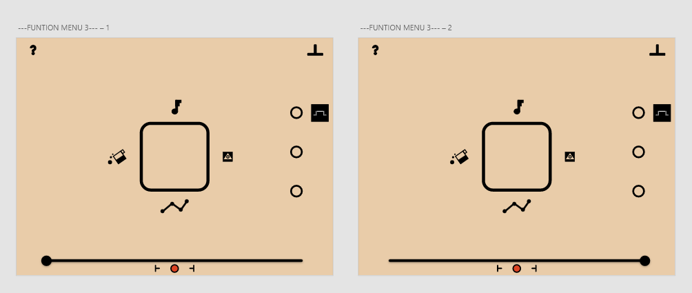
The square in the middle is the placeholder. In my design, a placeholder only has an outline, so that the players can tell the difference between an assigned element and a placeholder. I also added a music player at the bottom for live playback music.
Whilst designing the interface, I also considered the tone of colours, and that’s what the three dots on the side of the screen are for.
Besides the look of the overall app, I also decided to create an animation to bring it alive. I accidentally had this idea in mind after dragging the icons around: The parts of the icon will appear from the side of the screen and assemble next to the the element:
Here are more design and user interactions:
This is test video showcase the progress so far:
So far everything looks fine, and the animation seems accessible as well. Notice that I changed the three dots to a bar because I was thinking about having this function to shift the colours. However, it looks redundant during the testing, so I decided to change it back to the dots.
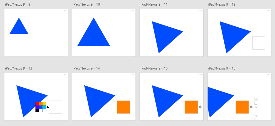
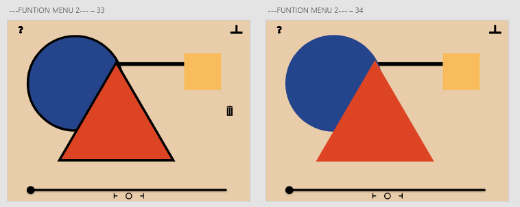
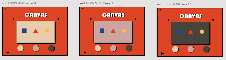
Here are the three external menus after tapping on the icons:
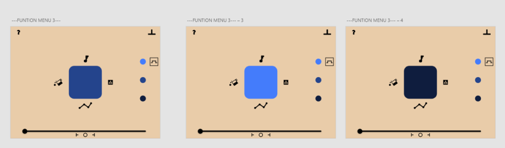
The biggest change here I did was to limit the number of colours users can assign because they are the four fundamental colours of Bauhaus. Another thing I did was to add a ‘question mark’ icon on the left-hand side corner. The idea is to have a tutorial interface that you can access by tapping on the icon at any time if the users are stuck. The last feature I changed was the setting icon on the right-hand side of the screen. I changed the three dots to the ‘skip’ button in the music player to match the thinking.
Once all is done, the next feature I made was the playback function. I noticed this problem during the prototyping phase: how do you hear the sound you choose?
To fix this issue, I added an icon that allows you to playback the music after assigning them:
And there is the colour changing feature with the three dots:
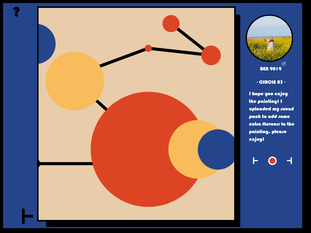
Once the assigning features are done, I then moved onto the ‘connector’:
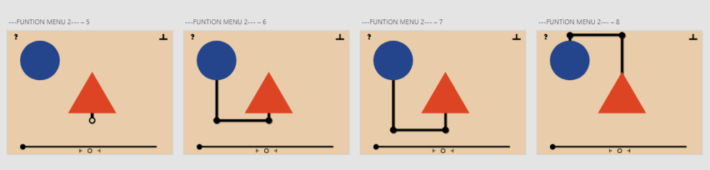
The connectors allow the users to create melody, and the idea is that they can move it around to create Bauhaus-like aesthetics.
If they don’t like it, they can always hold on to an element and enter the ‘editor’ to delete them by tapping on the ‘bin’ icon on the right-hand side:
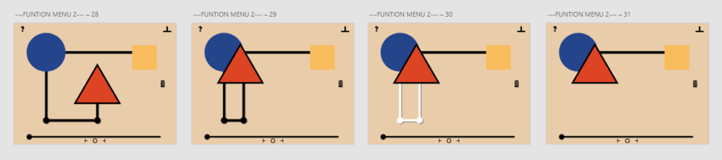
In editor mode, users can also rescale and reposition the elements:
After finishing the ‘creating phase’, the next thing to do is the ‘settings’.
I used three fundamental colours as the settings, and replaced the ‘saved’ work with ‘library’. There are two icons in the right-hand corner: upload and download.
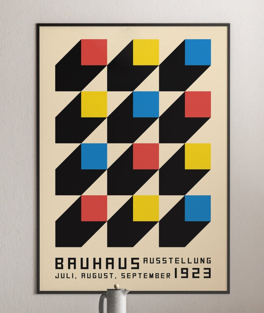
The aesthetic was inspired by this painting:
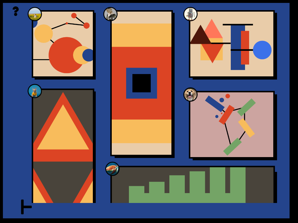
The first menu is the gallery. I think it’s a good idea to have everything in a ‘rectangular’ layout to unite the aesthetic a little bit more. User’s profiles pictures will also appear on the left corner of each painting:
The browser mode is similar to the editor mode. Users can drag the image aounrd, zoom in and playback. They can also see the work description on the right-hand side and subscribe to the
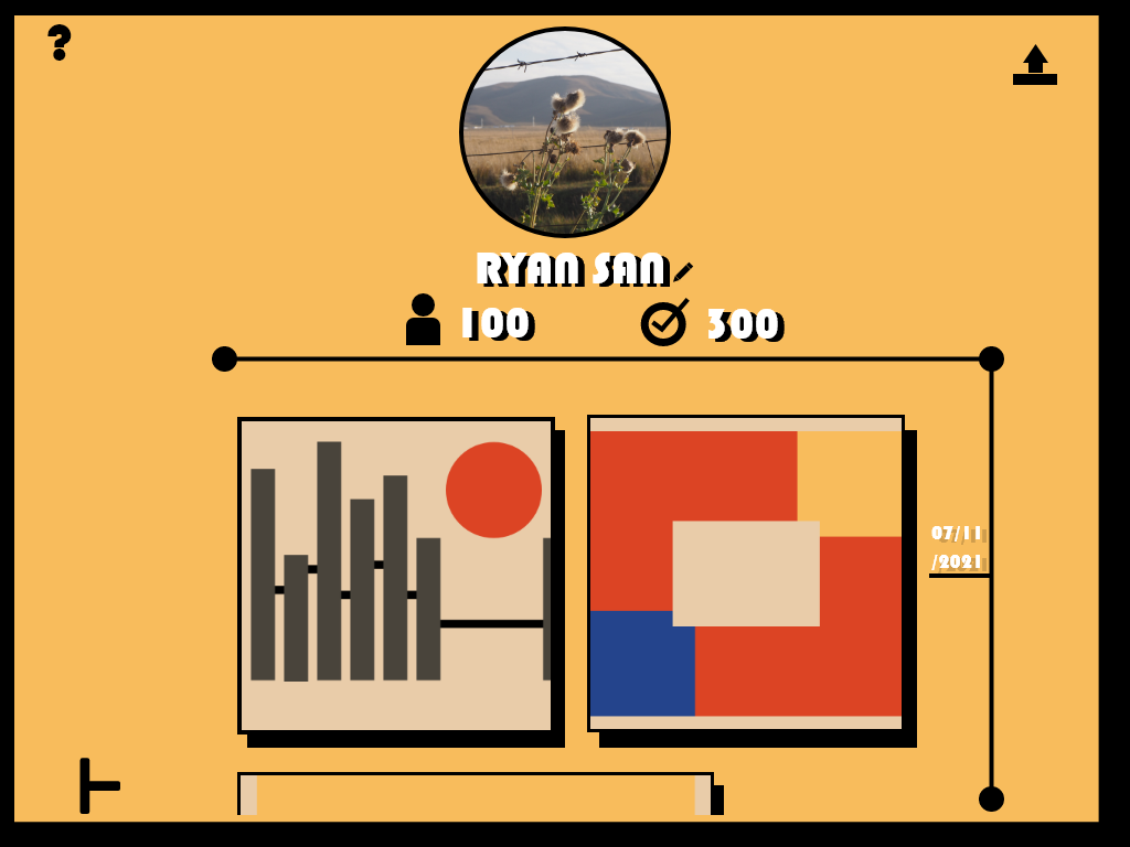
This is users’ profiles, they can see their subscribers, people they followed and a timeline recording the work they have uploaded. Notice the ‘upload’ icon in the right-hand corner.
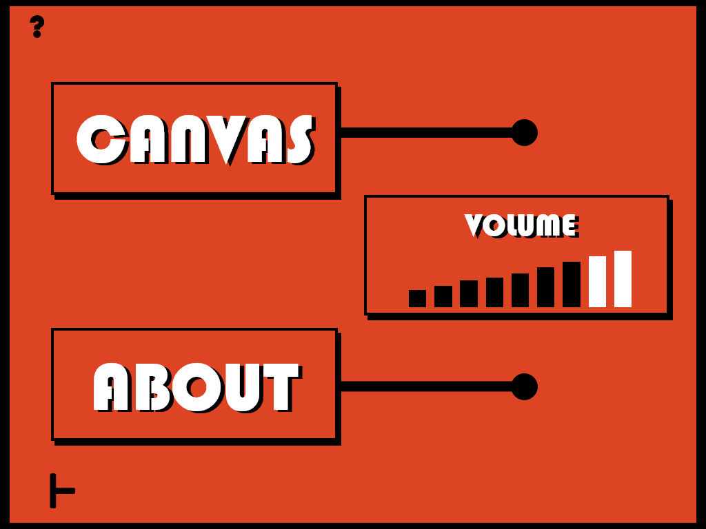
Finally, it’s the master settings. In this section, you can choose to change the canvas colour, volume and check out the ‘about’:
After creating the entire app, the final step is to make an icon.
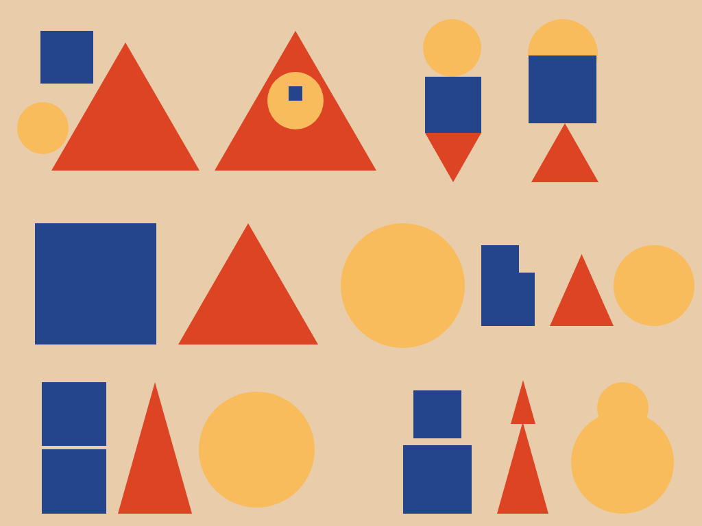
I started with the three fundamental colours and shapes:
1. Red, blue and yellow
2. Square, triangle and circle.
I chose them because they are the best representations of Bauhaus.
Here is a set of designs:
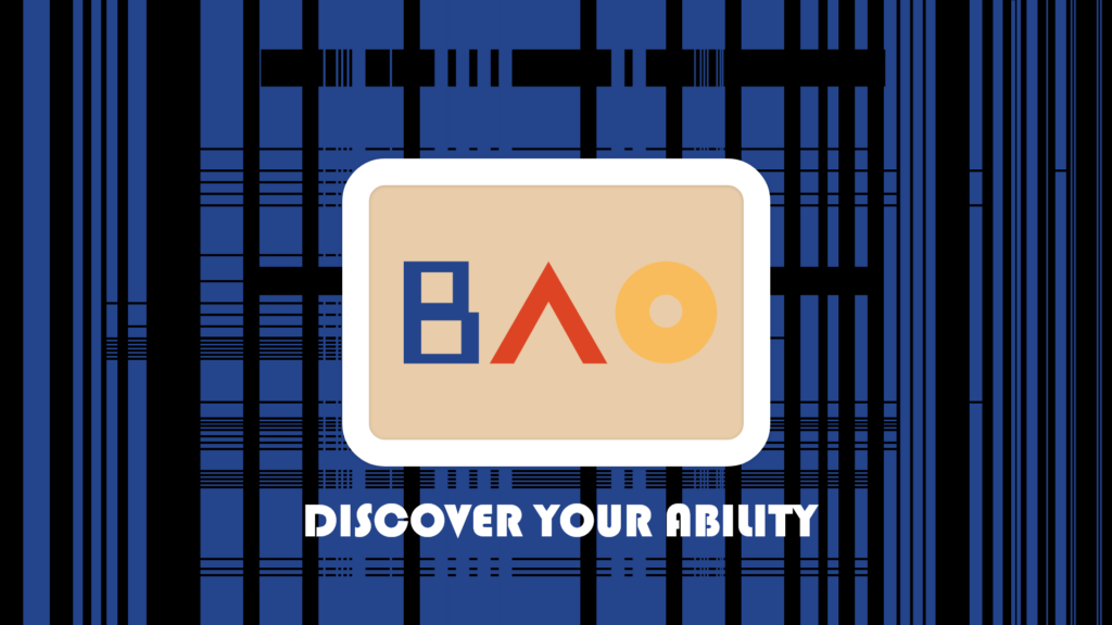
After experimenting with a couple of shapes, I noticed that the structure of square, triangle and circle looks like BAU IN Bauhaus. Therefore, I decided to go for this idea and create something that link them together:
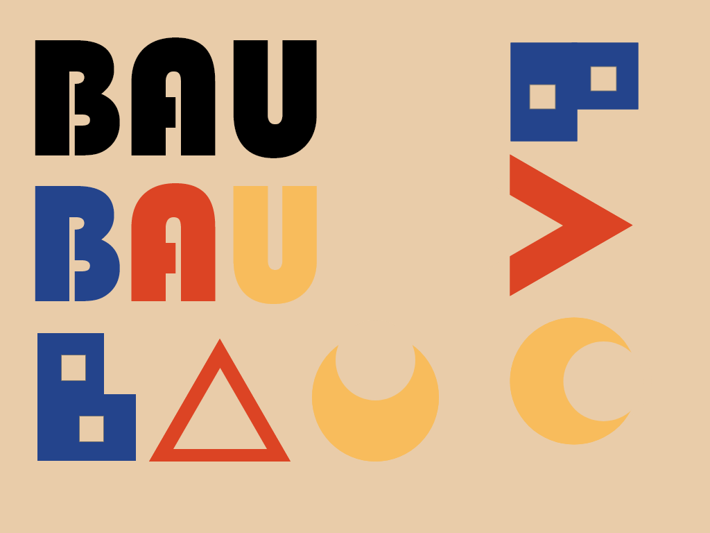
Above is the set of icons I tested, and below is the one I wanted to use in the app:
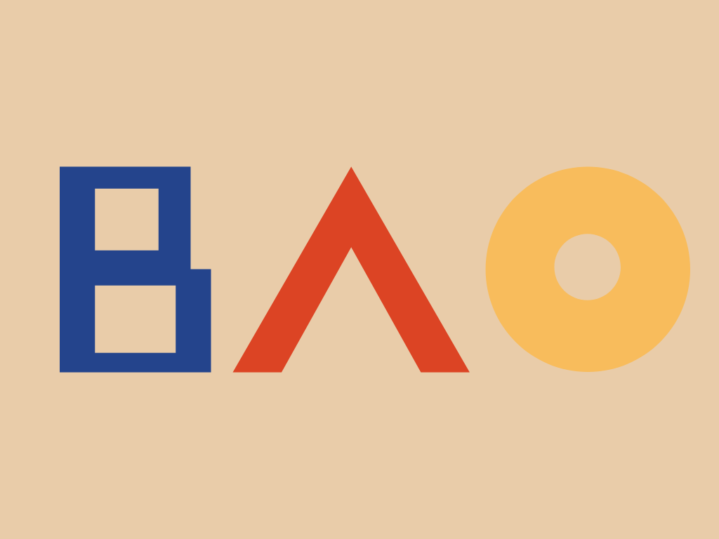
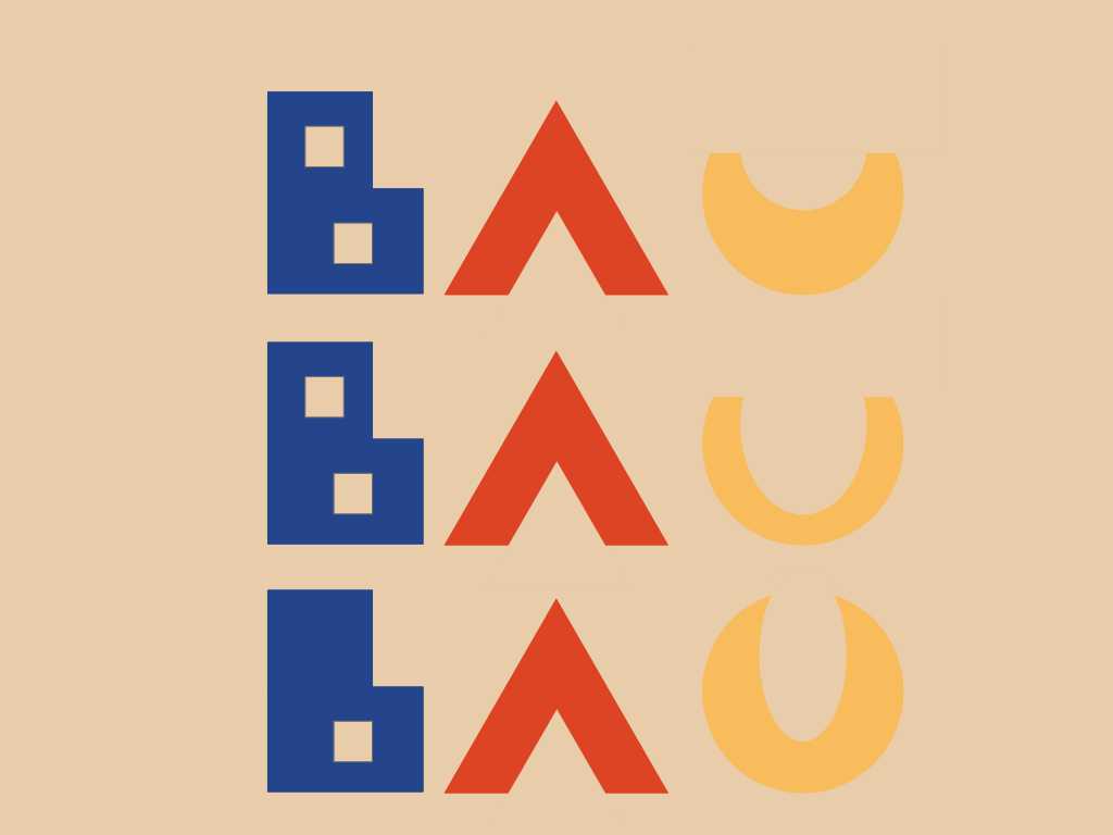
I changed U from BAU into BAO because it suits better with the shapes and makes it differ from other apps that may be called BAU.
After finishing pretty much everything, the last step is to animate them and create the final interactable product:
FMP OUTCOME.
Future development.
I think the further development for this app should be the ‘share assets’ function. This means that people can upload their own assets such as music, shapes or colours to create their own things. For example, they can replace the music with speech and make a phrase by using this app; Or they can replace the colour with textures such as stone, grass or water to create their own style of paintings. Everything is possible when you can create your own things.
What’s more, is the community the users can use. Imagine a community that people share their own assets around and generate amazing work, that’s the future of this app.
Conclusion.
This project is exhausting because I am basically creating something that is based on a condition – synesthesia. The issue with this condition is the ‘subjective’ feelings, this means that different people will have different experiences of the condition which makes it hard to target the user groups. For example, some people may feel the note ‘A’ sounds like red, but some may feel blue when they hear it, so should I target the people who feel blue or red?
Luckily, I found a solution: To limit the number of options you can feel and stick with it. That’s why I chose Bauhaus – the system of clear and strong feelings based on the simplest shapes and colours.
Overall, I am happy with the project and this is definitely something that can go further, and I have learned a lot of things during this experience of creating a thing from scratch to finished.