PDF preview:


PDF download:
Product video:
Design & Create Process
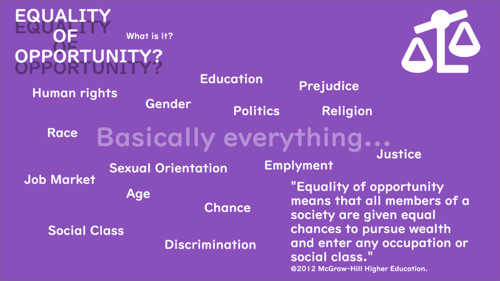
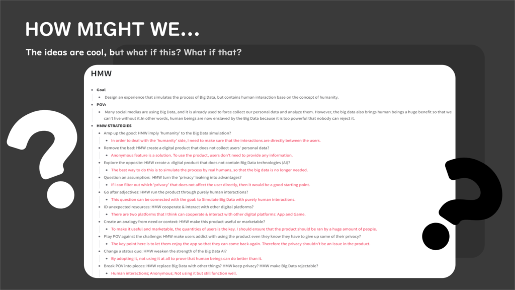
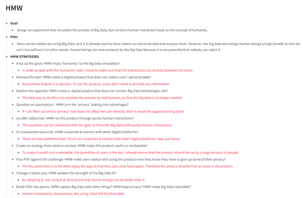
HOW MIGHT WE …
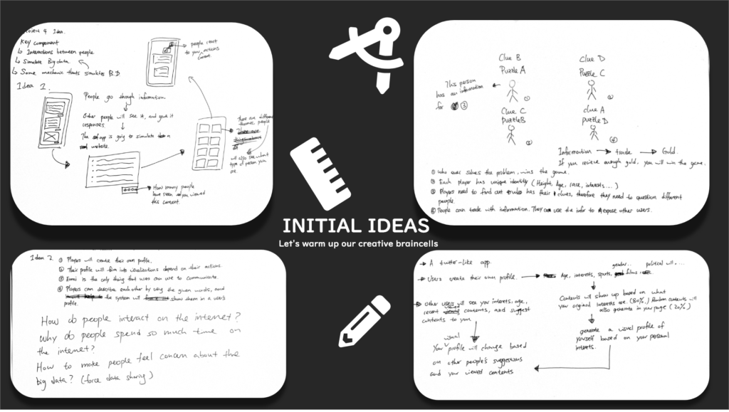
Ideas.
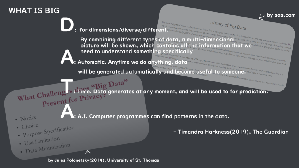
The first thing I did was to make a list of essential elements in the big data for the further usage:
Interactions: This is one of the most important element in big data. Big data is formed by human interactions, it can be between users and the system, or users and the users. In my product, I am focusing on the user to user interactions to simulate the big data.
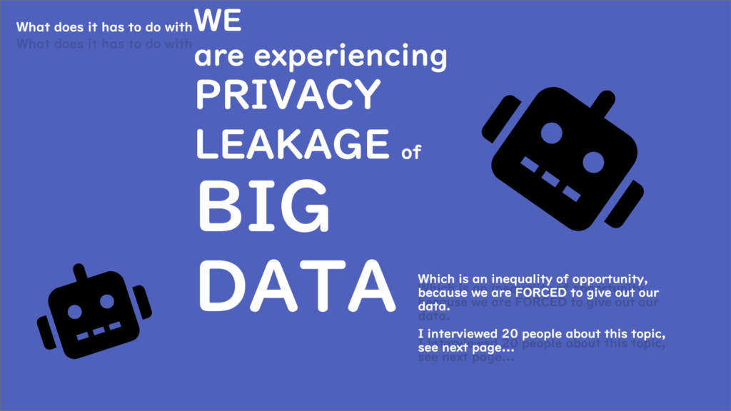
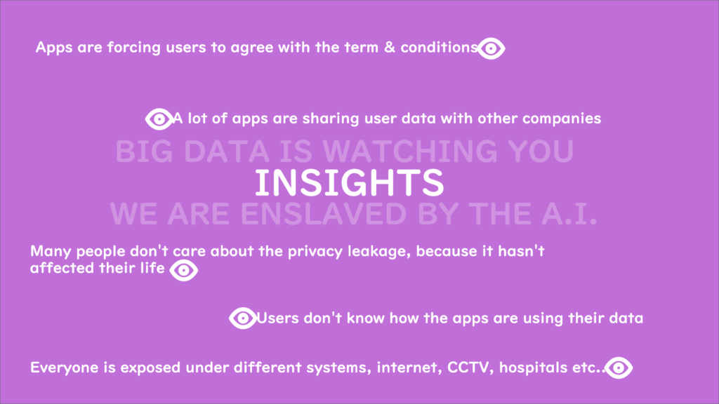
Privacy: Privacy is something that makes the big data controversial, and this is why I am doing it for this project. Privacy will be the main focus for my product, and all the mechanics or interaction designs will be delivered around this element.
Warn: I want to use this project as a sign to warn people about the big data. After using the product, the users should reflect to the ideations no matter it is positive or negative, the important messege over here is to be aware of it.
Idea 1.
The first idea is a game. I understand that my end product does not need to be a game, but I would like to use it as a starting point, because it is the easiest way to present big data.

The concept of Idea 1 is quite simple. The game is simulating a twitter-like app, where users can see different contents on there. The unique mechanic for this game is that whatever you see or do(within the game), will be saw by other users(real people), and they can react to it. Furthermore, users can see the amount of views in every page, it is the number of people who have seen what you saw or did in the game. In terms of reactions, other users can post what they think is useful contents to your page straight away, or simply text you through emojis.
The entire process here is to simulate big data. However, I think it is too blunt and needs to be more formative.
Idea 2.
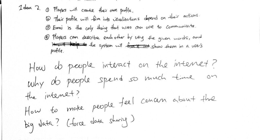
Idea 2 is an extension of idea 1, but with more details. During this stage, I have came up with couple of questions because I think I was confused and stuck by the idea. Therefore, I need to explore other areas to get my design thinking going.
Idea 3
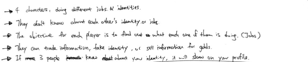
Idea 3 is even more like a game. The essential experience in this idea is to let the players have control of their data, and then force them to use them for different purposes: trade, steal and fake.

After designing it, I realized that putting players into a competitive game to let them aware of big data is not realistic, because the only thing they care about is winning the game. Furthermore, it is less realistic and personal when the game gives them a made up identity to play with, because they have nothing to lose.
In summary, I want to make a game that makes the players feel more personal and offended when they have been forced to share data.
Idea 5.
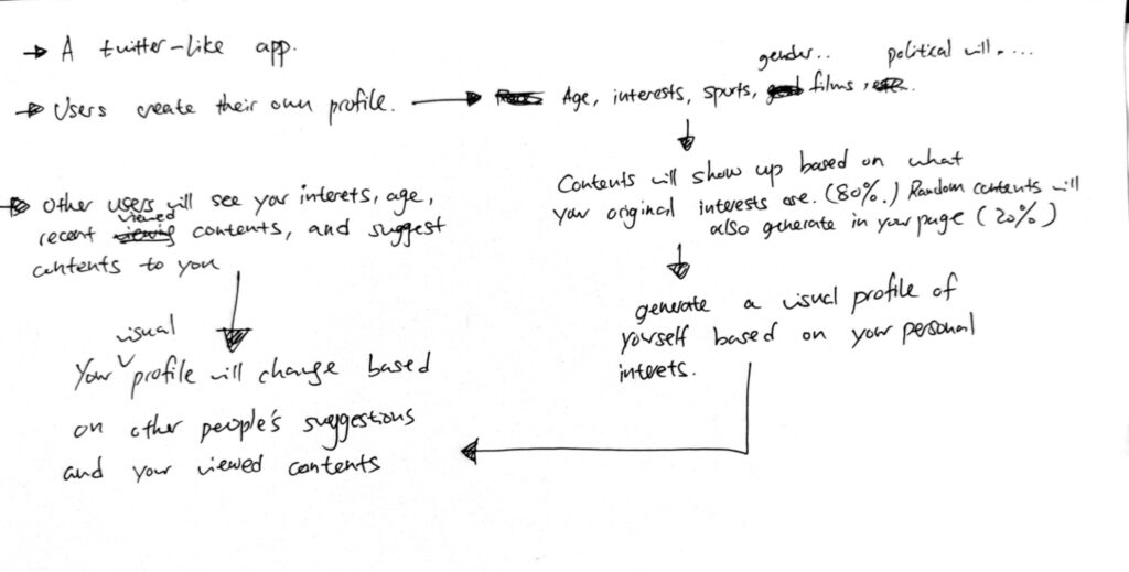
For idea 5, I sort of combined both idea 1 and 2. Personally I quite like this mechanic of ‘forming into a profile based on what you have viewed’. I think it’s important to show the interactions between users, and what consequences it bring to the end. We are all exposed under the big data system, and knowing who I am is a very personal thing, therefore by creating a visual profile for each user, it allows everyone to see what kind of person you are, and this might makes users feel unsafe and start to concern about the big data.
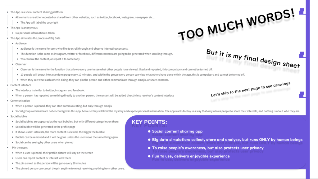
Final Idea & Initial mechanic
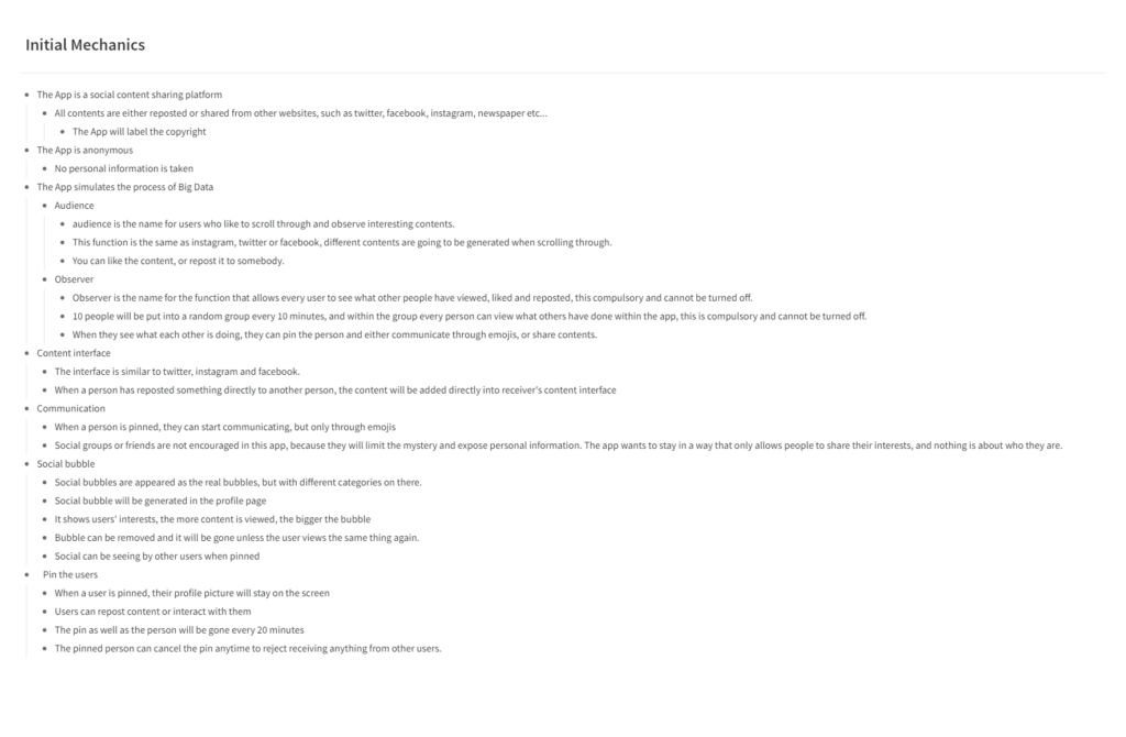
Here are some key points from my final idea:
1.This is a social content sharing app, users will be able to view links from different platforms, such as Facebook, Twitter or instagram.
2.This app simulates the process of the Big Data, but it is only done by actual humans.
3.This app aims to raise people’s awareness on the privacy leakage, but also protects their privacy.
4.This app should be fun to use, and the aim is to deliver enjoyable experience.
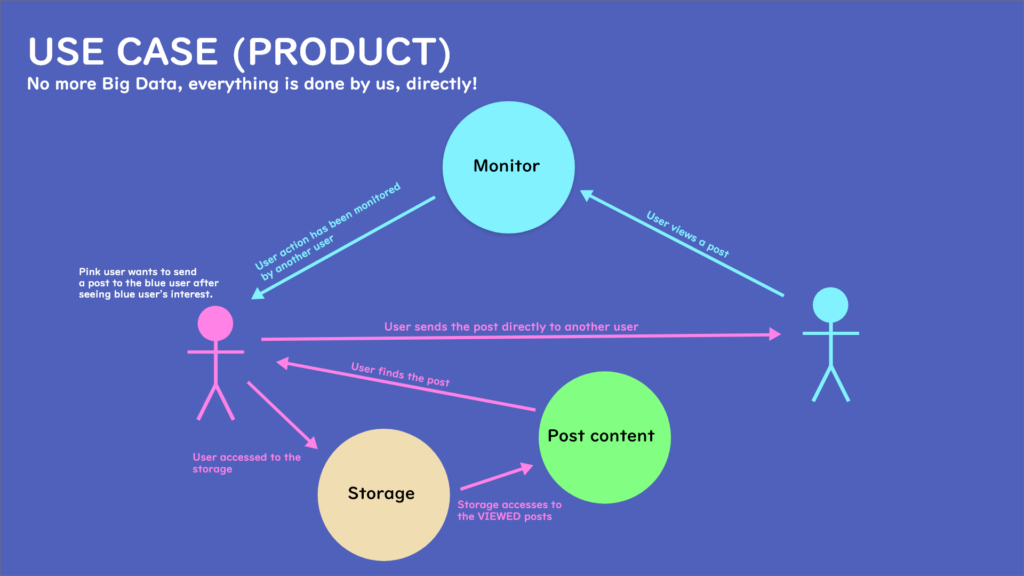
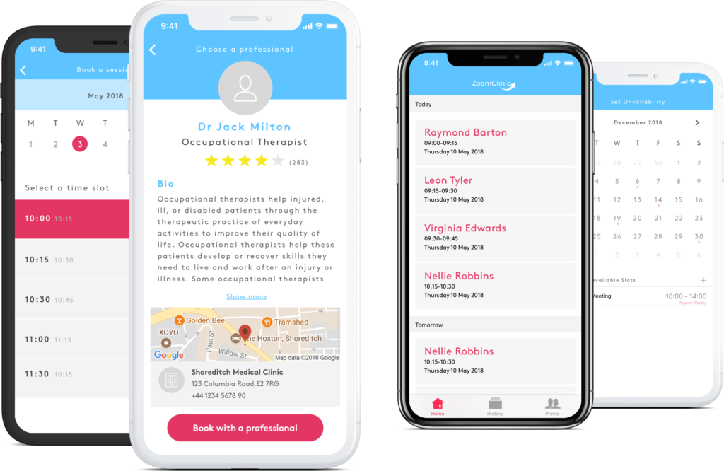
Use Case (Product)

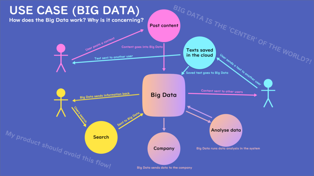
Now the idea is confirmed, I drew another use case diagram to showcase the differences between my app and the apps that use big data system.
The biggest differences so far is that all actions don’t involve with the big data, everything is done directly between the users. This means that there will not be data collections from the a.i. and the information will not be sent to the companies.
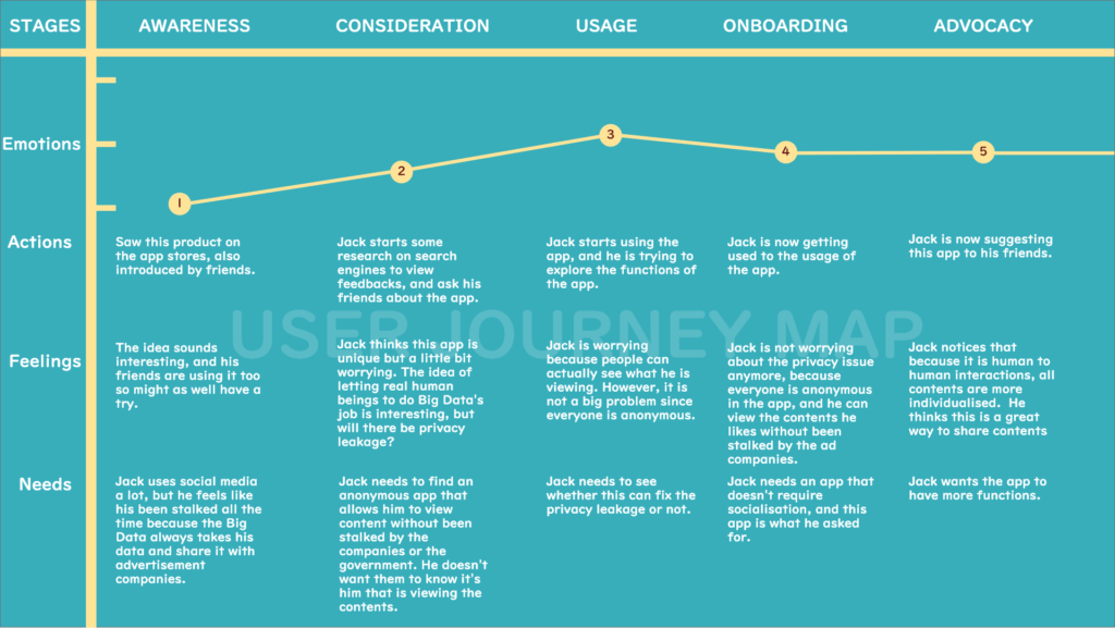
User Journey Map
Here is a user journey map. It shows the process of how Jack awares of the app, and then became advocacy in the end:
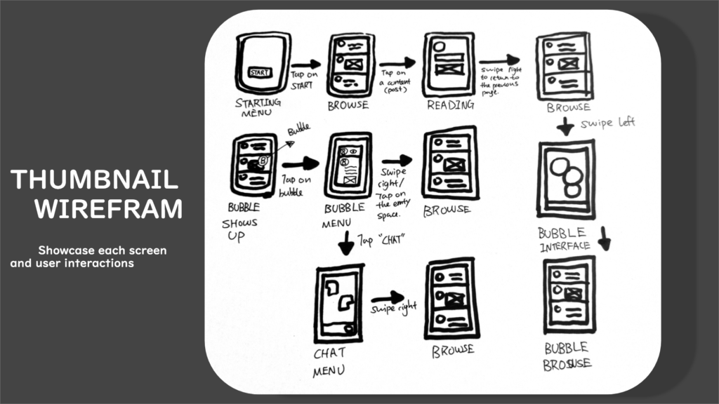
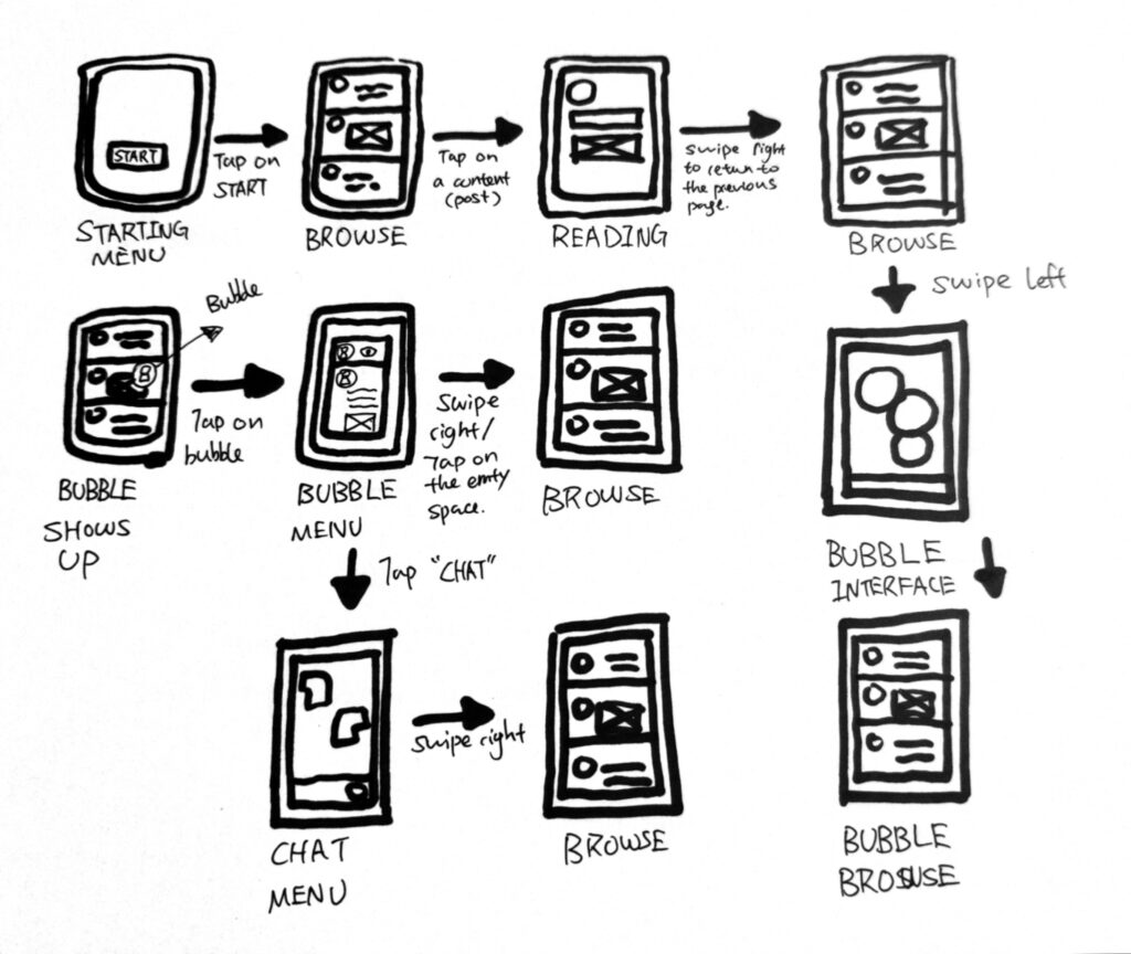
UI Flow
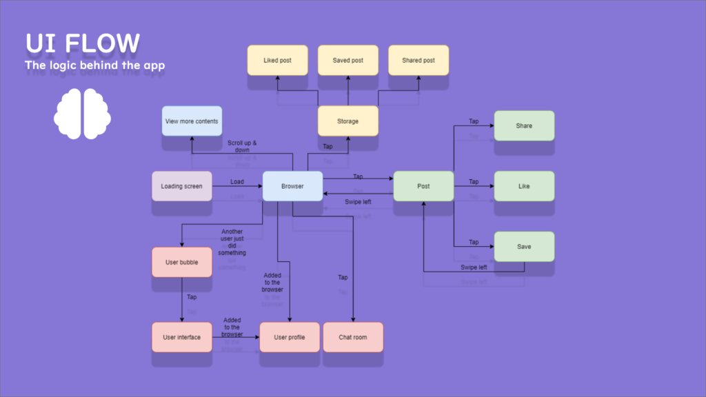
This is the flow I have done before getting into the development. It showcases the logic behind each screen and how they can be manipulated by the users.
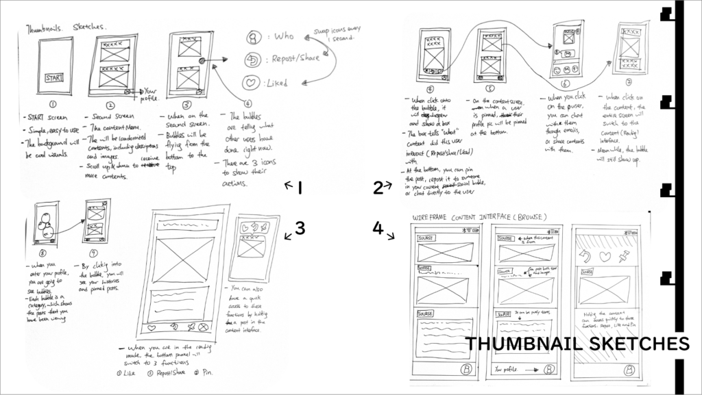
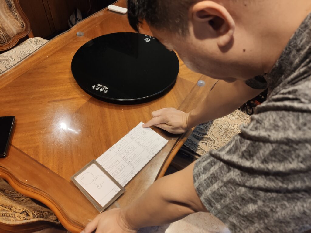
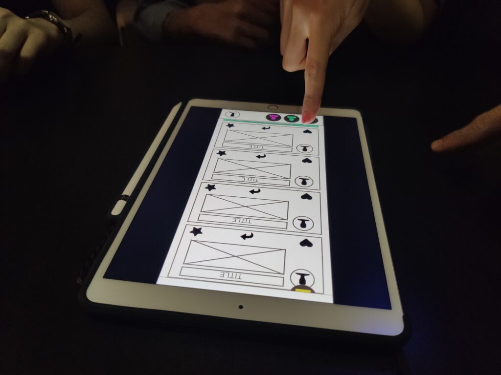
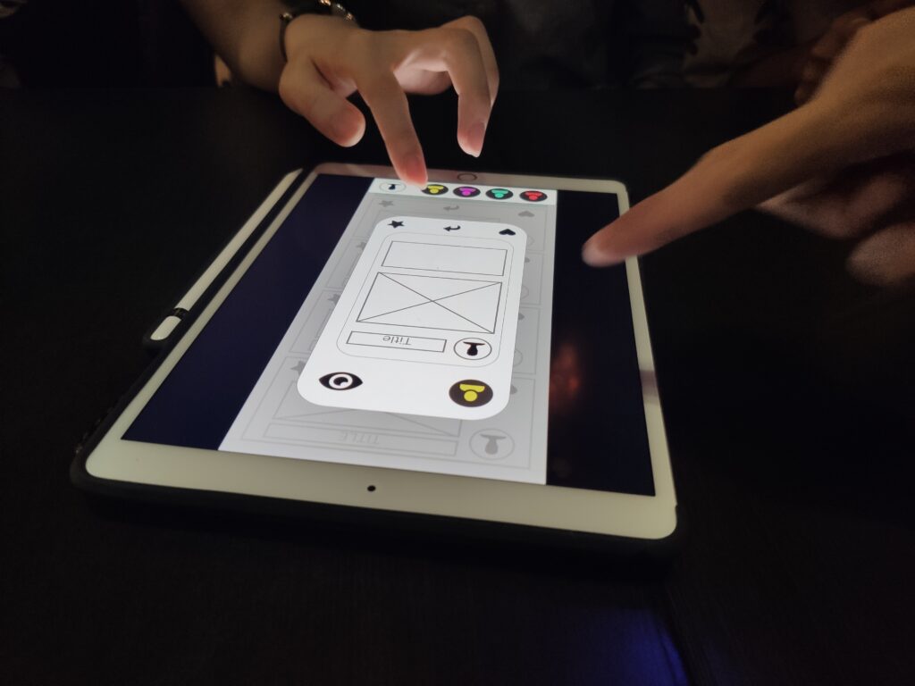
Thumbnail wireframes
I created these thumbnail wireframes after the ui flow is done. These are all sketches in the current stage because I wanted to test out the layouts and functions.

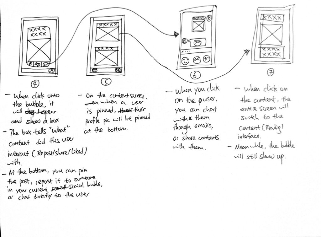
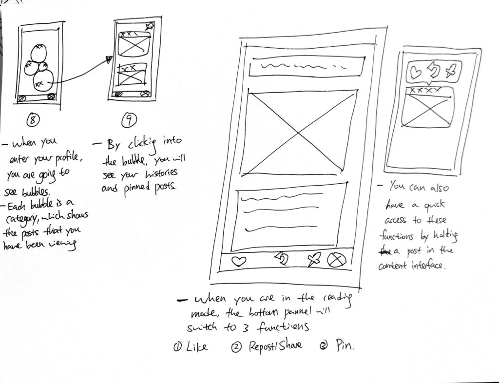
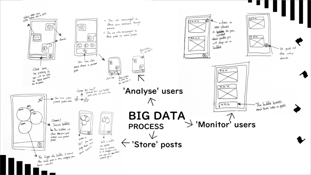
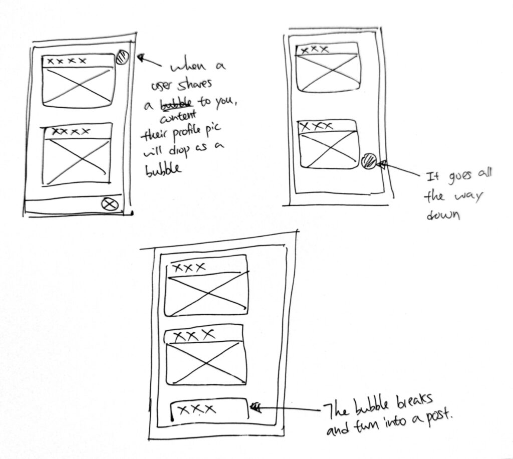
Image below is a unique function in my app. When users are in the browser, they will see a bubble flies from the bottom to the top. This is the ‘action bubble’, which occurs when another user has done something in their app (view, like, share or save). This helps the users to monitor each other to simulate the process of ‘collect & analyse’ in the Big Data.
References 1.
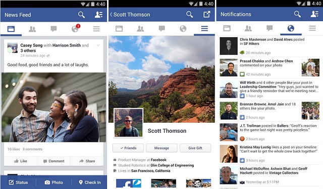
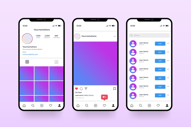
I also looked into designs from other apps such as Facebook and Instagram.
One thing I noticed is that the background are always white or simple colours, this is because these apps are content driven, and colourful background will distract them from reading the contents.
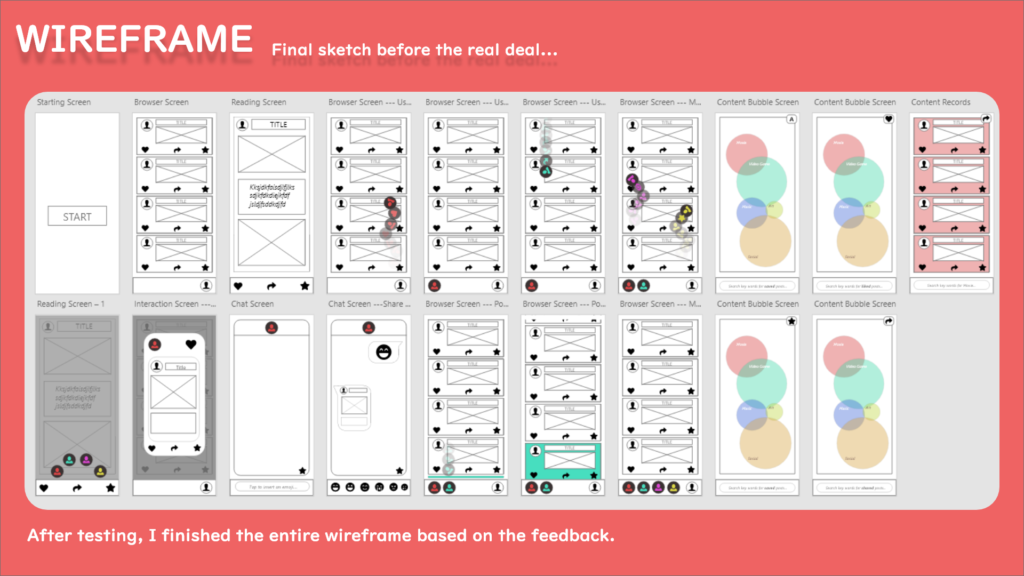
Wireframe.
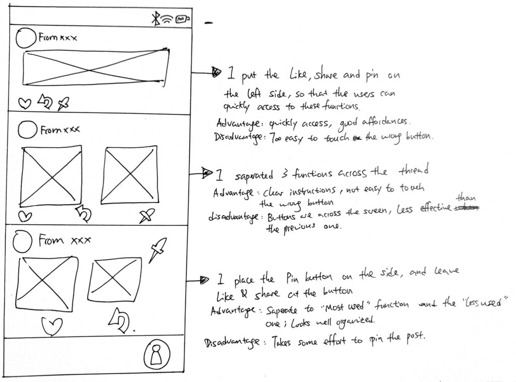
Here are more detailed wireframes I have done to polish the features in my app:

I was testing the layout of the browser. One thing that is important to show is the source link from other platforms.
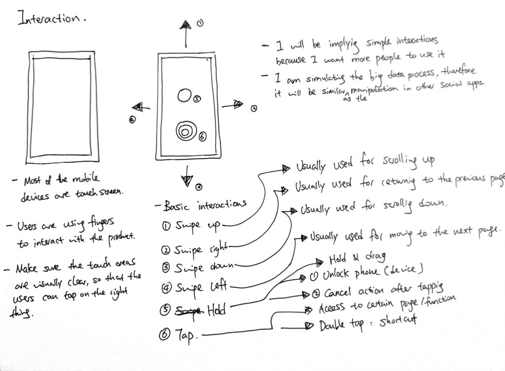
Interaction diagrams.
I also looked into how users can interact with the phone & app, and ergonomics. This includes the position of their fingers, how far can their thumb moves and etc…

Thumbnail wireframe.
Here is the thumbnail wireframe I made before turning the design into a paper prototype@
The design process was complicated, but when it is organised everything looks simple.
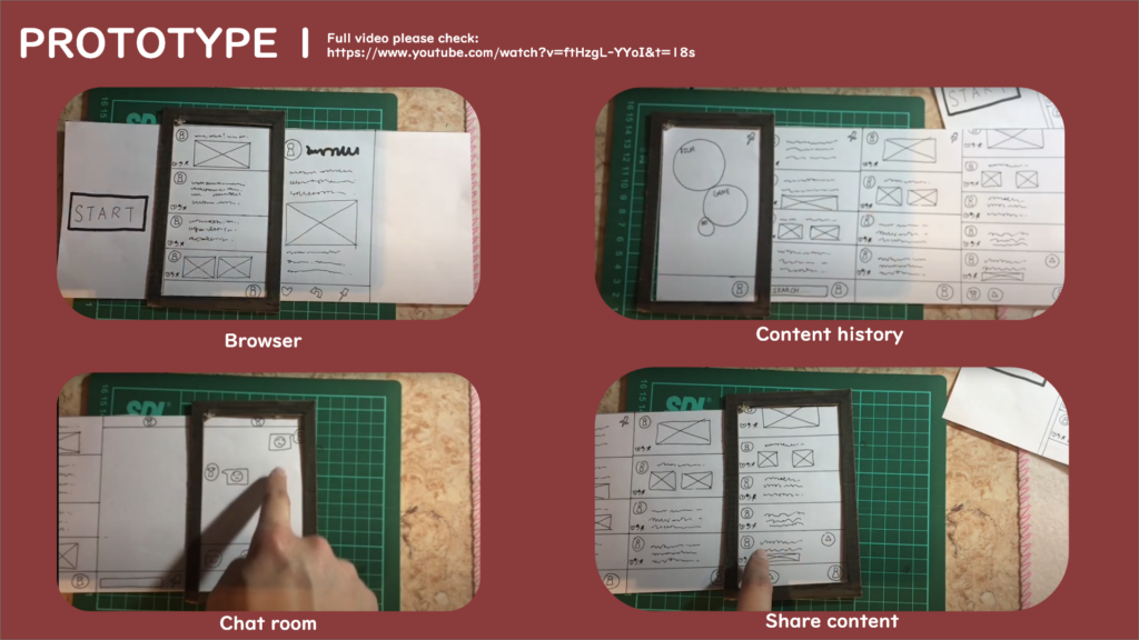
Prototype 1.
Here is the first prototype I made for testing. It is simply built from paper and cardboard, but functions just fine.
Paper prototype user testing.
I asked my parents to test it because they are middle age people who are less aware of the privacy leakage, I want to see what kind of feedback they will give me.
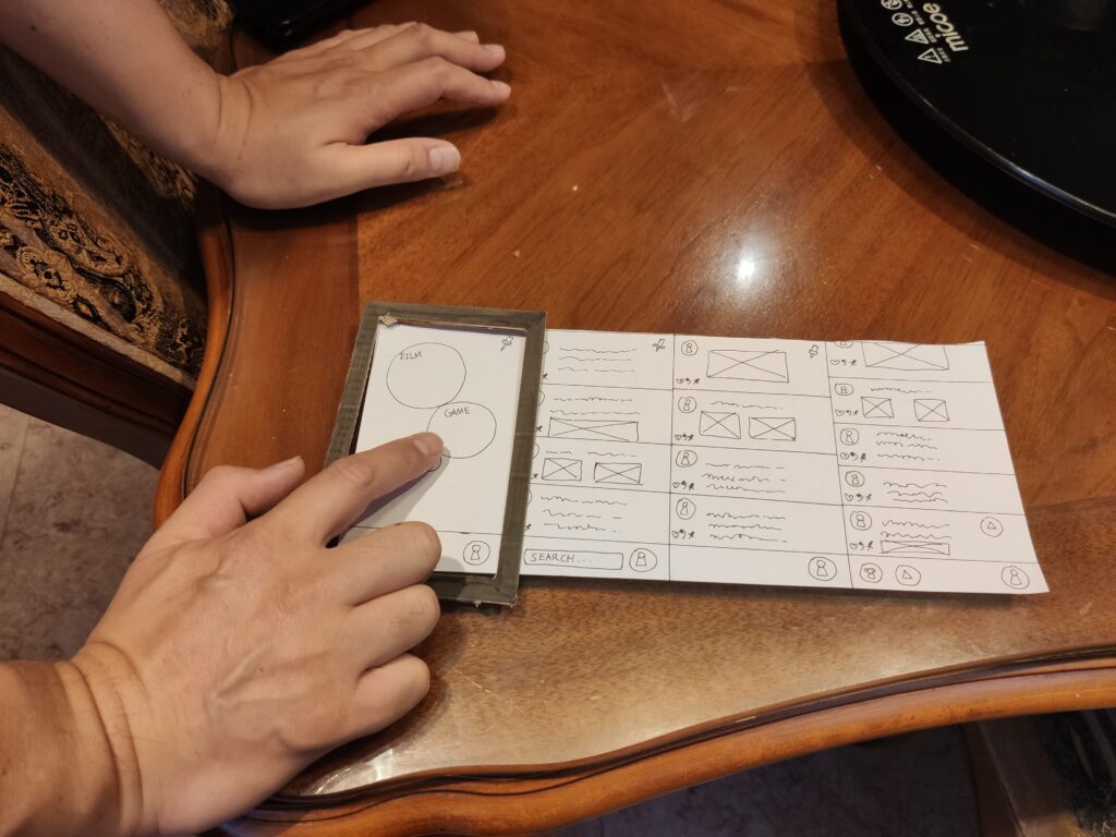
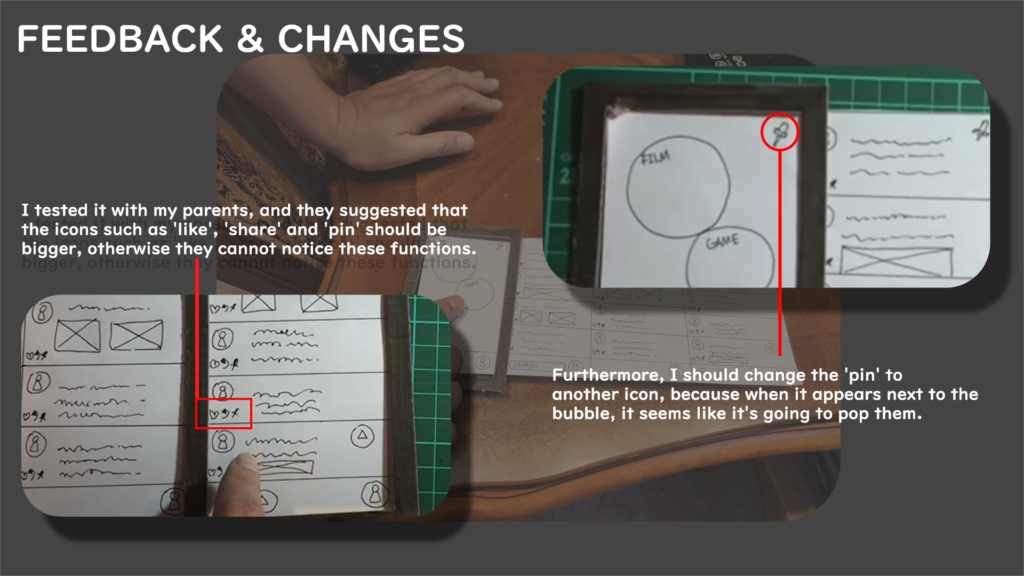
Two major feedback are shown in the image above.
I also received a positive review: My father thinks this app is handy because he can share some political opinions without been stalked by the big data.
Wireframe 2.
After receiving the feedback from my parents, I then moved onto making some digital wireframes because they look more organised.
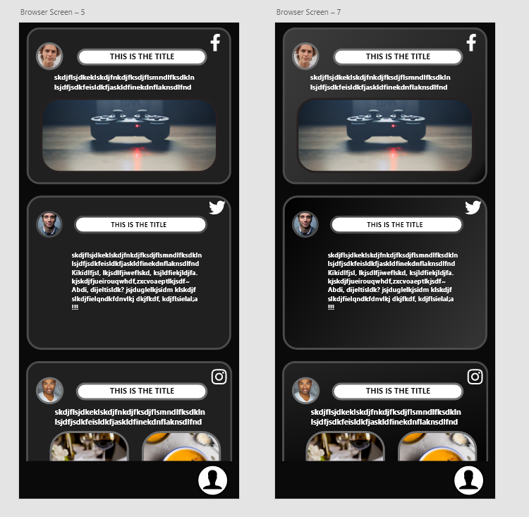
Browser.
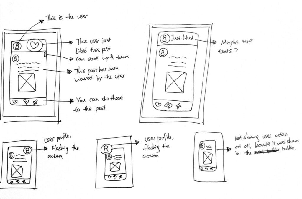
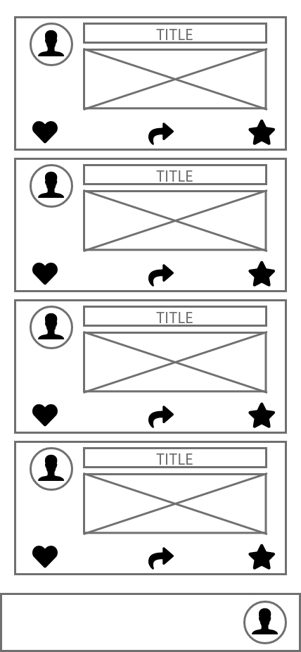
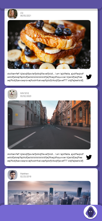
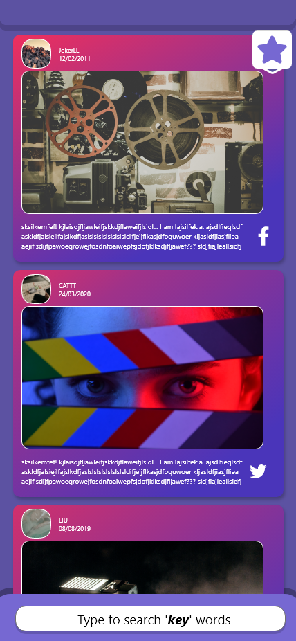
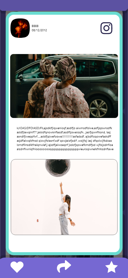
This is the browser, users can simply scroll up and down to view different contents on this page. They can also tap into a post and view the whole content.

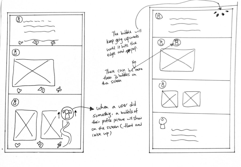
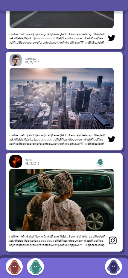
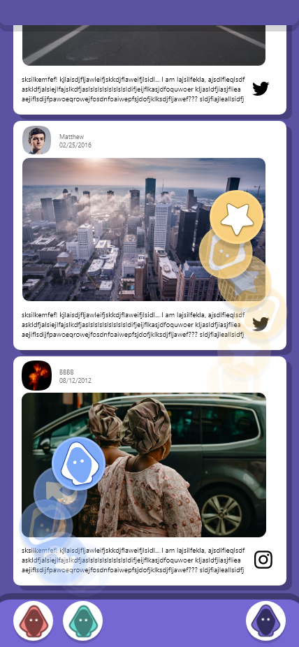
Action bubble.
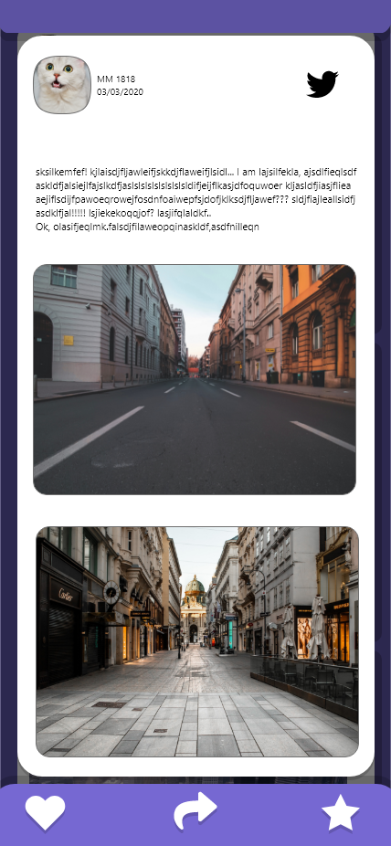
When another user did something, you will see their profile flying from the bottom of the screen. This is called the ‘action bubble’, if you tap them you will see what action they did towards which post. For example, in the images below, the red user just ‘liked’ a post:
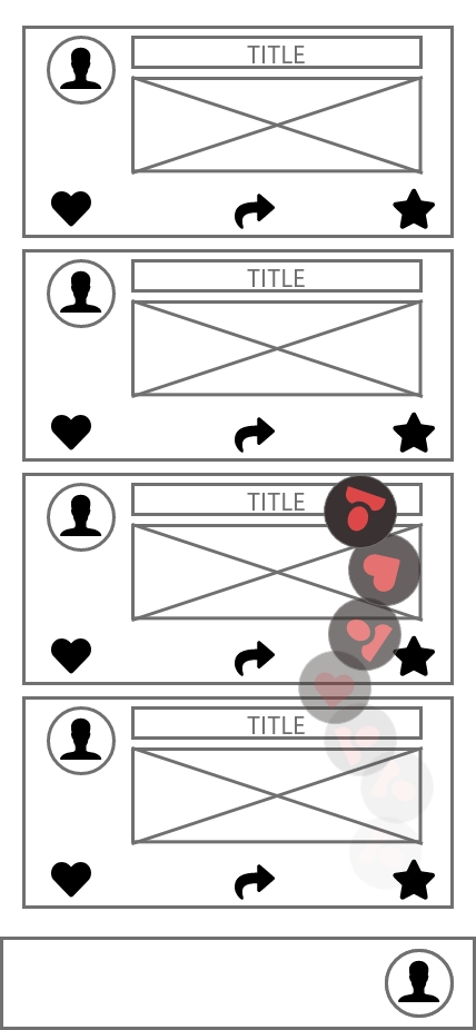
There can be more than 2 bubbles appear on the screen to ensure they don’t distract you from reading the contents.
Chat room.
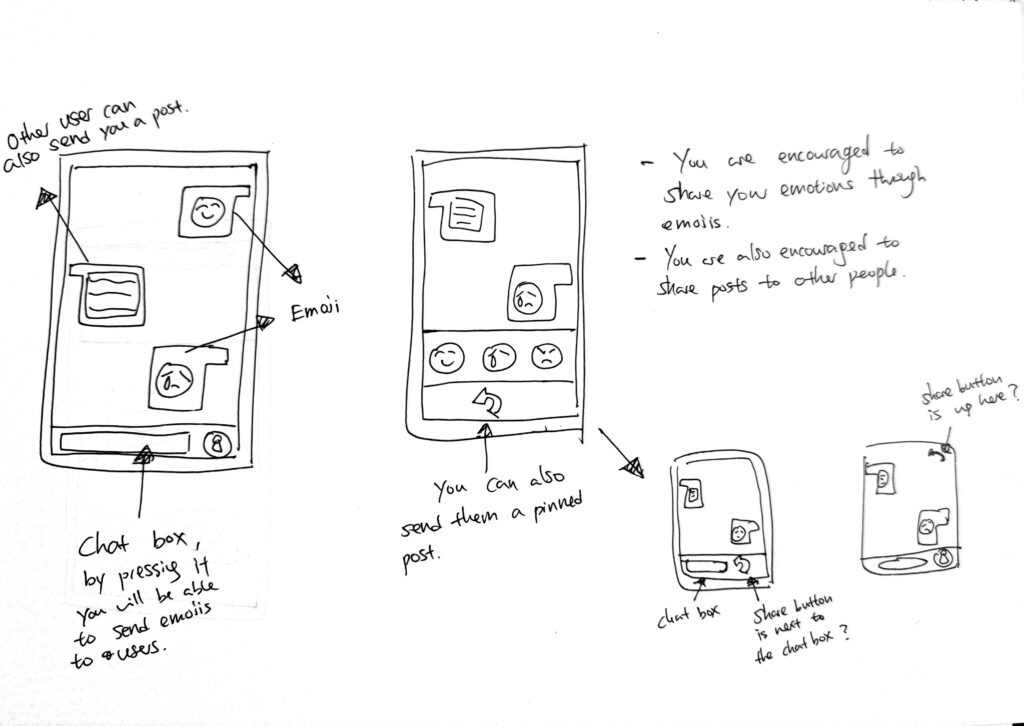
Once you have interacted with the interaction bubble, you can then communicate with the user. In this app, you are only allowed to chat with emojis because it is the purest way to communicate with your emotions.
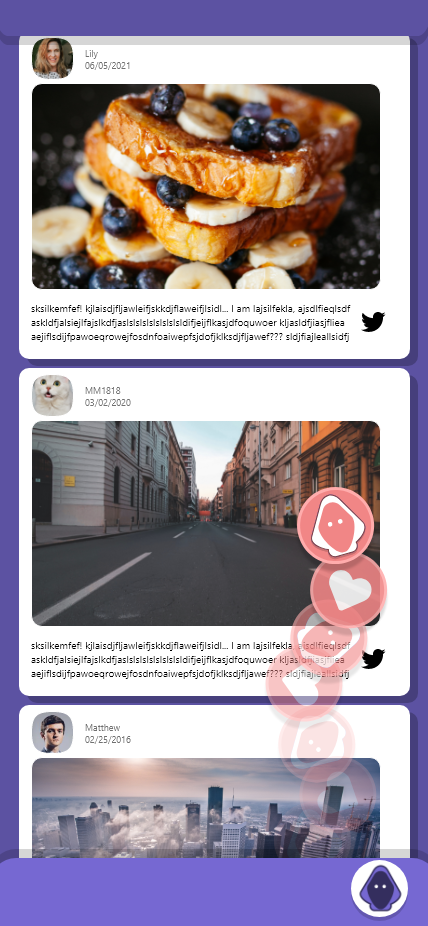
Share function.
The share functino allows you to receive contents from other users. For instance, a green user just shared you a post. This action appeared as their profil picture quickly falls and became a post at the bottom of your browser. The shared post is green to indicate the sharer.
You can also share contents to other users, by simply tapping on the ‘share’ icon.
You will be put into a group of 5 every 10 minutes, so you can only share a post to 4 people at once. This is designed for ensure that users don’t receive 10+ posts every minute.
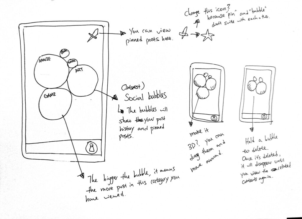
Bubble section.
Bubble section is the storage which contains all the posts that you have ‘viewed’, ‘shared’, ‘saved’ or ‘liked’. Each bubble represents as a category, the more related post you viewed, the bigger the bubble will be.
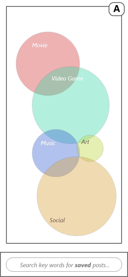
You can also type the key words to find the posts.

Prototype 2.
After wireframing the app, I then turned it into a digital version to test the interactions and the functions:
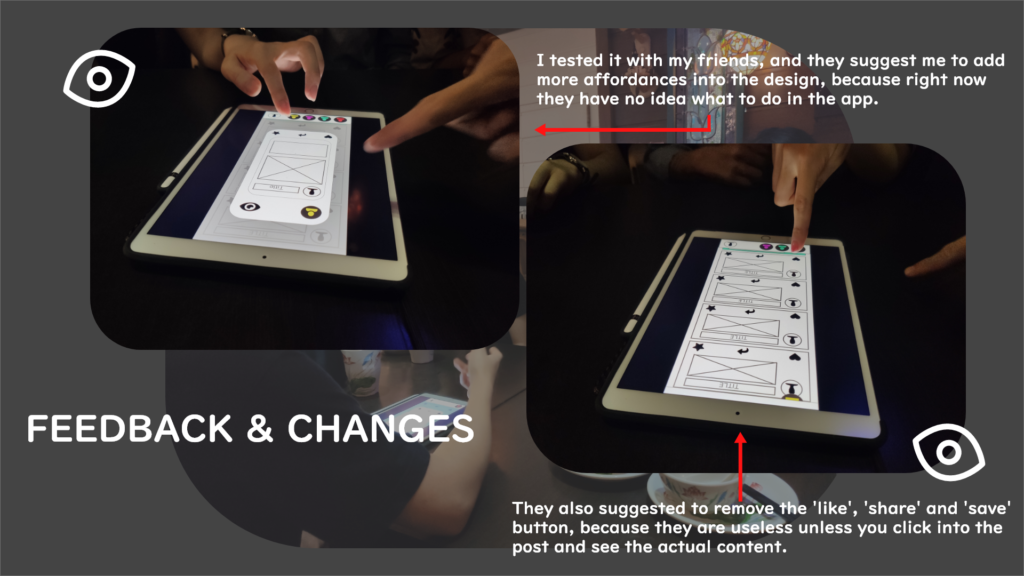
Prototype 2 user testing.
This time, I tested my prototype with my friends at 20 to 25 years old to receive feedbacks from younger people compare to my parents.


The major feedbacks are shown above. This time, they asked for more affordances and visuals because they didn’t know what to do in the app.
Reference 2.
After user testing, I then moved into the visual design. Here are some references I collected:
I found a useful link that teaches you how to do ui design for apps:
Tips for designing UI: https://uxdesign.cc/good-to-great-ui-animation-tips-7850805c12e5
Colours:
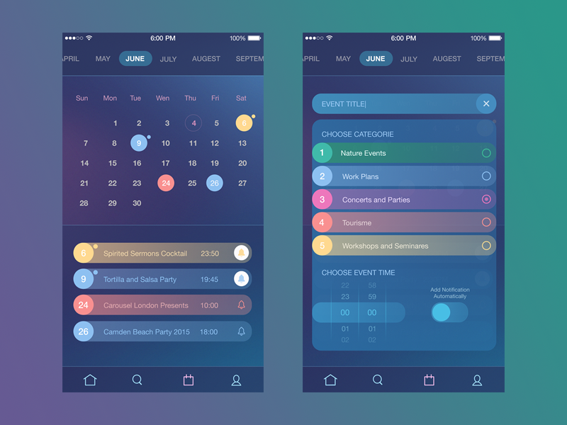
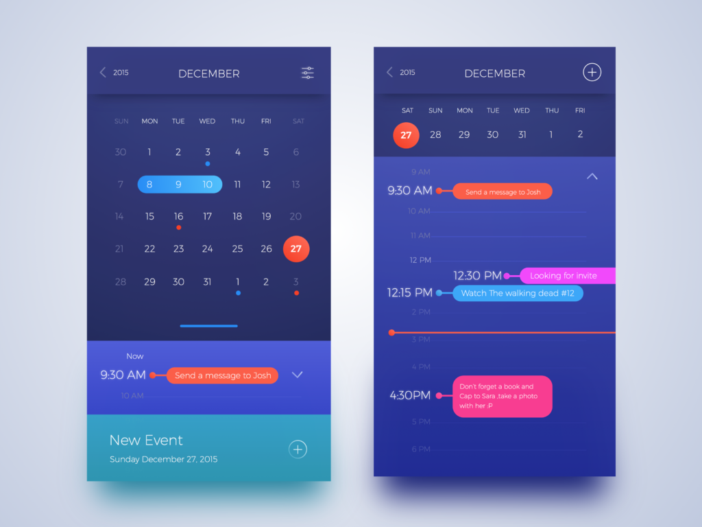
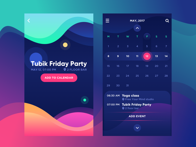

I like the use of colours in these interfaces. They usually have a darker colour as major, and add brighter and ambient colours to highlight the features.
Layout.
Some useful layouts from different app designs. Although they look cool, but my app is content driven so there shouldn’t be too much visual features in the app.

Animation.
Here are some inspiring animations if I decide to turn my app into a functional


Colour design.
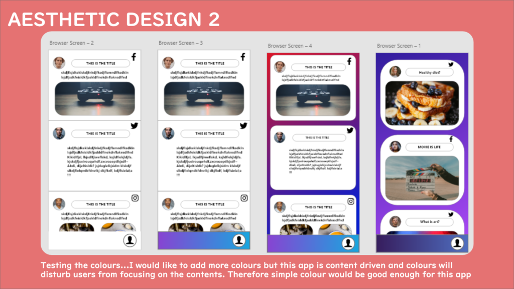
I would like to test some colours first before getting into the actual design because it is a big part of the visualisation.
Here are some simple colours I made in Adobe XD:
I also tested the shifting colours to see how it goes:
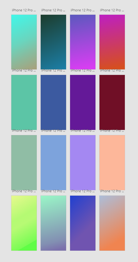
It turns out that purple is the colour I would like to go for the final design because it represents mystery, which suites well with the idea of ‘anonymous’.
Layout design.
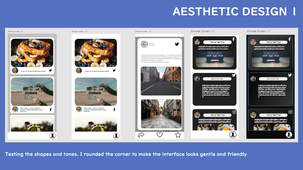
Here are the layouts I designed for the browser:
I used photos from unsplash to create some ‘actual’ contents to test out the visual. I tried to keep it simple so that the users can focus on the content instead of the visual effects.
Each post contains four features: author, content, title and source.

I also tested the background, but they look to disturbing when using the app, so I sort of gave up on this design in the end.
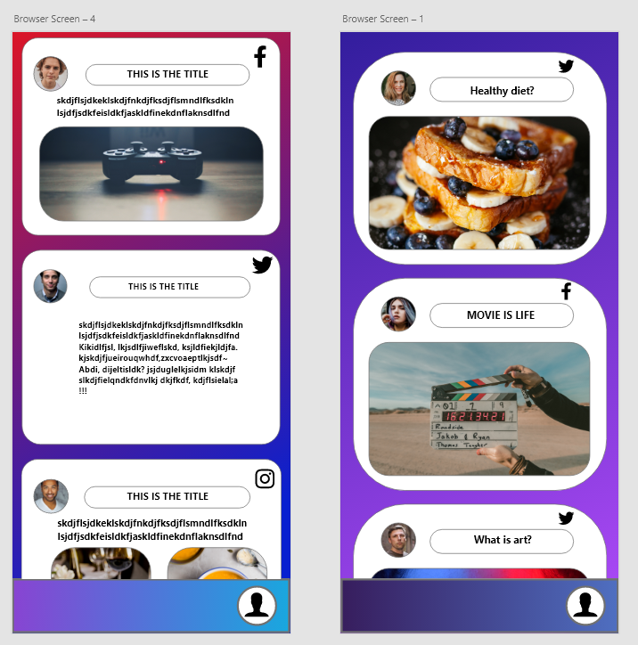
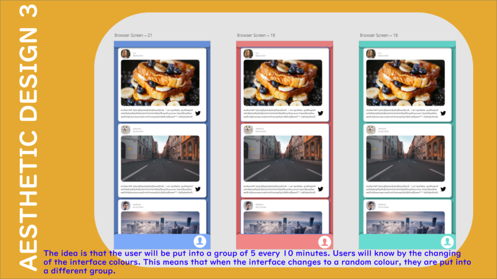
I decided to use one colour for the backgrounds to make them look less disturbing:
Here are some results I made in the end:
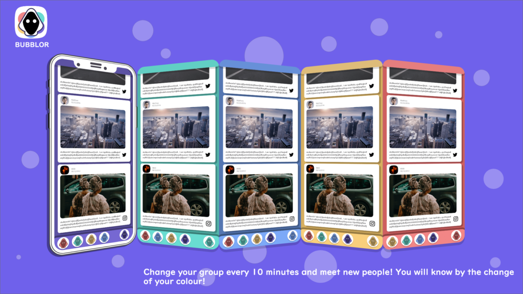
The idea is that the users will be put into a random group of 5 every 10 minutes, and they will know this by changing colours on their interface.
I also added some shadows for each post, to make them look like interactable.
The interface is pretty much done, and I will use this style to finish the rest of the panels.
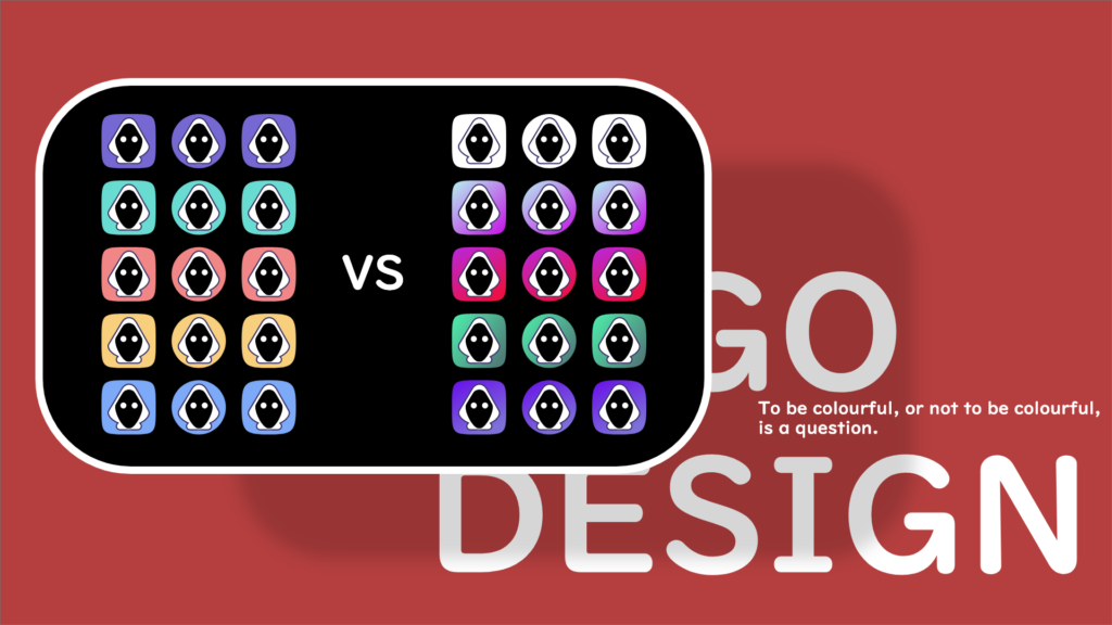
Logo design.
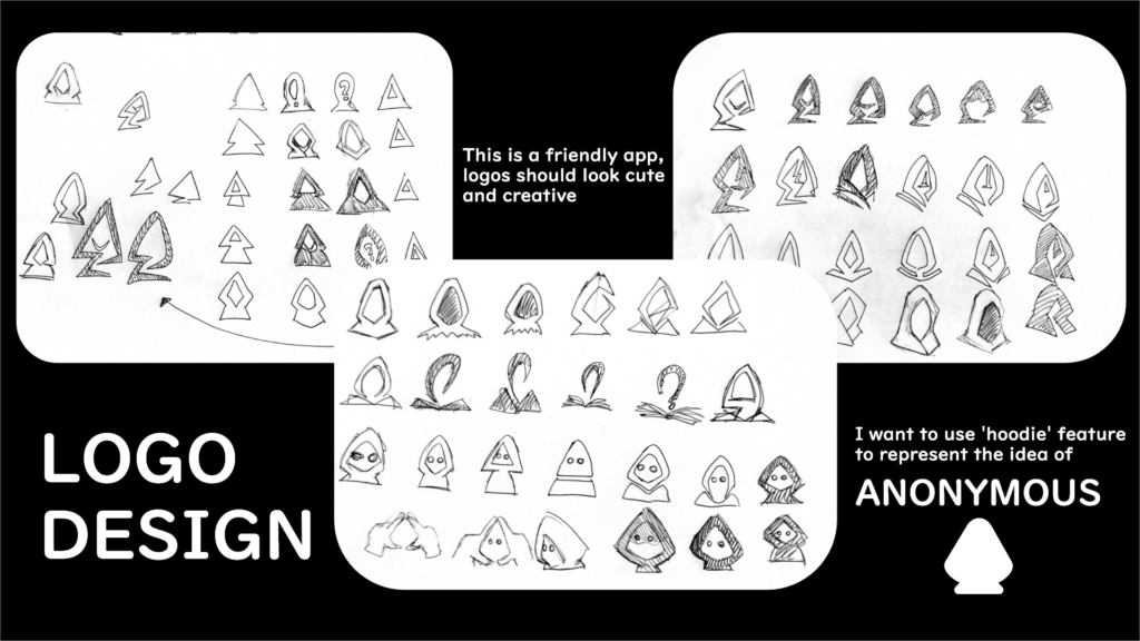
Logo is an important feature in an app because it shows the significant features from your app.
I drew out some simple shapes on the paper first. The principle for my logo is to highlight the idea of ‘anonymous’ and ‘friendly experience’. Therefore, I used ‘hood’ and ‘cartoon’ style to represents both features:


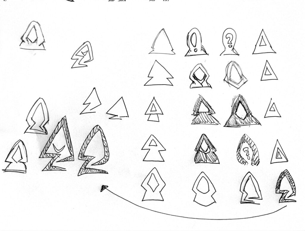
Here are some designs I made based on the sketches:
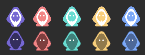
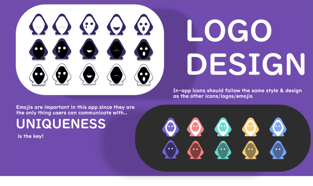
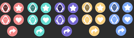
Whilst doing the logo, I was struggling with making them to look ‘unique’, therefore I decided to do some emojis first because different facial expressions might inspire me. The idea is still ‘anonymous’, therefore I am only showing the key expressions such as mouth, tear and eyes.
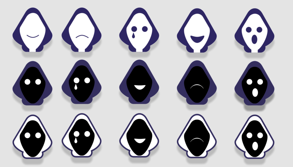
It turns out that the white hood looks good as a logo, therefore I chose that one for the further development:
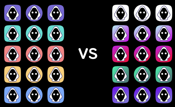
I tested some background design, but non of the is good enough. I want to show ‘diversity’ in the logo because that’s my app’s property.
Here is how I came up with the final deisng:
Once the logo and emojis are done, the icons are came naturally:
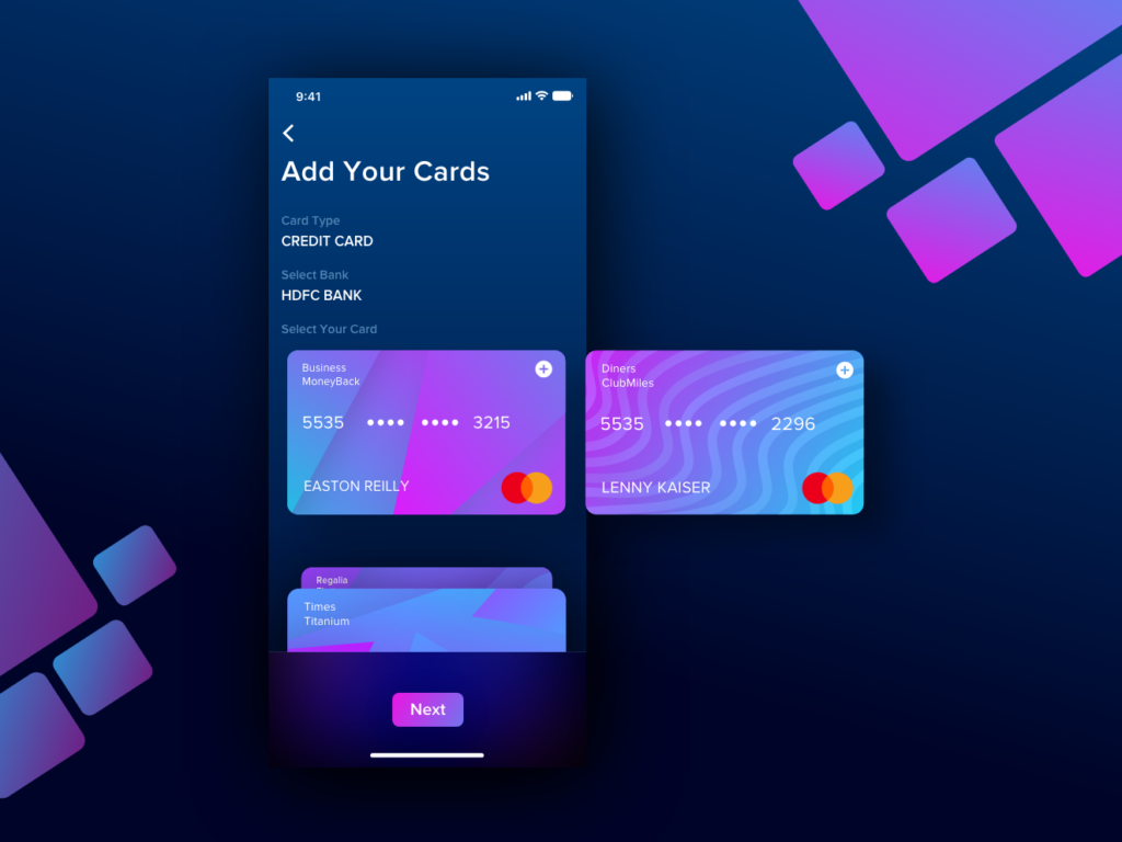
High-fidelity wireframe & functions
Here is the finished wireframe, I will go through each screen and explain the functions:
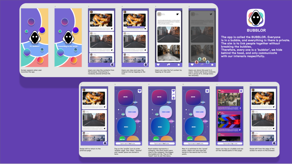
The app is called the BUBBLOR. Everyone is in a bubble, and everything in there is private. The aim is to link people together without breaking the bubbles. Therefore, every one is a ‘bubblor’, we hide behind the hood, and only communicate with our interests respectfully.
Wireframe 1.

Loading screen.
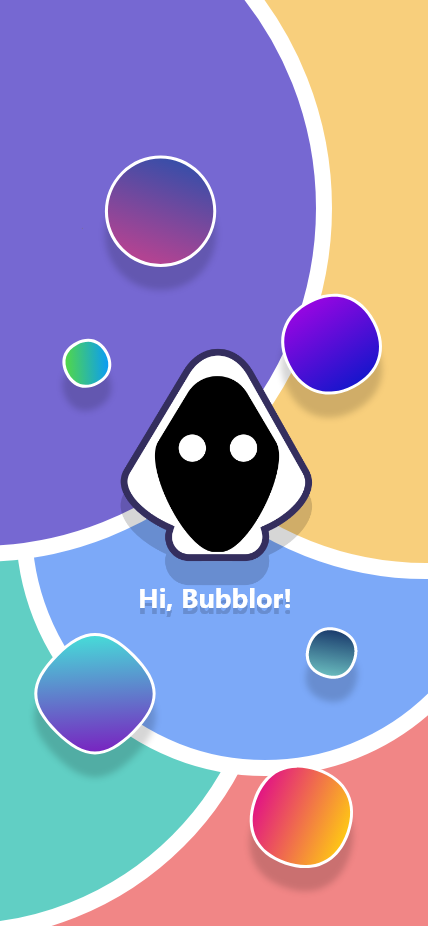
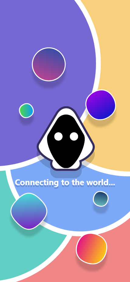
The first two screens are the loading screen. The logo welcomes the users by calling them the ‘bubblor’, and telling them that they are now connecting to the world.
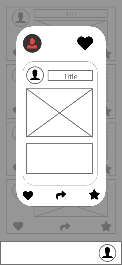
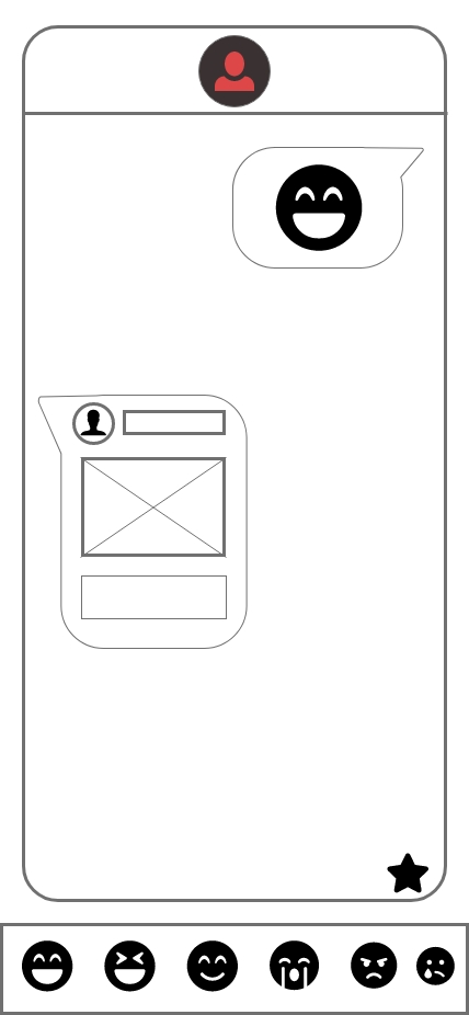
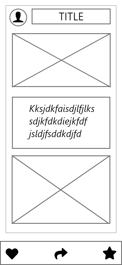
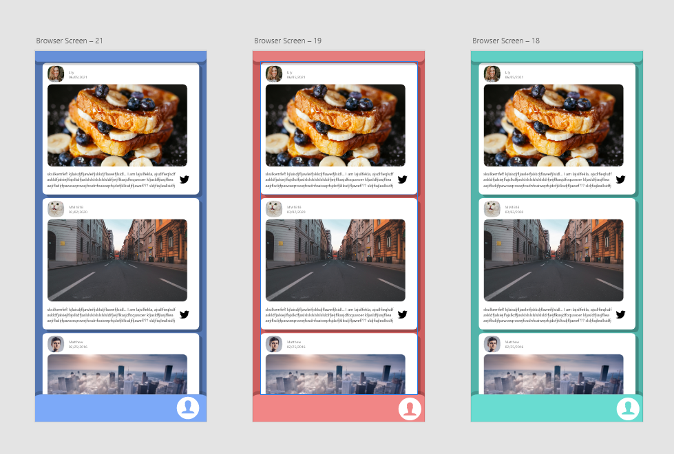
Browser.

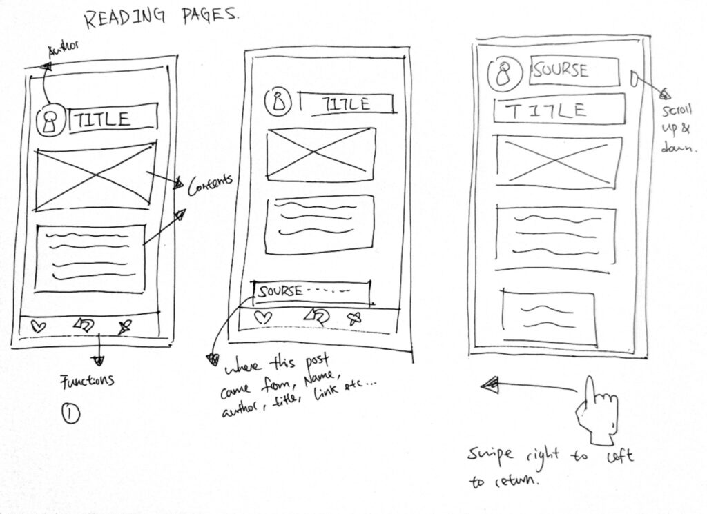
Users can view contents in this page, and by tapping on the source icon they can see a link to the original post.
Viewing & sharing.

You can tap on the post and view content. In the viewing page, you can like, share and save the post. When sharing, simply hold onto the ‘share’ button and you will see the users you can share your post with.
Wireframe 2.
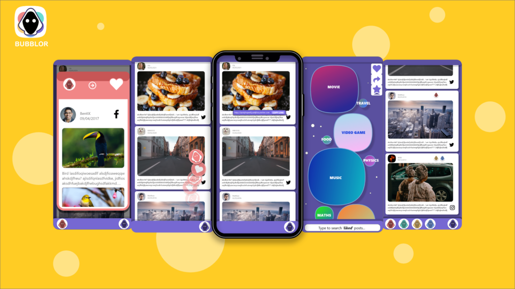
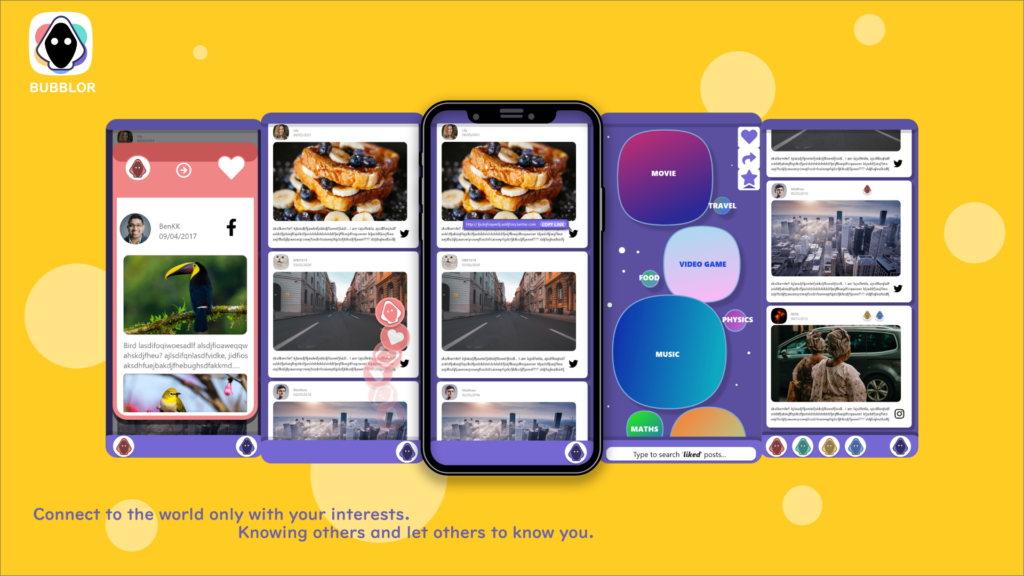
Bubble section.


This is the ‘storage’ page, where you can see all the posts that you have liked, saved or shared. Just like what I explained before, each bubble represents a category, and the more related post you read, the bigger the bubble. You can type in the search bar to find posts, or tap on the top-right corner to choose which category you would like to search.
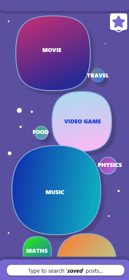
You can tap on the bubble to access to the posts in its category. For example. if you tap on the ‘movie’ bubble, you can see all the movie-related posts, that matches the same colour as the bubble.
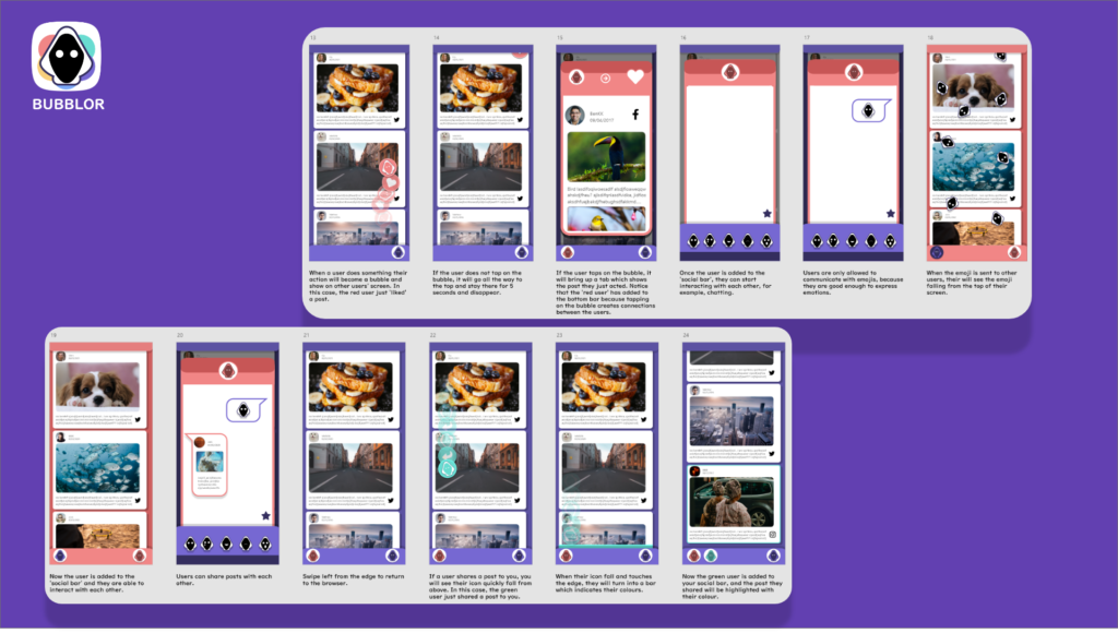
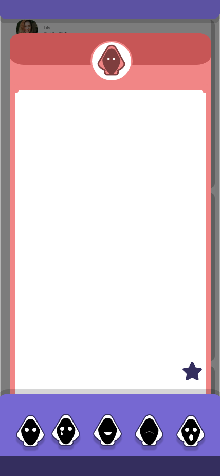
Wireframe 3.
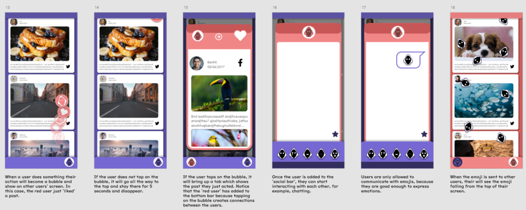
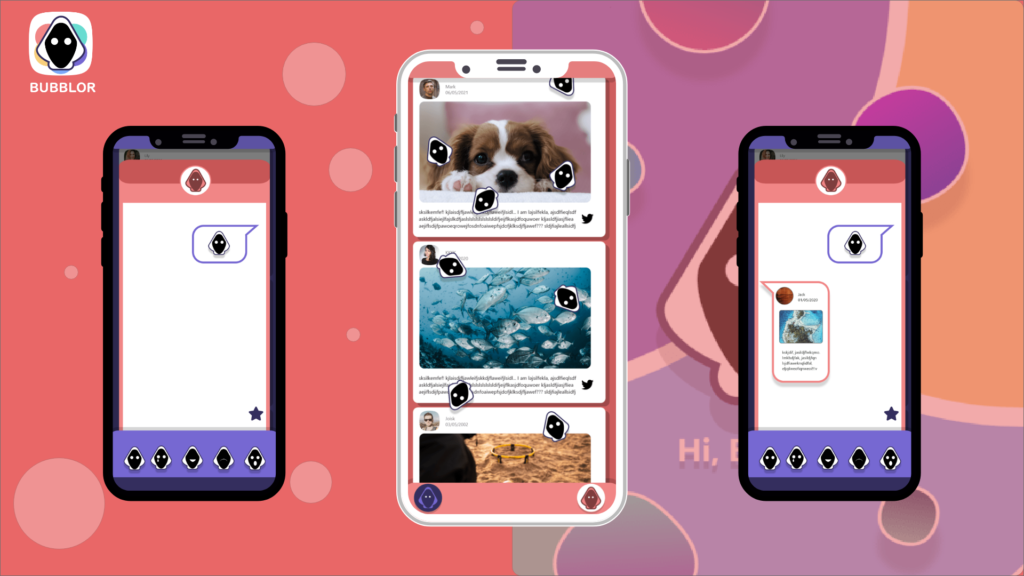
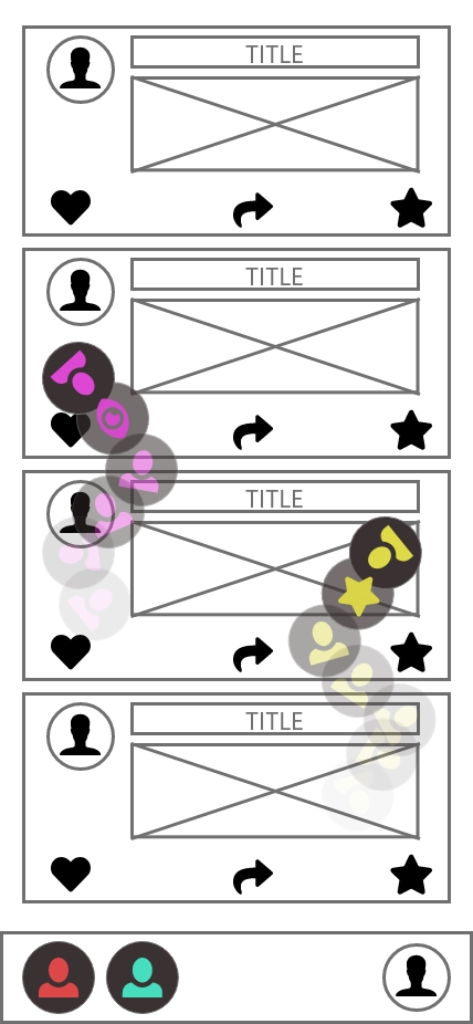
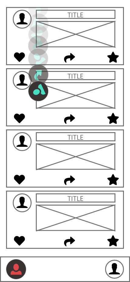
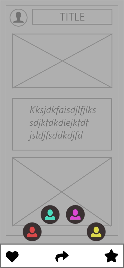
Monitor function.

When another user in your group has done something , their action will appear on your screen as a bubble. If you don’t do anything , the bubble will stay on top of your screen for 5 seconds and disappear.
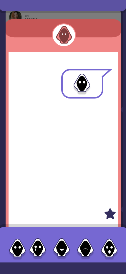
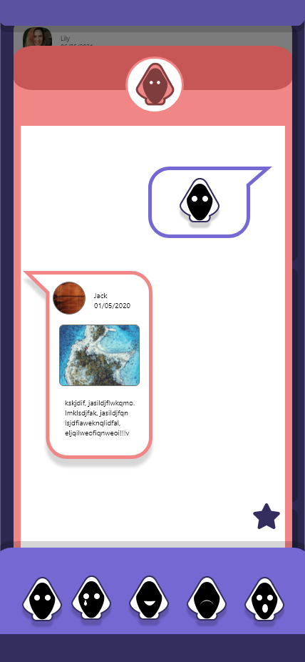
Chat room.
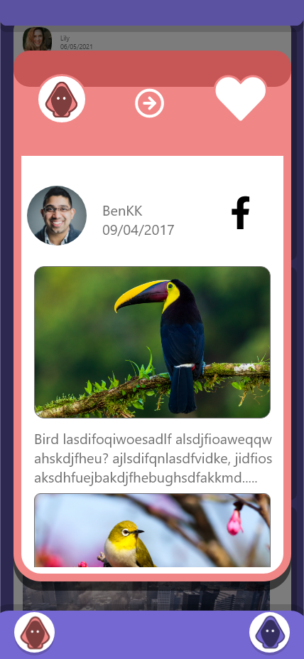
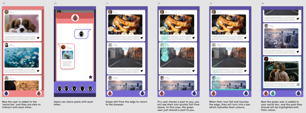
If you tap on the bubble, you can see which post they have interacted with. For instance, in images above the red user just liked this post from BenKK. Notice that the red user is added to your ‘social bar’ once you have seen what they have done, therefore you can now interact with them. Tap on their profile to enter the ‘chat room’.
Once in the chat room, you can then send emojis or the saved posts on this page. If you send an emoji to the indicated user, their browser will start raining the emojis, and your profile will flash.
Wireframe 4.
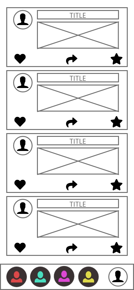
Chat room.
Another user can also send you emojis or a post.
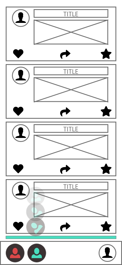
Post sharing.
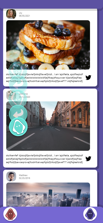
When a user sends you a post, their icon will fall from above and became a post in your browser. You can tap on the post and see what they sent you.
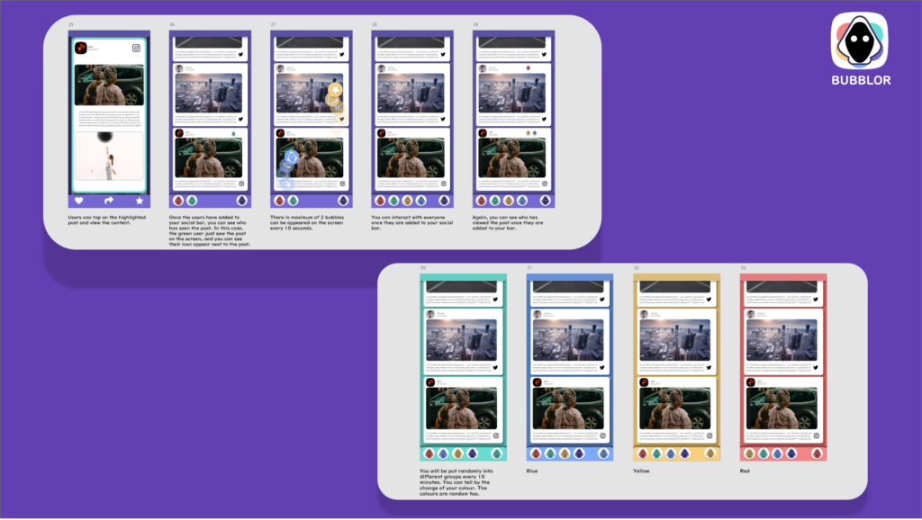
Wireframe 5.
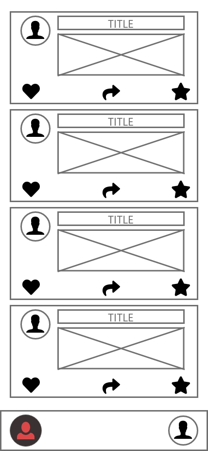
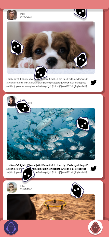
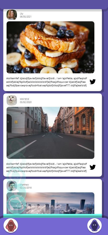
Post sharing & monitoring.
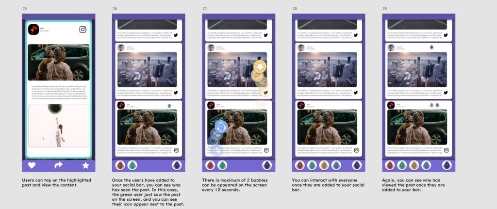
When you access to the post, the outline will be highlighted, which informs who sent this to you. When the user is added to your ‘social bar’, you can then see who has seen the posts. For example, the green user is added to your bar, and now you can see his icon in one of the posts, and this means that he has viewed this post before.
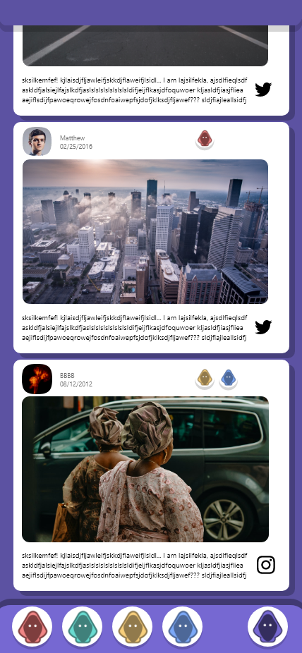
Only up to 2 icons can appear on the screen, for a10 seconds gap in between. This ensure that users don’t spam on other people whilst viewing the contents. Again, once they are added to your ‘social bar’, you can now see which post has been viewed by whom.
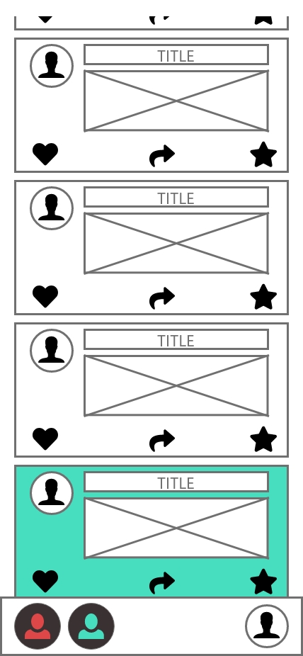
Wireframe 6.
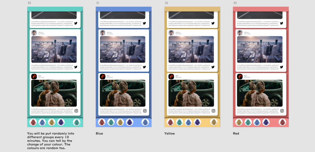
Users are randomly put into a group of 5, for every 10 minutes. This mechanic controls the number of bubbles showing on the screen. Users will notice their interface colour changes throughout the time, this design allows the users to know when are they switching the group.
High-Fidelity Prototype: