PROJECT OUTCOME PREVIEW:
THERMOCHROMIC MASK:
MASK, POSTER AND PACKAGE.
IDEATION.
After doing research and some experiments, I think it is time to move on and start making the actual thing.
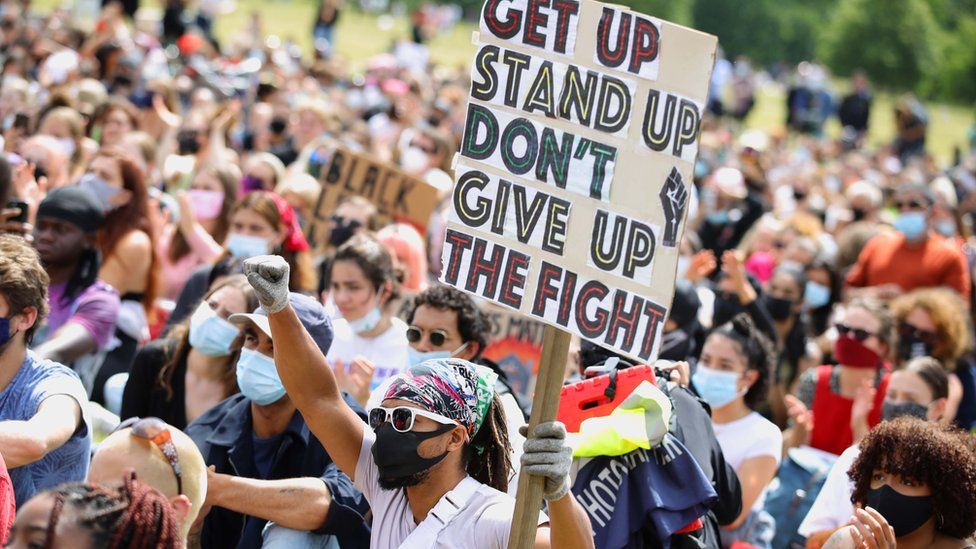
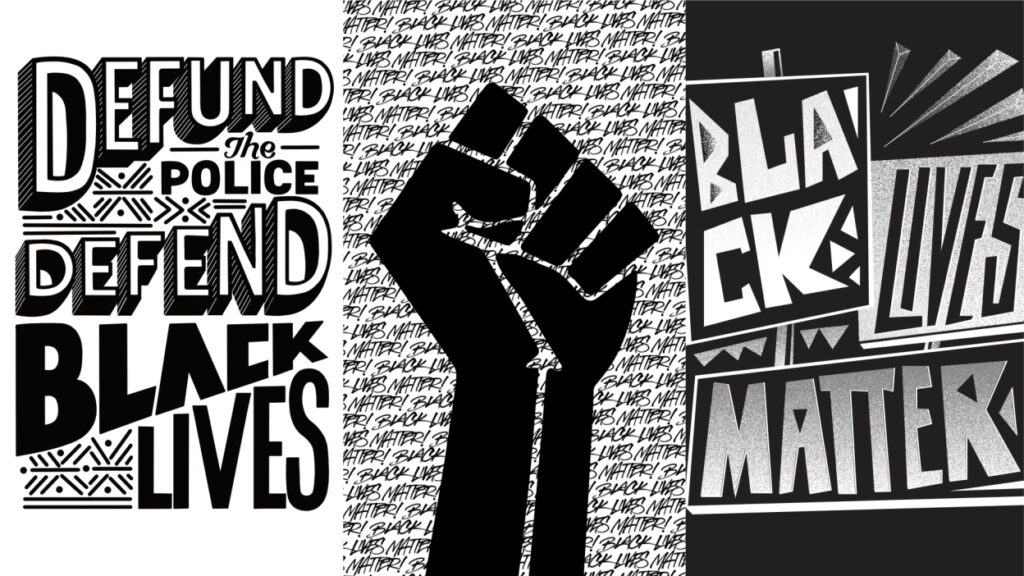
The initial idea was inspired by the image I used for the projector experiment:
Here is an original image:
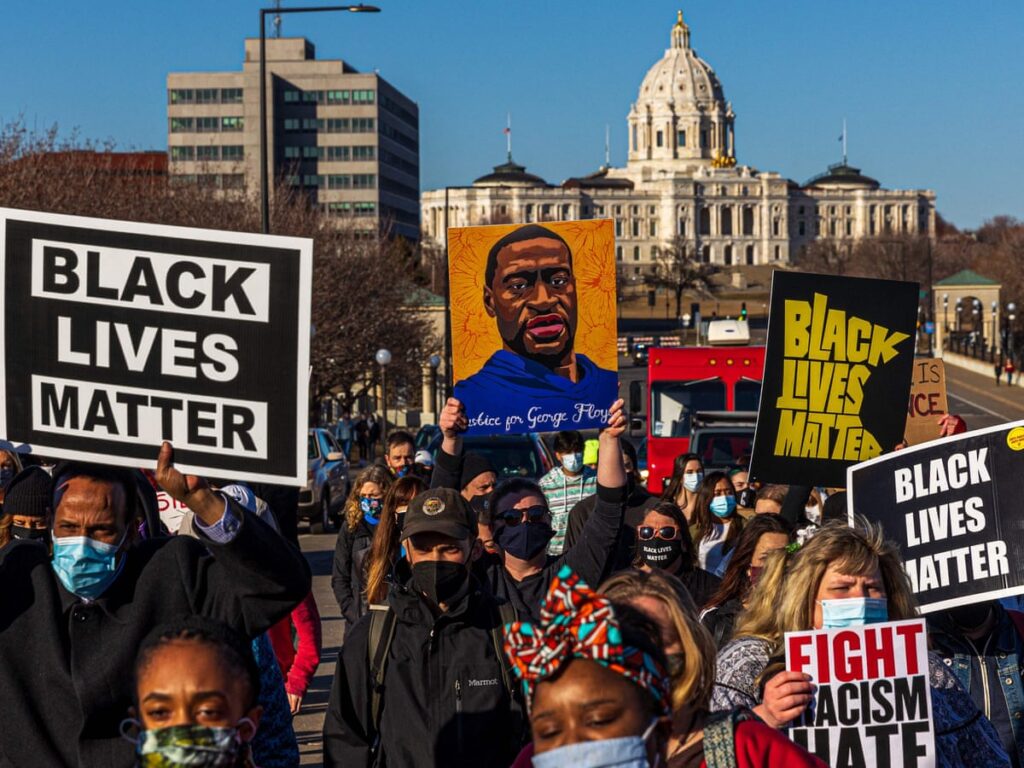
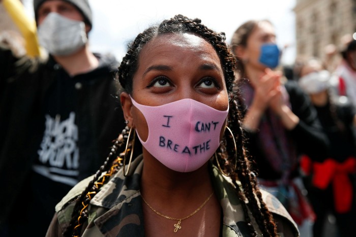
Notice that everyone is wearing face masks and protesting for George Floyd’s tragedy. In the picture above, one lady in the back had my attention: she was wearing a black facemask with printed texts on it.
This idea inspired me hugely because I was struggling to find a suitable medium to present the idea of ‘revolution’ (thanks to the previous experimentation). Now, by using facemask as a publication, it suits the context and the background of ‘breathing’ and ‘freedom’.
This is an initial idea sketch I did as a starting point:
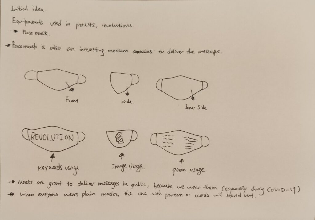
The idea behind it is very simple: printing texts straight on the mask, and then wear them.
I also used a design method called Kipling’s Checklist to evaluate the ideas from different aspects:
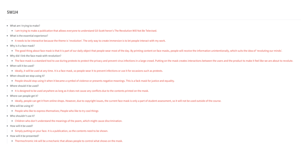
After the evaluation, I realised that using facemasks is a great way to deliver the message because people can wear them and walk around in public. Furthermore, the audiences don’t need to pay to read the message, they will read it when somebody is wearing the mask.
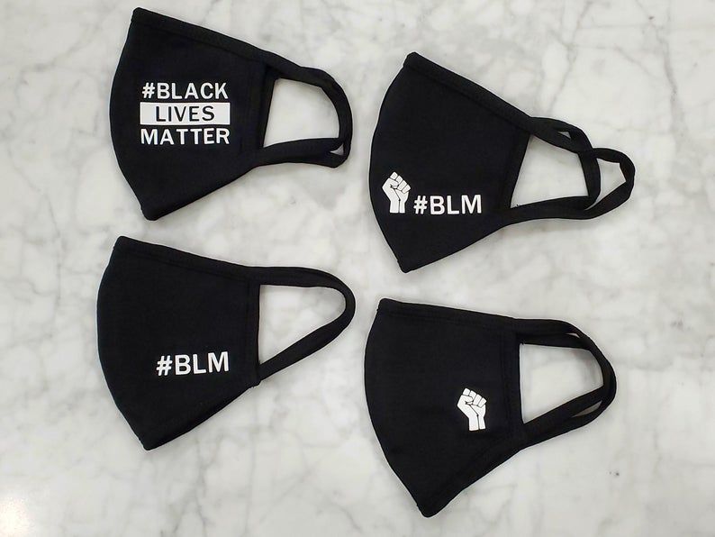
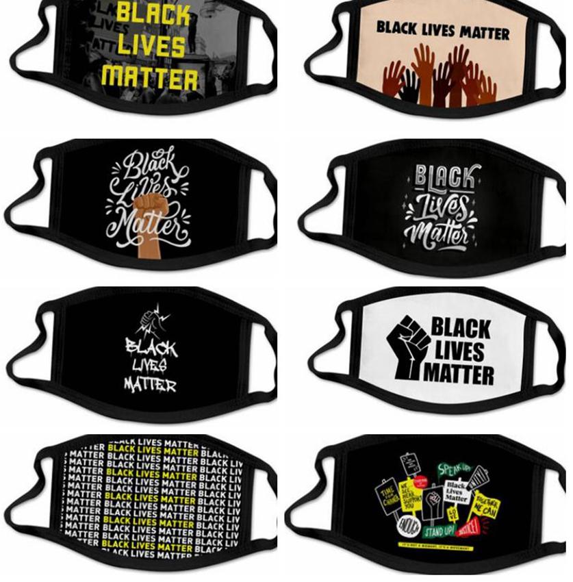
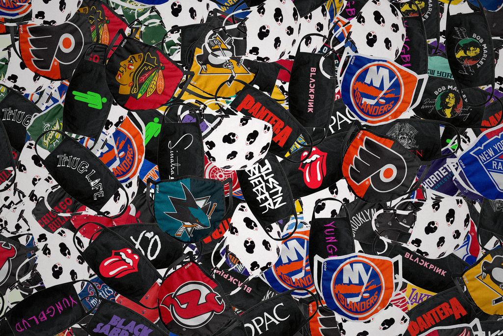
Here is some research I did on the printed facemasks:

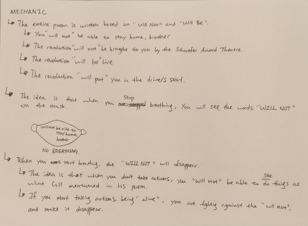
After looking through some of the ideas, I then started to design the mechanic for the facemask.
The biggest challenge is the uniqueness of my product: What is the difference between my facemask and the ones that are already existed?
Here is my thought process:
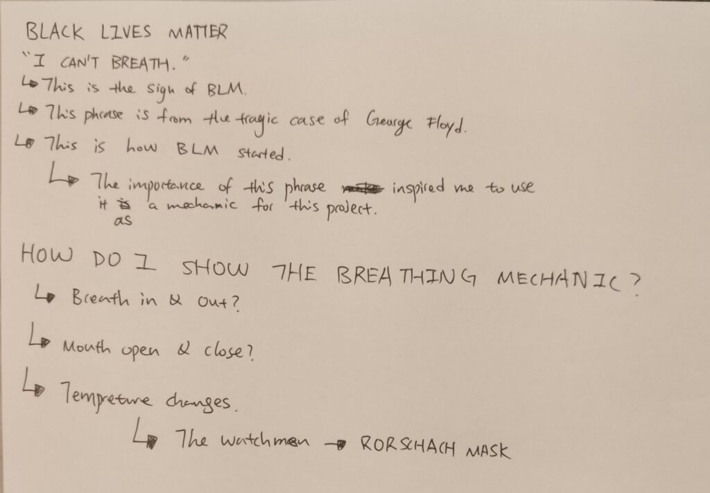
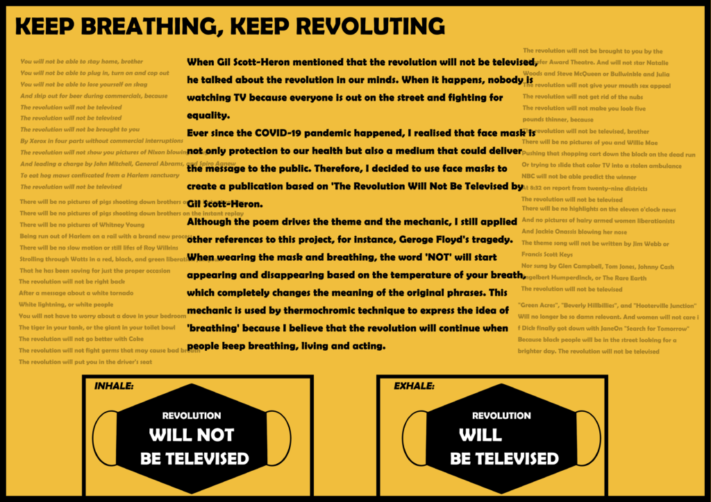
One thing I want to highlight is the ‘breathing’ mechanic. This was inspired by Geoge Floyd’s phrase: “I can’t breath.”
By implementing this idea into my product, people will always remember this tragic sentence, and everyone is part of the “revolution”.
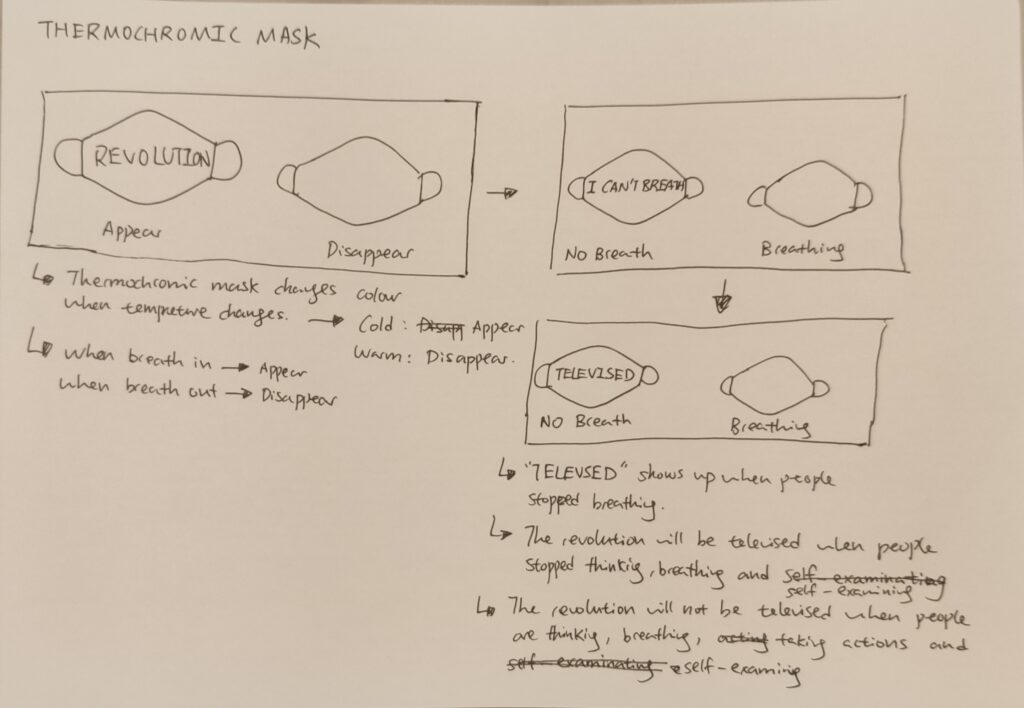
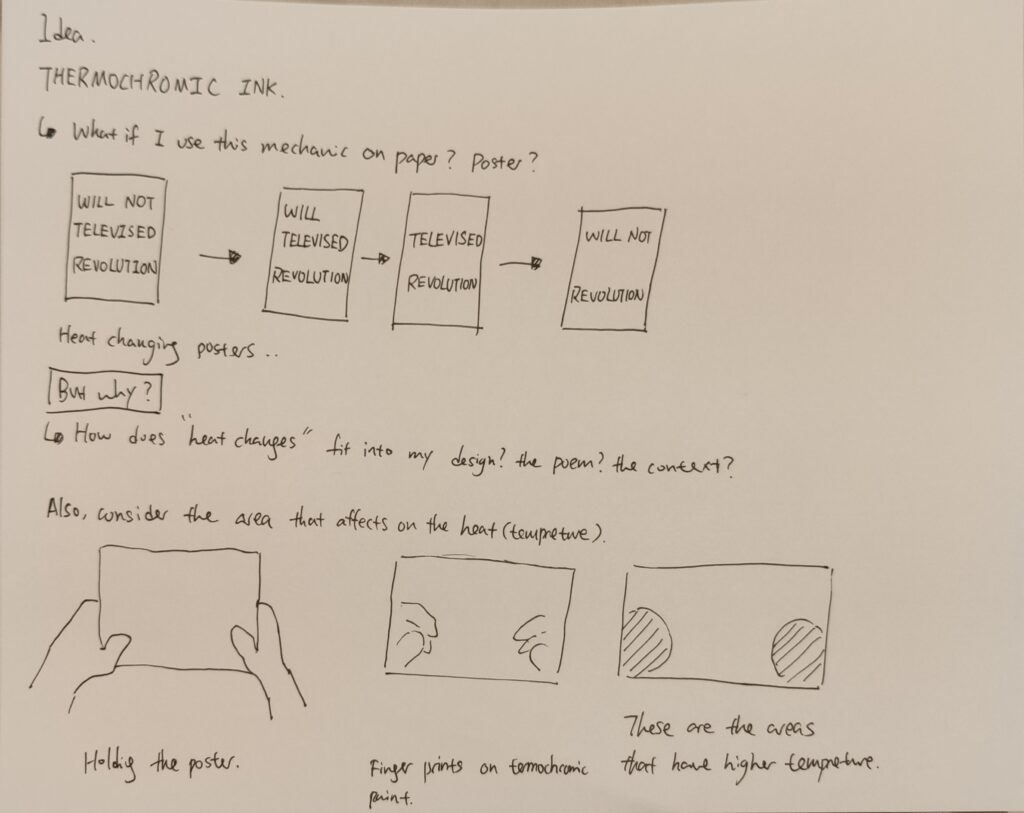
I went onto Youtube and tried to look for the method to test my design. Luckily, I came across a special material called thermochromic paint/ink.
Thermochromic paint/ink is a type of paint/ink that becomes translucent when tempreture gets higher, which is a perfect material for my design.
Here are some videos showcasing the material:
Once I understand how it works, I then moved onto the detailed designs:
Here are a couple of designs I made both on paper and software:
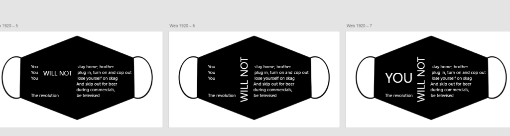
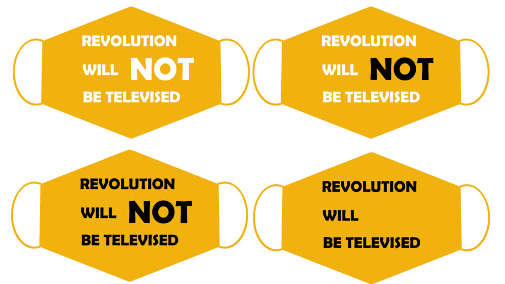
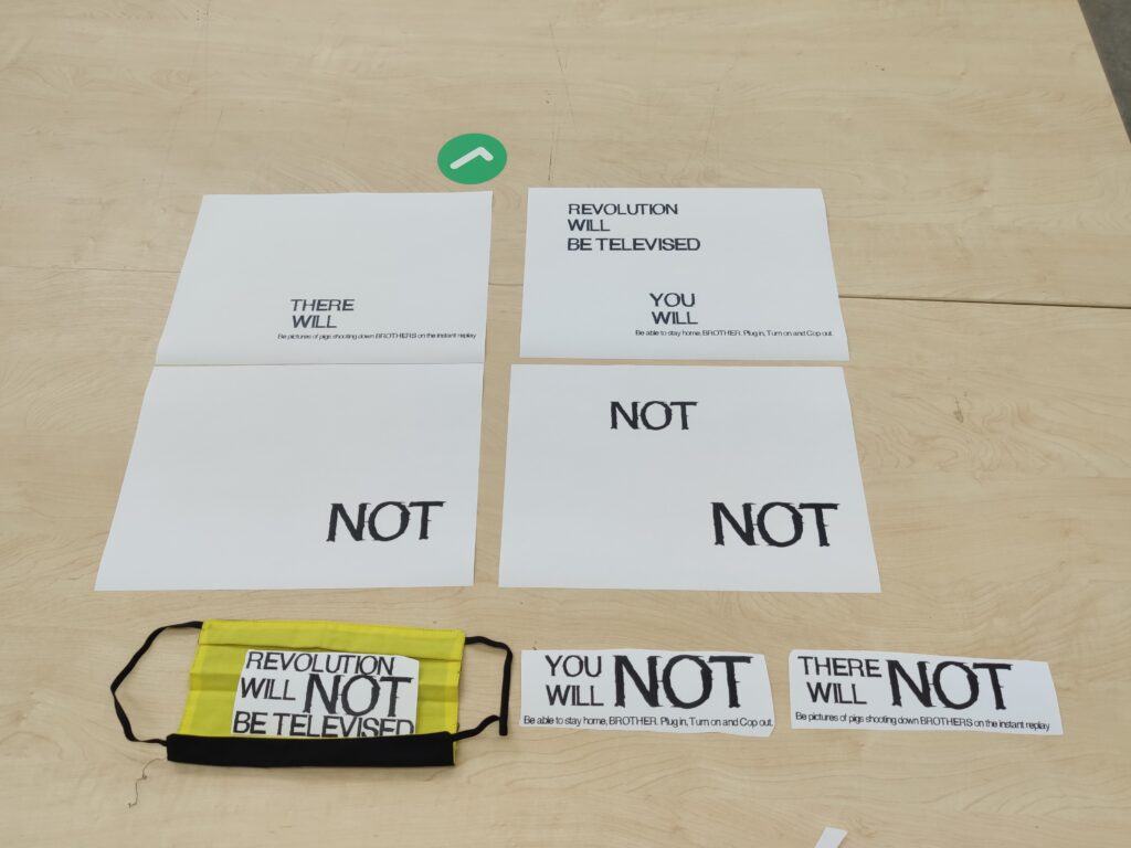
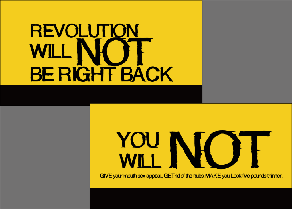
1.. In my first design, I tried to fit all sentences in one mask. However, after drawing out the sketches I realised that it is impossible to fit all words in one small piece of facemask, therefore, I selected some keywords and tried to develop from them.

Here are some digital versions of the design:

In the second design, I took the typography into a more ‘experimental’ direction:
They did look really cool, but there is also a disadvantage for these designs: If people are wearing them and walking on the street or protesting, the layout makes it hard to read which reduces its functionality.
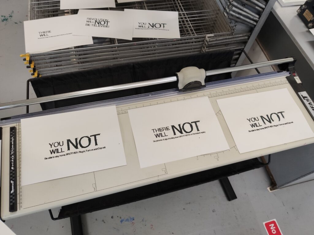
Here is the third set of designs:
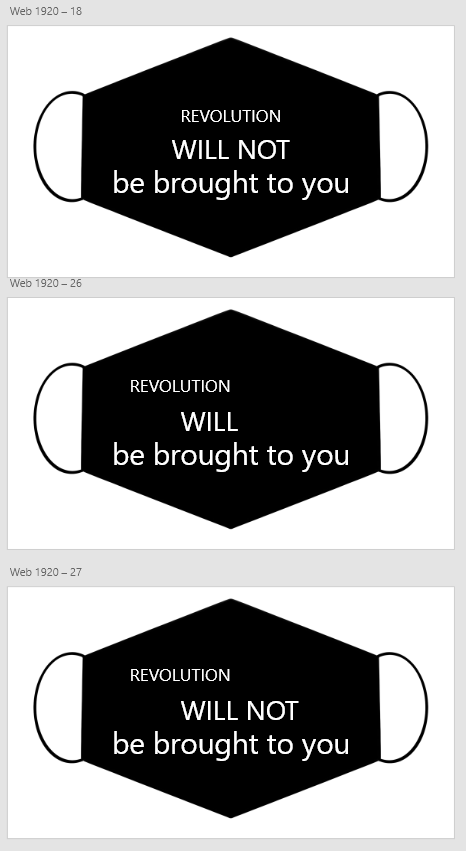
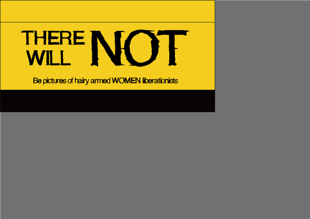
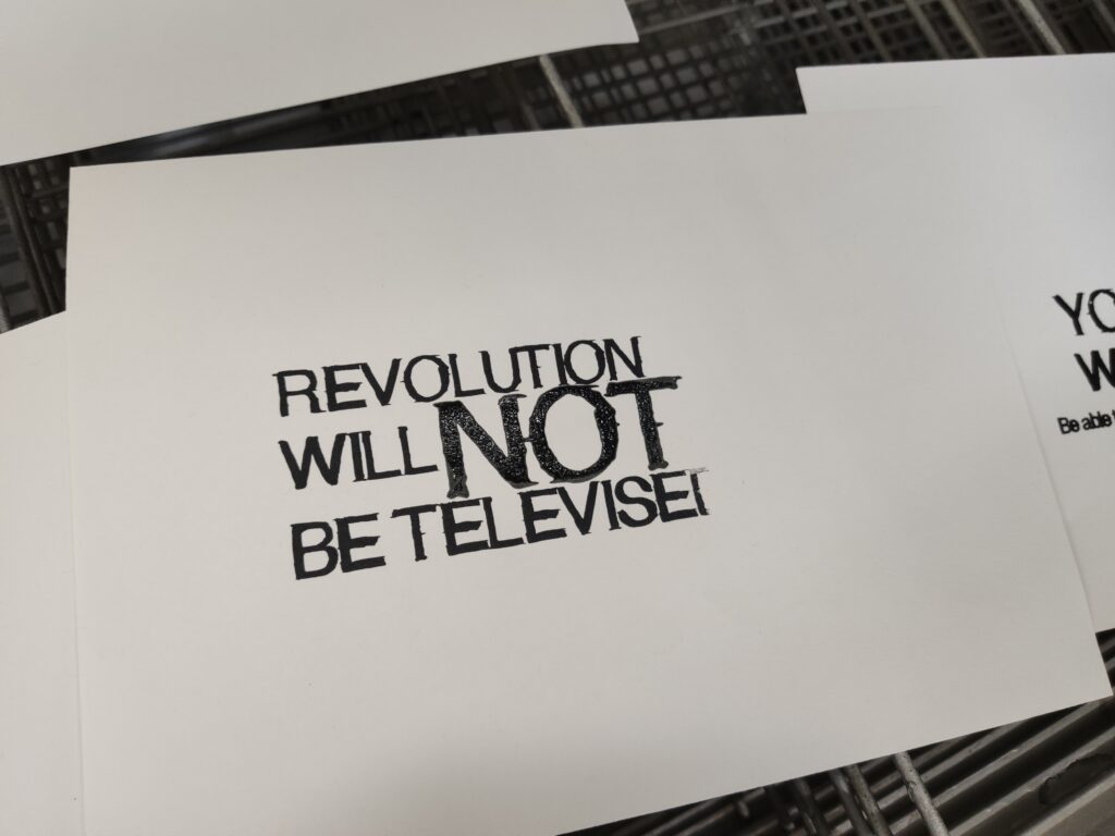
Personally, I really like this set of designs. I rephrased the original sentences and enlarge the keywords to make them look like it’s shouting at you.
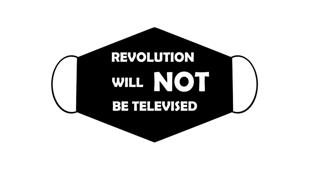
Here is the final design layout:
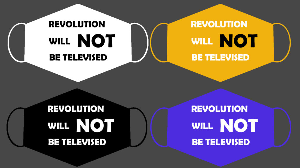
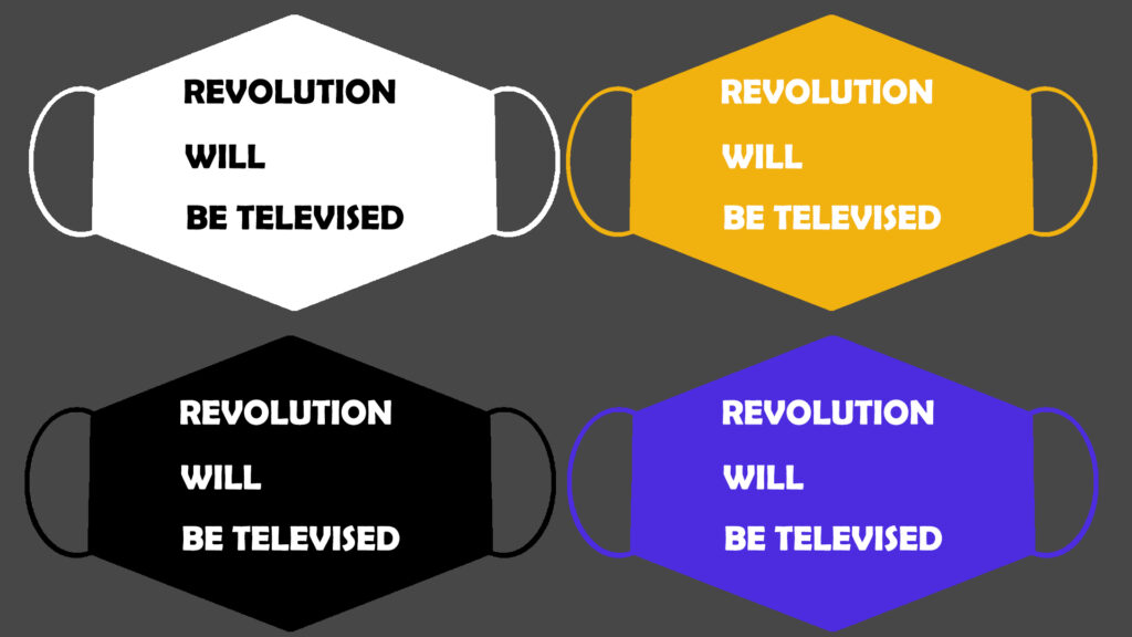
Here are some colour experiments I did base on the layout design:
I chose yellow as my starting point because it is one of the primary colours in the BLM movement. I think it makes a perfect effect when printing black on top of it because they make the mask looks like a warning sign.
Here are some test pieces with other facemasks:
THERMOCHROMIC INK.
I purchased the thermochromic ink from SFXC, and this will be the outcome I am looking forward to receive:

FONT DESIGN.
To make create a stronger visual impact, I decided to design a set of fonts.
The idea is generated from signs and objects used in protests. These words are usually written by hand but still delivers strong intentions:
Based on this inspiration, I created my own ‘handwritten’ font:
I also tested them with paragraphs to see how strong the message can be delivered through the fonts:
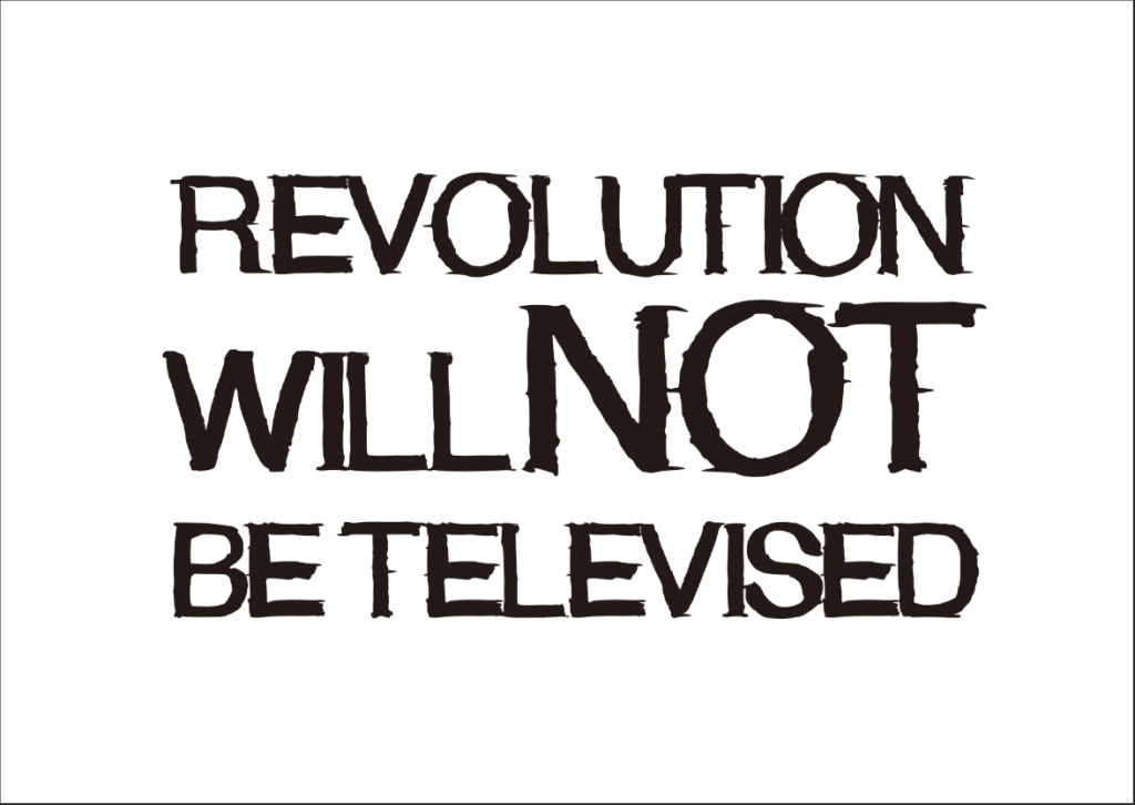
This here is the outcome:
CHOOSING A FACEMASK.
Mask 1.
This is the first type of mask I bought for the experiment:
I printed out the design on A4 paper and tried to fit it with the facemask. There are two issues with the mask: firstly, the works are stretched due to the hump; secondly, I spoke to the printing technician Andy, and he suggested to find a mask that can be flattened because a mask like this cannot be screen-printed.

In conclusion, mask 1 cannot be used in this project.
Mask 2.
After testing with the first type of facemask, I bought a new one, which can be flattened and suits perfectly with the texts:

I cut some bits off to make it flatter but accidentally enlarged the size of the mask. Therefore, the users need to roll the inner side out to fit their face structure, which adds some cool aesthetics to the design.
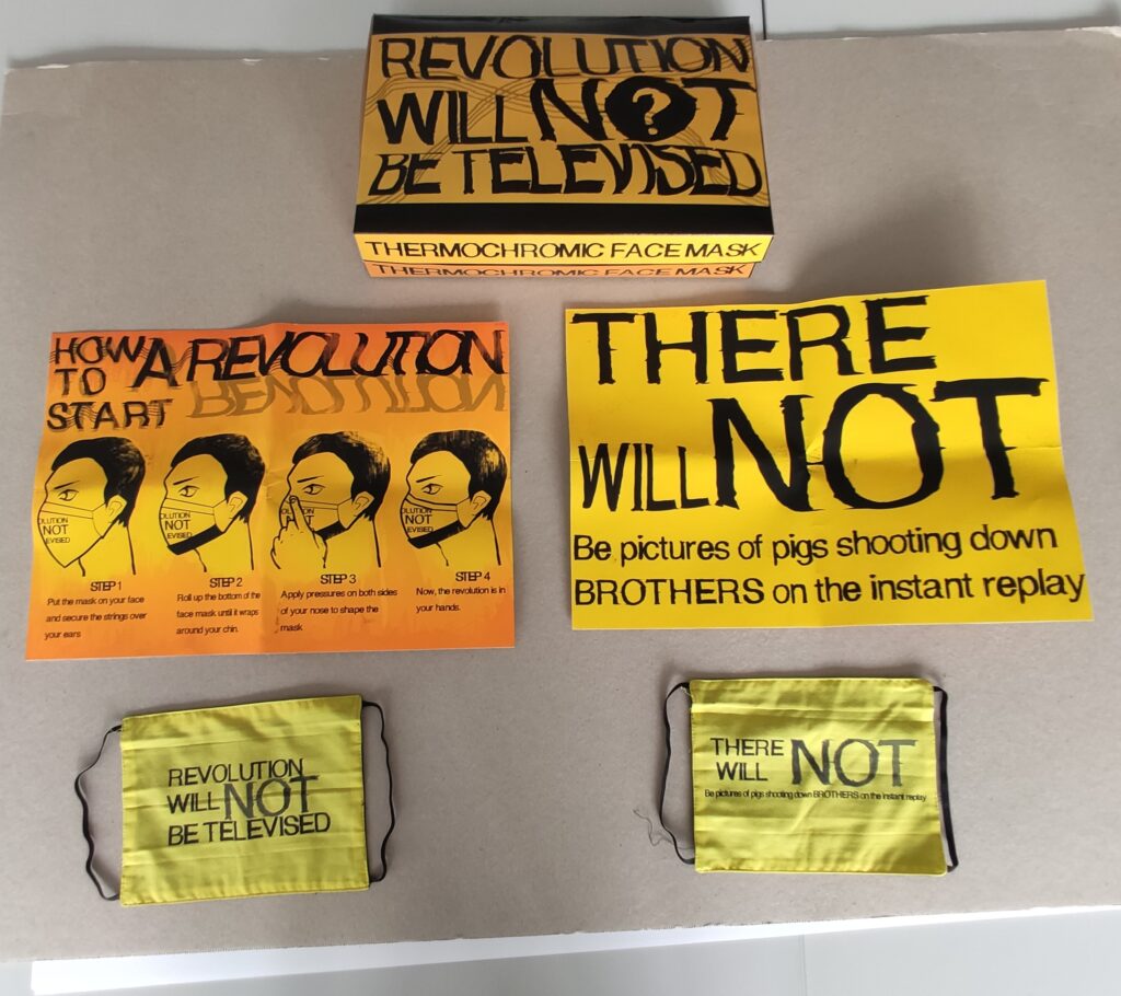
FINAL FACEMASK DESIGN.
Based on the experiments above, I designed the final look of the masks.
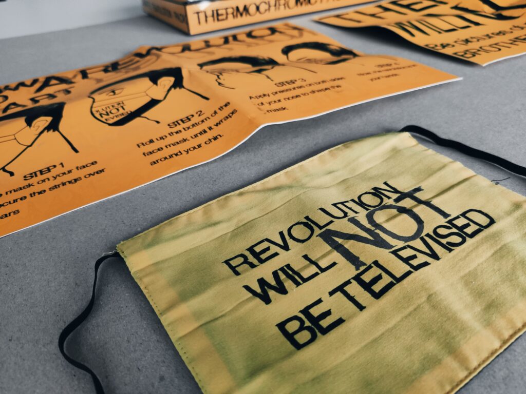
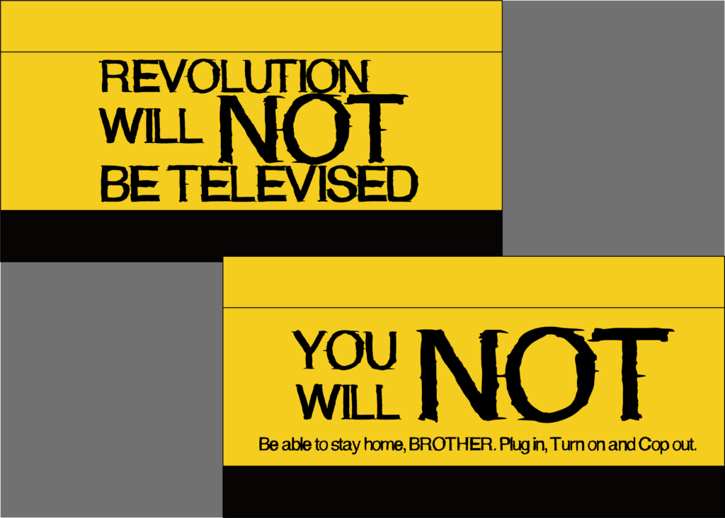
There are five masks in total. I have chosen some key phrases to print on one mask to indicate one or two paragraphs in the song:
THE MAKING OF THE MASK:
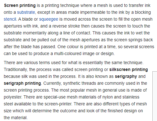
The method I will be using is called the screen-printing:
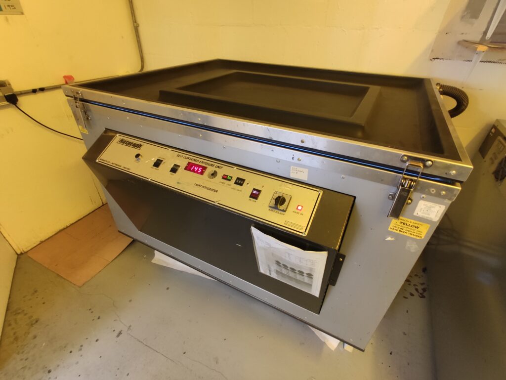
The first step is to use a UV machine to overlay the texts on a film board:
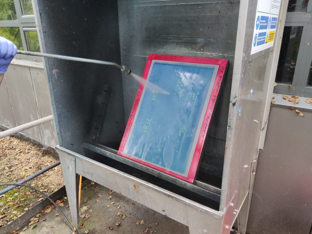
Once the texts are overlaid, we used a high-pressure water gun to watch the chemicals of the board:
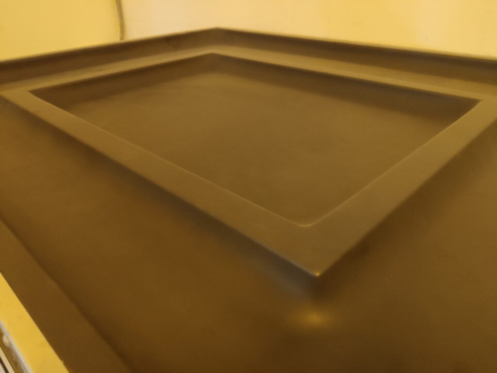
This is what it looks like after the preparation stage:
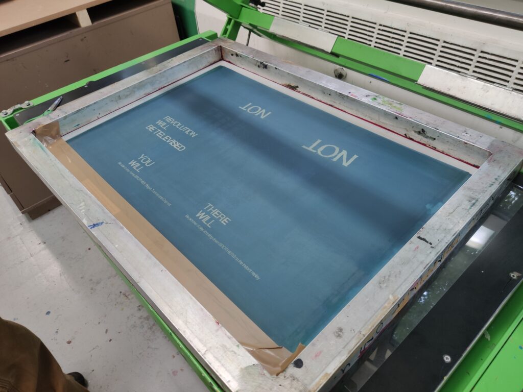
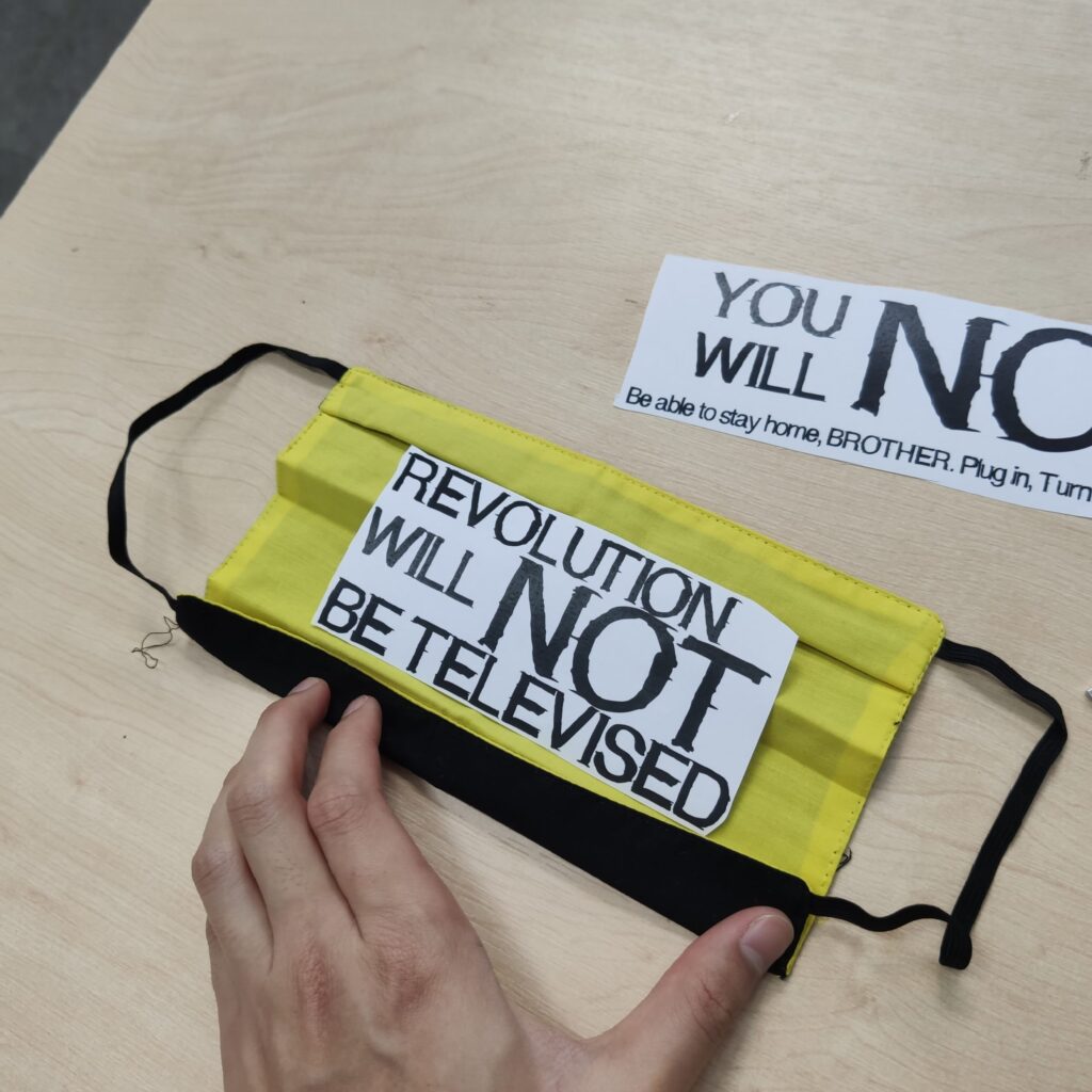
I separated the word ‘NOT’ and the rest of the text because they are using different inks. For ‘NOT’, I will be using thermochromic ink because it is the one that disappears when breathing. The rest of the texts are using acrylic paint since they don’t need to disappear.
To avoid errors, I tested it first on A4 paper to see how it goes:
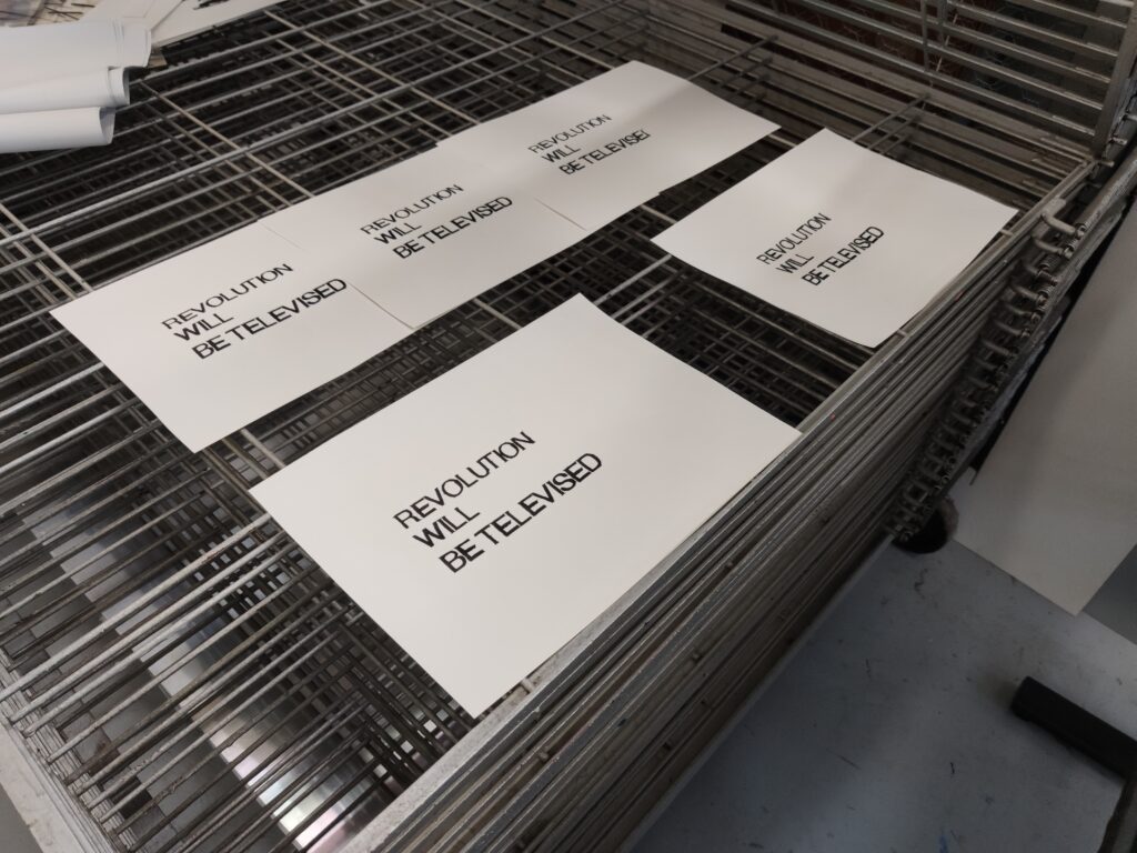
I printed out the texts with acrylic paint first and left a space for ‘NOT’.
After that, I used thermochromic ink to fill the texts with the ‘NOT’s.
This is the testing video:
Notice that the word doesn’t disappear completely. This is because the ink doesn’t work well with the paper but the fabric.
Once the experiment is done, I then started to print everything on the mask:

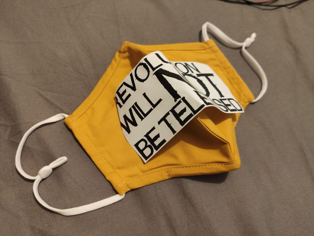
This is the outcome (with higher temperature):
This is the outcome (wearing the mask):
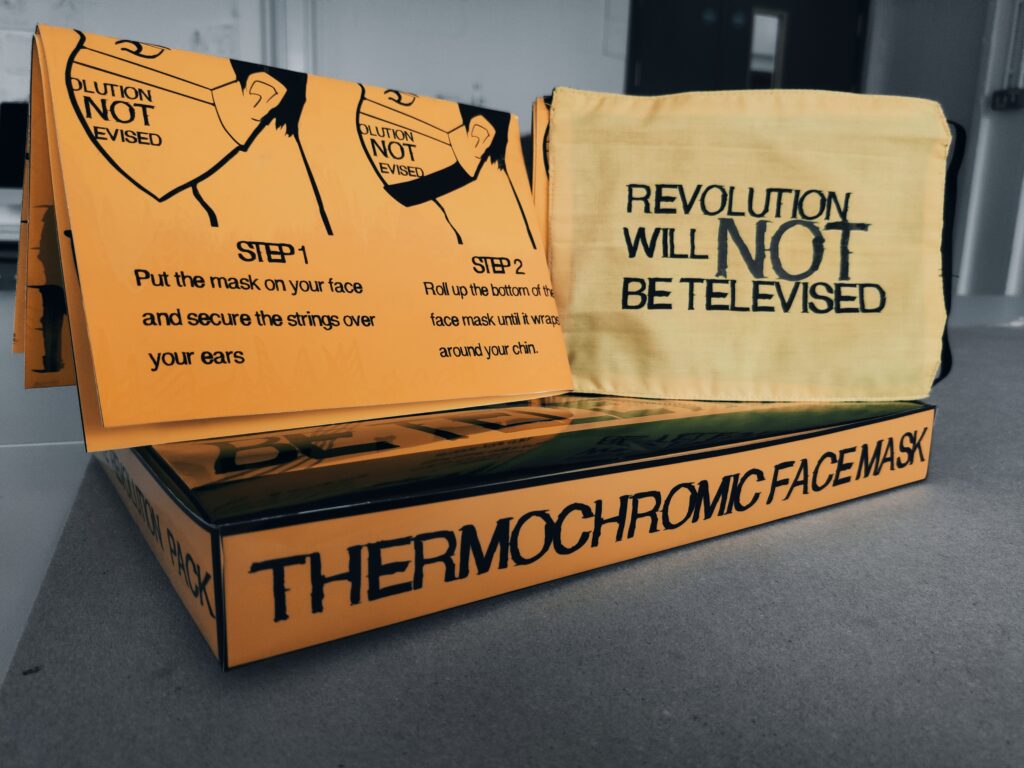
POSTERS.
During our tutorial, my tutor Danny suggested creating an instruction that helps the users to understand the purpose of this mask, as well as how to use it. Therefore, I decided to turn my facemask into a protest kit that people can use in the protests.
The plan is to create an instruction poster as well as a box that contains both the poster and the facemask.
The initial idea was to use thermochromic paint on the poster as well, see below:
This is a video showing how thermochromic paint can be used on paper:
From this idea, I designed a couple of posters.
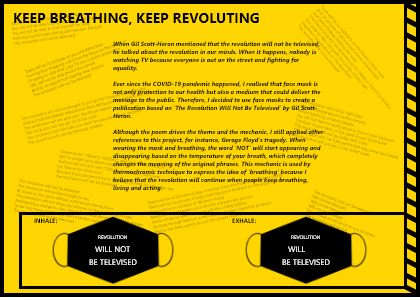
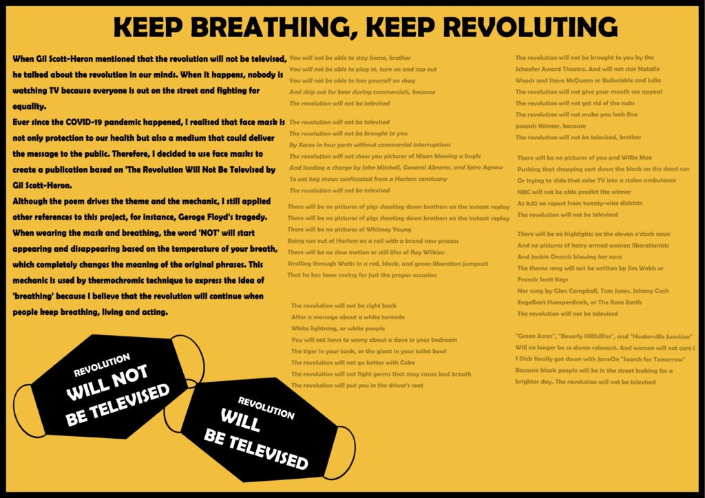
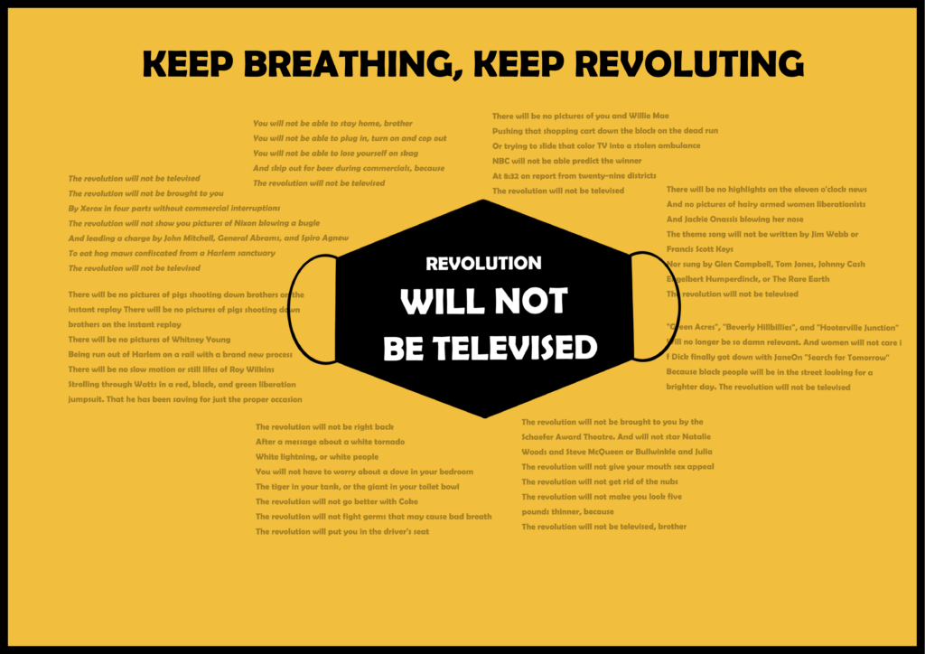
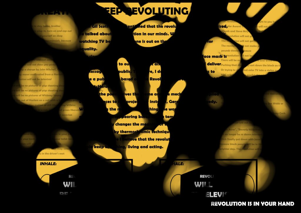
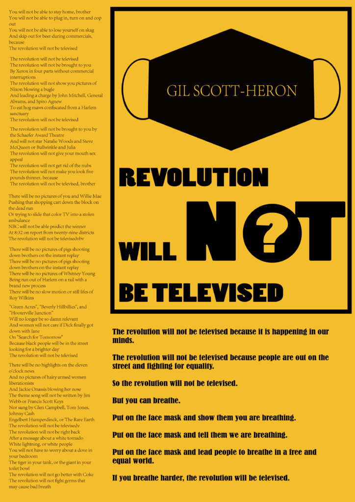
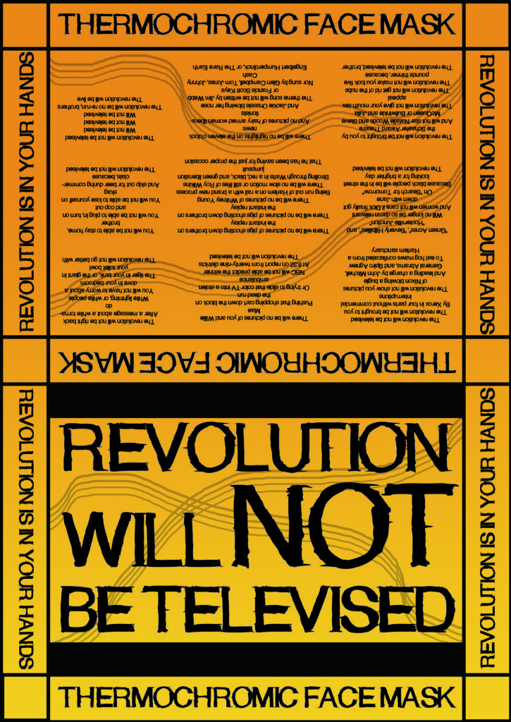
The idea behind this poster is to contain the entire song as well as instruct people how to use the facemask. I use the colours yellow and black to connect to the colours of the facemask. Furthermore, I use headlines to highlight my design principle, for instance, ‘keep breathing, keep revoluting’.

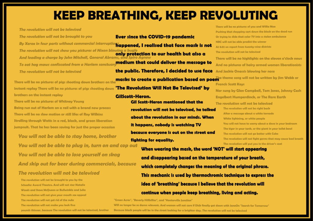
I tried to keep the composition ‘square’ and highlight the description of my mask rather than the song. The reason for doing this is because I want to make sure that people understand the logic behind my design.
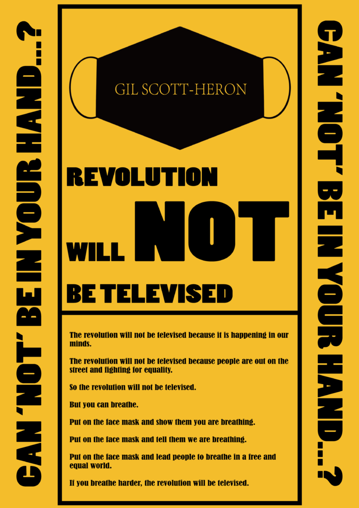
I also experimented with the thermochromic mechanic:
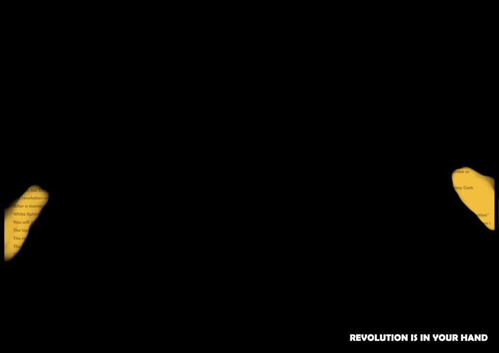
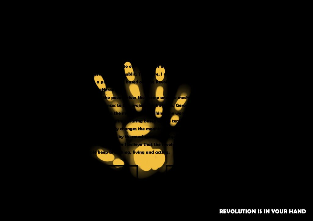
When there is no heat, the entire poster is only showing black except the phrase, ‘REVOLUTION IS IN YOUR HAND’. This is a small instruction telling people to put their hands on the paper.
Once they have put their hands or fingers on the paper, the temperature rises and they will be able to see what’s underneath.
Apart from the horizontal posters, I also tested the vertical ones to make them look more like a poster that can be settled on walls.
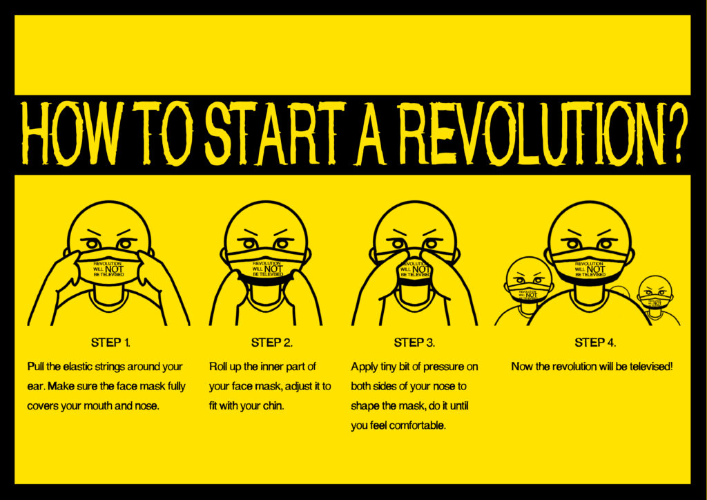
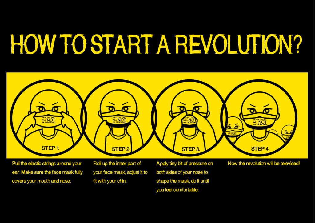
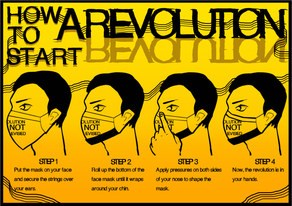
At this point, I realised that the poster doesn’t show enough information about ‘how to wear the mask’. It focuses too much on the ‘description’ side. Therefore, I decided to draw some figures showing the process of wearing a facemask:

Apart from the figures, I also started to design the compositions in the poster.
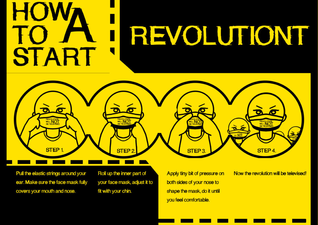
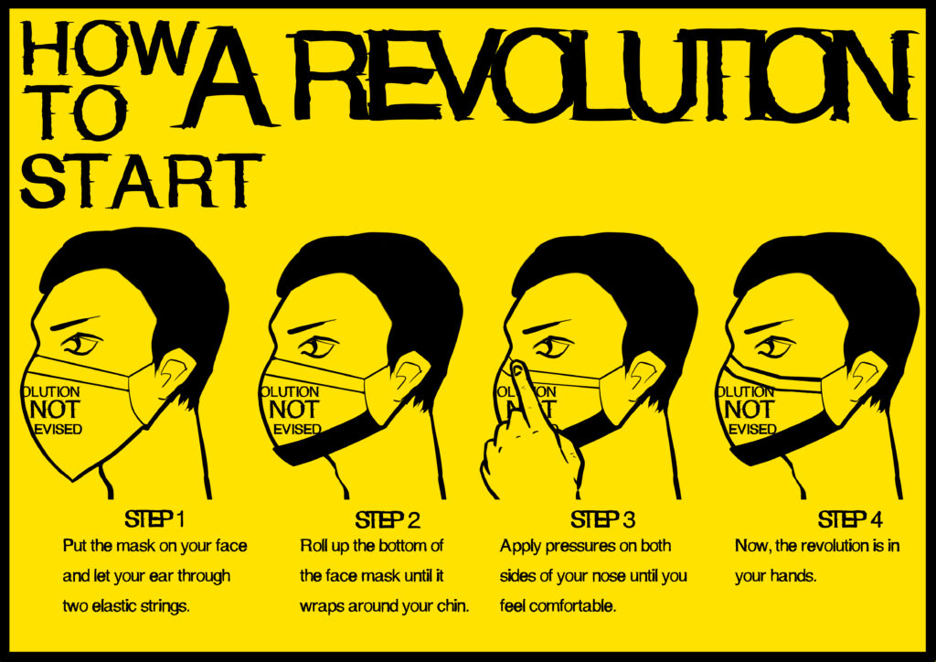
In the end, I decided to use side portraits as instructions, because it looks more formal and makes the product looks more professional. Here is the first look:
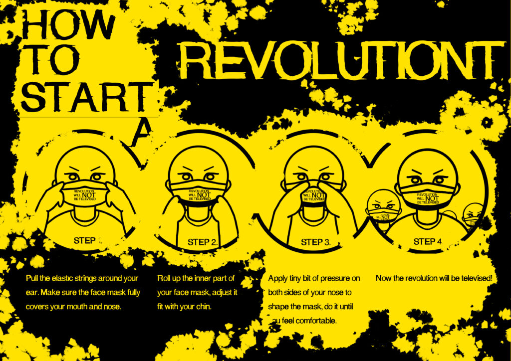
I also created some patterns and colour shifting to add more flavours into the poster:
Finally, I applied some paintbrush textures to create more visual impacts:

PACKAGE DESIGN.
Once the poster design is done, I then moved onto the package design.
My goal is to make a paper box for the masks, and the idea is inspired by this video:
I measured the gaps and designed the layout below:
The design can be separated into 3 parts: the front, the back and the side.
The front is going to be ‘REVOLUTION WILL NOT BE TELEVISED’, that follows the same design as the facemask.
The back is going to be all lyrics from the original song.
The side is printed with texts that add more flavour to the design.
This is the final design:

PROJECT 2 FINISHED PRODUCT.