Downloadable PDF link for project 2:
Brief.
In summary, our task for the next couple of weeks is to discover our surroundings, figure out daily activities, and try to implement the techniques we have learnt from research to create 3 user experience models.
Planning.
Mind Map and plans.
According to the brief, we should be gathering research base on where we stay, and I chose the park nearby where I live in order to collect reasonable data. The title I will be going for is to discover the ‘Activities in the park’, therefore all research and conclusions will be outcoming base on this theme.
The reason of choosing ‘Activities in the park’ as my theme is because it happens all the time, from morning to evening and back to morning again, just like a cycle. I have been living next to the park for over 10 years now, but I haven’t been paying attention to the activities, community or even the ecosystem in the park until now, therefore I will use this project as an opportunity to discover what is going on in the park.
The first thing I did was to make a mind map to get started:
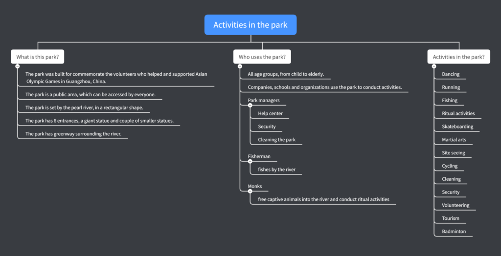
According to the mind map above, I asked myself 3 questions relating to the park, the users and the functions. By listing down all these bullet points, more questions appear:
1… Why do people come to this park?
2… When do they come to this park?
3… Why do people do these activities in the park?
In order to find answers to these questions listed above, I made a plan to show the data I need to collect and the methods could be used during the data collection.

Making a plan helps me to construct what I will be doing and self checking everything I have done. In this plan I created three rectangular tabs which hold the directions that I want to discover. Circular tabs are the actions/methods I use to collect data. Dimond tabs are the specific data I will be collecting. Furthermore, colours also have meanings in this plan: Blue is the theme, yellow is the interview and red is the observation.
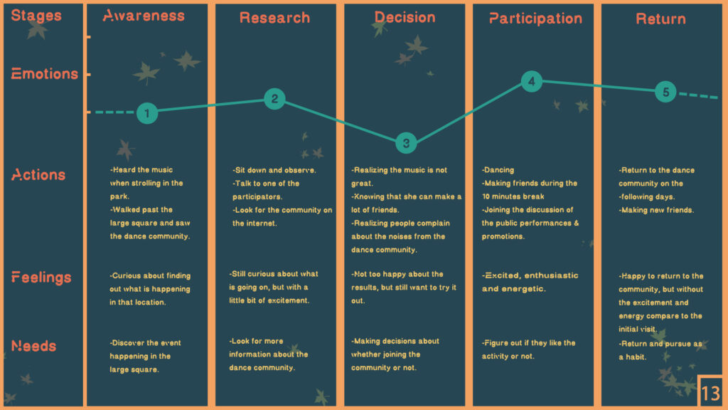
In order to come up with clear answers to the three questions above, I decided to use three user experience methods to compile all the data and simulate a person’s activity in the park, here is the structure sheet:
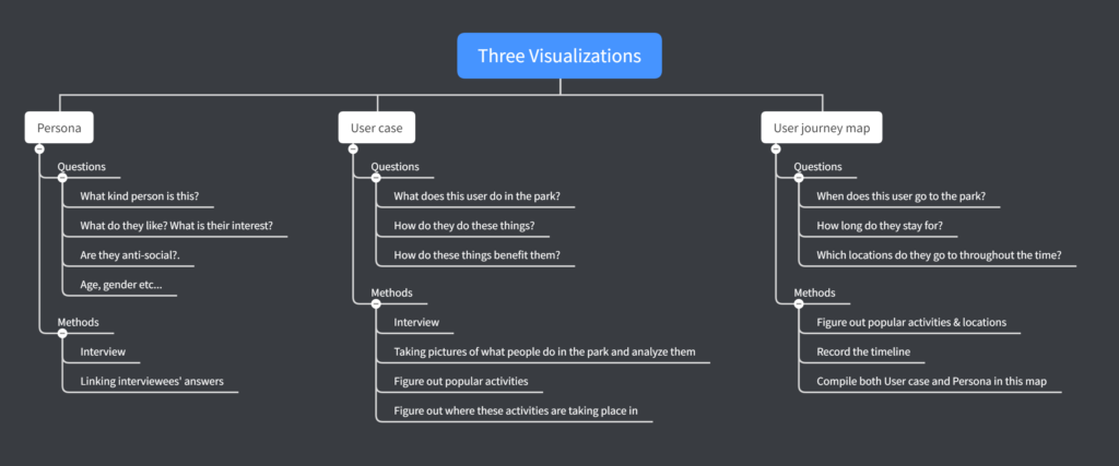
By following the plan and the structure sheet, I am having a clear vision of what to do in the next couple of weeks.
Research.
Phase 1. Users in the park
In phase 1, I will be collecting as much information as I need in order to form Persona model, User case model and User journey map.
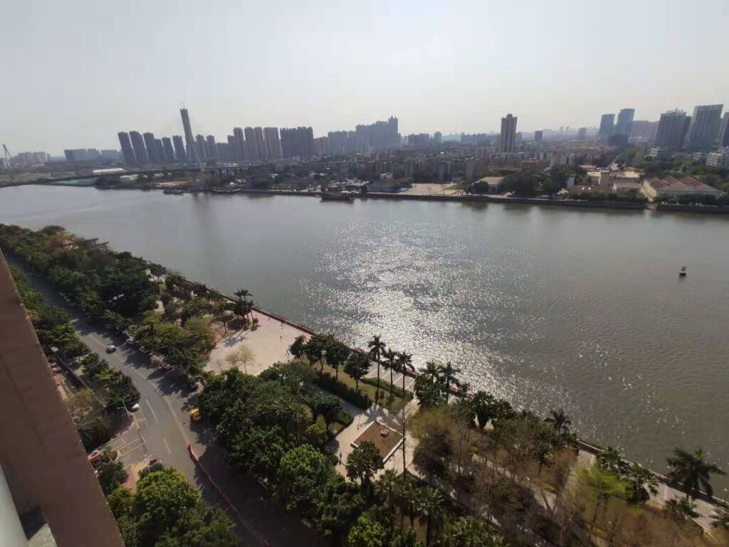
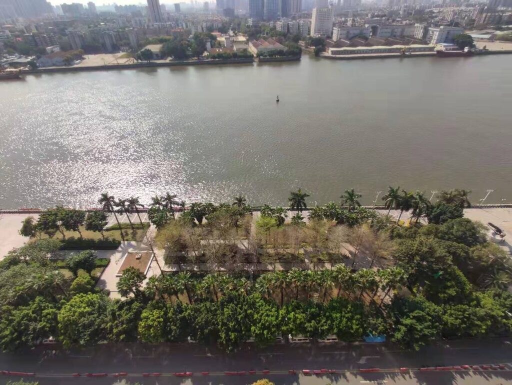
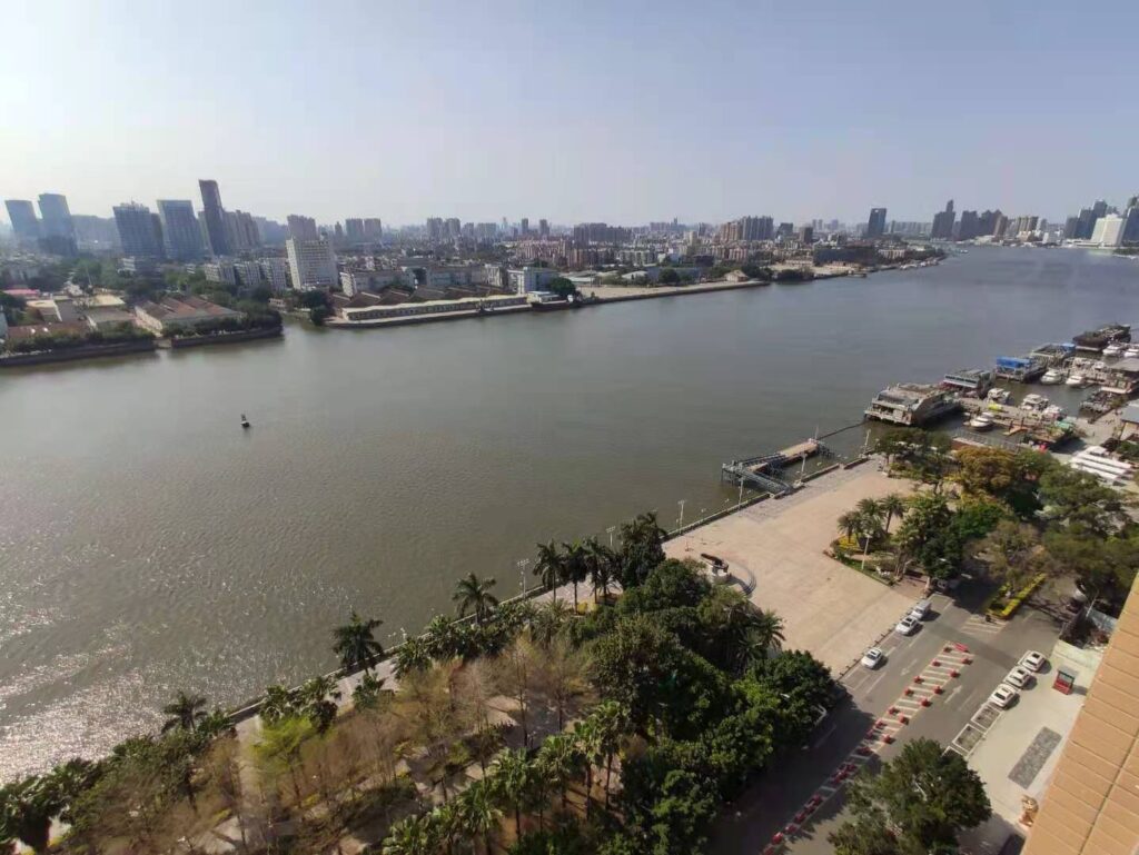
The very first thing I do is gathering primary research and making reflections/annotation of them. Due to the fact that the park is located downstairs from where I live, it provides me a clear top-down view and also conveniency when interviewing people, therefore most of my primary research will be taking place either in the park or in my room. Here are photos taken from my window, they present clear overviews of the park:
To get things started, I decided to count the total number of people in the park per hour, from 6am to 2am. The reason of doing this is because firstly I will know the active hours (timeline) in the park, and secondly I will be able to see when is the best time to go downstairs and do research. Here is the table I made to showcase the results:

Here is a line chart I made to visualize results from the table above (figure 1):
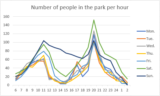
The line chart visualizes the active hours in the park. According to figure 2, time zones such as 6 – 7am, 2- 4 pm and 2am onwards have the least active moments; In comparison, 11 – 12pm, 8 – 9 pm have the most active moments among all time zones. (Reason for this phenomena is in Phase 4)
This set of data will be very helpful when building the timeline for my user model.
Phase 2. Who are the users?
Here are 20 people I interviewed at 20:00 on Tuesday:
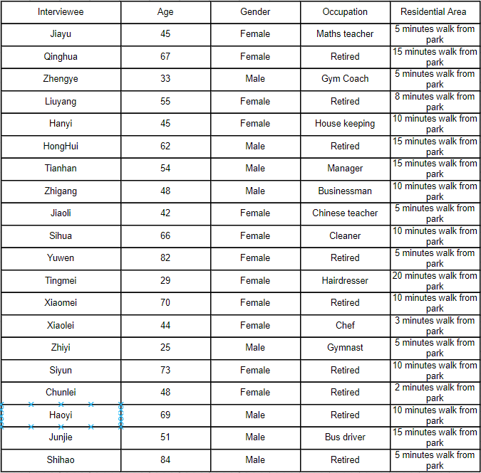
For privacy issues, all names are made up and their looks are not going to be shown.
The way I interviewed them was completely random. I stood nearby one of the entrances and interviewed anyone who walked out from the park in order to get the widest range of results.
The first set of questions covers their age, gender, current status and residential area.
The reason for collecting these data is because I need a rich set of data to support the Persona model I am about to create, which means I need to know what kind of people go to the park.
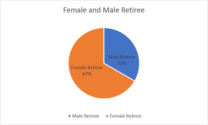
Here is a pie chart(figure 4) showcases the percentage of male and female from the interview, and it gives me a clear idea when justifying the gender for the user model.
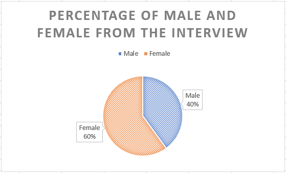
According to figure 4, there are more female interviewees I encountered at 20:00 on Monday, therefore the gender for my user model will be female. (Reason for this phenomena is in Phase 4)
Here is a box plot(figure 5) I created to figure out my interviewees’ age group:
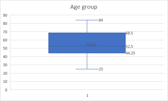
As we can see from figure 5, 84 is the oldest and 25 is the youngest. The range of the age group is around 44 to 68, which means the most of my interviewees are in their middle ages.(Reason for this phenomena is in Phase 4) Therefore, I will be using 53 as the age for my user model because it was shown as the middle number in this chart.
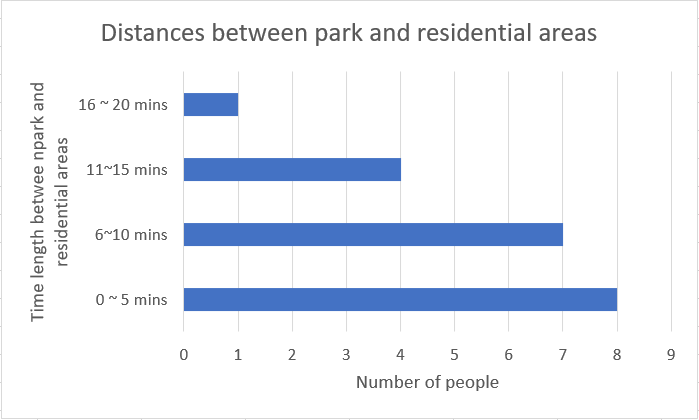
With figure 6, I was aiming to find out how far do people live from the park. By knowing this, I will have a clear understanding why people come to this park to do activities rather than other places. (Reason for this phenomena is in Phase 4)
According to figure 6, most of the people are living only 0 – 5 mins away from the park, and only 1 people lives 16 – 20 minutes away from the park. Base on the data collected, my user model will be living about 5 minutes away from the park.
Phase 3. What do users do?
In the 3rd phase, I will be looking at what do people do and think during these activities in the park.
I interviewed the same group of people but with extended questions, see below (figure 7):
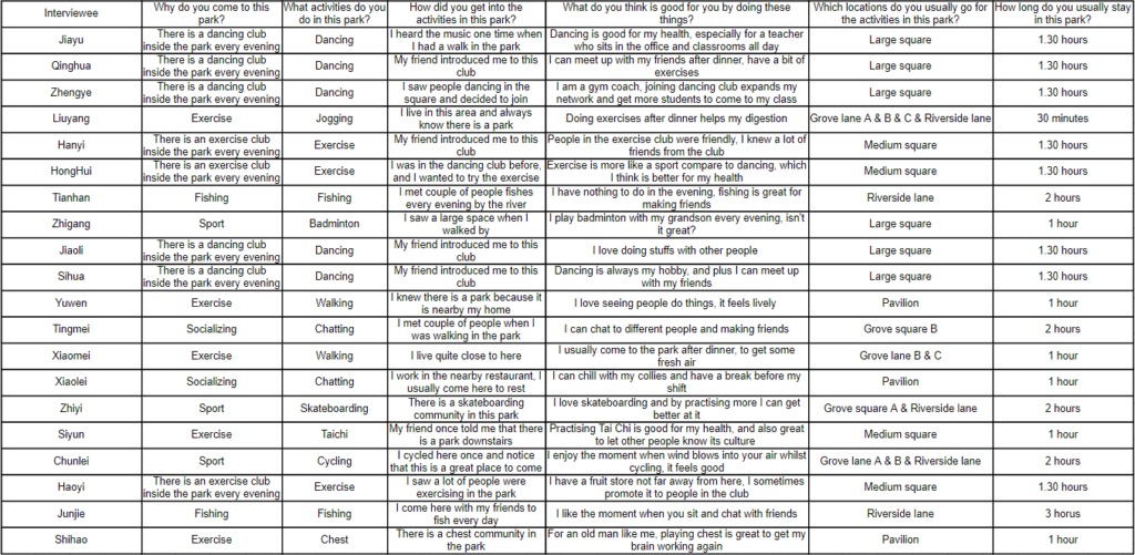
By interviewing people with the extended questions, I will have a clear view of their activities, purposes, interests and locations etc..

Image above is an photograph I took in the park at 20:00 on Saturday, it is located in the large square. The reason for showing this image is because I want to present a clear vision of what it looks like in the park’s busiest time. As we can see from the picture, there are a lot of people doing different activities in the park such as exercising, cycling, dancing, walking and socializing. In addition to the activities, the park provides a great lighting system to observe better at night, as well as the huge space for people to do activities.
Similar to phase 2, I will be visualizing the interview (figure 7) in order to generate the results in a better and clearer way:
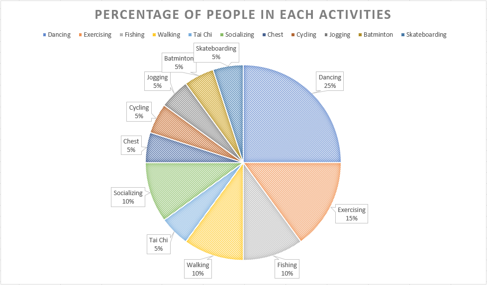
The first visualization is the percentage of people in each activity(figure 8). The aim for making this graph is to find out what are the most popular activities in the park. In this case, they are dancing(25%) and exercising(15%). (Conclusion for this phenomena is in Phase 4)
Base on the data shown above, dancing will be the major activity for my user model.
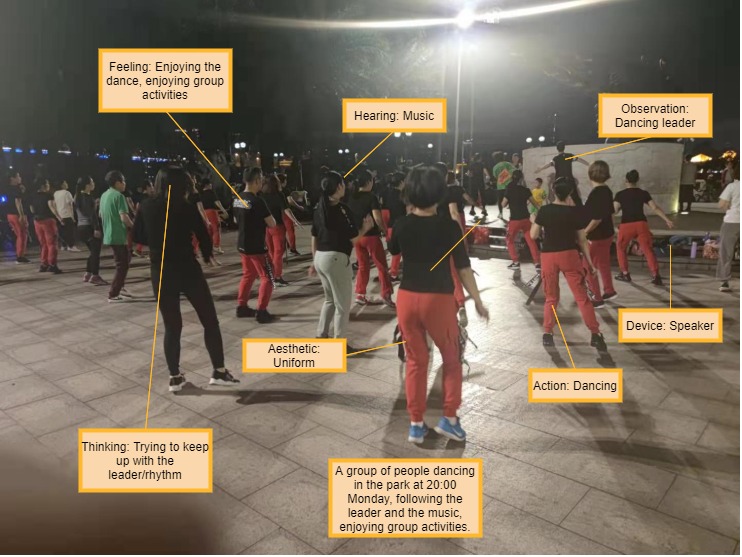
In order to have better understanding of dancing in the park, I made an image analysis shown below:
The second visualization is how long the interviewees are usually staying in the park.
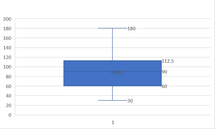
According to the box plot, the longest time people stays is 180 minutes, and the shortest time is 30 minutes. The middle number for this range is about 90 minutes long, therefore my user model will be staying in the park for about 90 minutes.
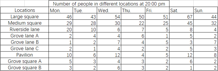
In order to expand the research on counting number of people in the park in each hour, I also counted number of people in each location at 20:00. The reason for choosing this time is because it is the most active moment in the park, which means that it will be easier to collect data.
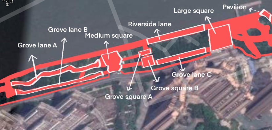
Here is a basic layout of the park, I captured this image from google map and putting annotations on top. I divided the entire park into 9 locations in order to visually present number of people in each area.

Based on the external research, I drew out an orthography of the park in order to figure out and present to visualize the hottest spots in the park. I used Monday’s data as an example, here is the outcome:
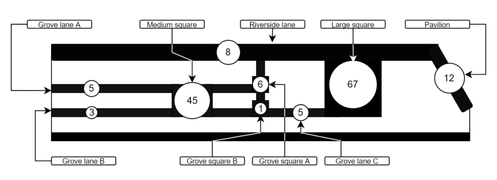
According to figure 12, ‘large square’ has the highest number of people and ‘grove square B’ is the opposite. (Reason for this phenomena is in Phase 4) Therefore, my user model will be mainly doing activities in the large square.
Phase 4. Linking researches and making conclusions
In this section, I will be mainly linking the researches together in order to build a system which allows me to create my user models. Furthermore, making conclusions will also be part of this sections, to explain why people are proceeding some kind of actions or habbit.
The first topic I am talking about is the gender. According to figure 4, there are more female than male (0.6 : 0.4) in the park. Based on this result, I would like to dig deeper to find out what causes this phenomenon. One of the most important features leads to this result is that I chose 20:00 to proceed my interviews, and it was the time when most of the people were dancing, based on data shown in figure 8.
Reported by He Huifeng, ‘Square dancing’ is a phenomenon in China, which was originally appeared in the 1990s, when tens of millions of people lost their jobs. Professor Huang Yongjun at Hunan Normal University said that “People have plenty of time but little money” was a common phenomenon during that period of time. In that case, this low-cost activity is one of the few entertainments which people can participate and enjoy. Professor Huang also said that most square dancers are older Chinese women between the ages of 50 and 60, who had overlapped with the Cultural Revolution throughout their childhood and teenage. During that period of time, women were encouraged to be collective, which makes them feel stronger and safer when doing things with others. In my opinion, this is a situation where it presents how women’s status in the society and how they try to overcome the hurdles. This explains why there are women in my interview results. In addition to the square dancing, I also noticed that there are more female retirees than male:
According to China’s Labor Insurance Regulation, the general retirement age for male is 60, and 50 – 55 for woman. This explains why there are more female in the park than the male, because most of the older Chinese women are retired, who has plenty of time to participate the activities in the park.
The second topic is why most of the people in the park are in their older ages. According to Huang yongjun, not only women but men who have been through their childhood and teenage during 1960 – 1970 was also influenced by the popular trend of collectivism rather than individualism. Therefore, people in their ages of 50 and 60, no matter they are male of female will enjoy the atmosphere of doing activities with others. This also explains why people in the dancing community are wearing same uniforms, because it is a representation of unifying.
The third topic is the reason of people coming to this park for the activities. According to my interview, most of the people are living 0 – 5 minutes away from their residential area. This means that the park has easier accessibility for people who live nearby. However, people come to the park for different purposes rather than doing the activities, for instance a gym coach wants to build his reputation as well as building his network, in order to get more students to sign up for his classes.
The fourth topic I am going to discuss the reason why square dancing is so popular in the park. According to Forrest Yu, square dancing is an activity that is no cost, easy to learn and full of happiness. It brings people together and have fun with each other, letting people to know they are not alone in the society. After reading Yu’s article, I realized that the square dancing and exercising is the only group activities in my research, and it probably explains why these are the two hottest activities among others.
The final topic is about how people found the activities, especially for the square dancing. According to my research, most of the people either heard the music from the speaker, or saw the activity when walked past the community. This leads to an interesting thought: Is affordance functioning in these cases?
Here is a quick overview of what affordance is in designs:
According to figure 12, I realized that all paths such as grove lane A, B, C and riverside lane are intersecting with both medium and large squares. This means if people follow the lanes, no matter where they start and which directions they walk towards, they will eventually end up in one of the squares. Furthermore, based on the theory explained in the video, when people are walking in a narrower space, something different to their current environment will be attractive and automatically lead them to there, for instance, a square. Maybe this is one of the reasons why there are more people in the squares rather than other parts of the park.
After concluding all the research I have done, the next thing is to use the outcome to actually build my user models.
User models
Persona.

Use case.

User journey map.
Downloadable PDF link for project 2: